

The Situation and What Was on the Line
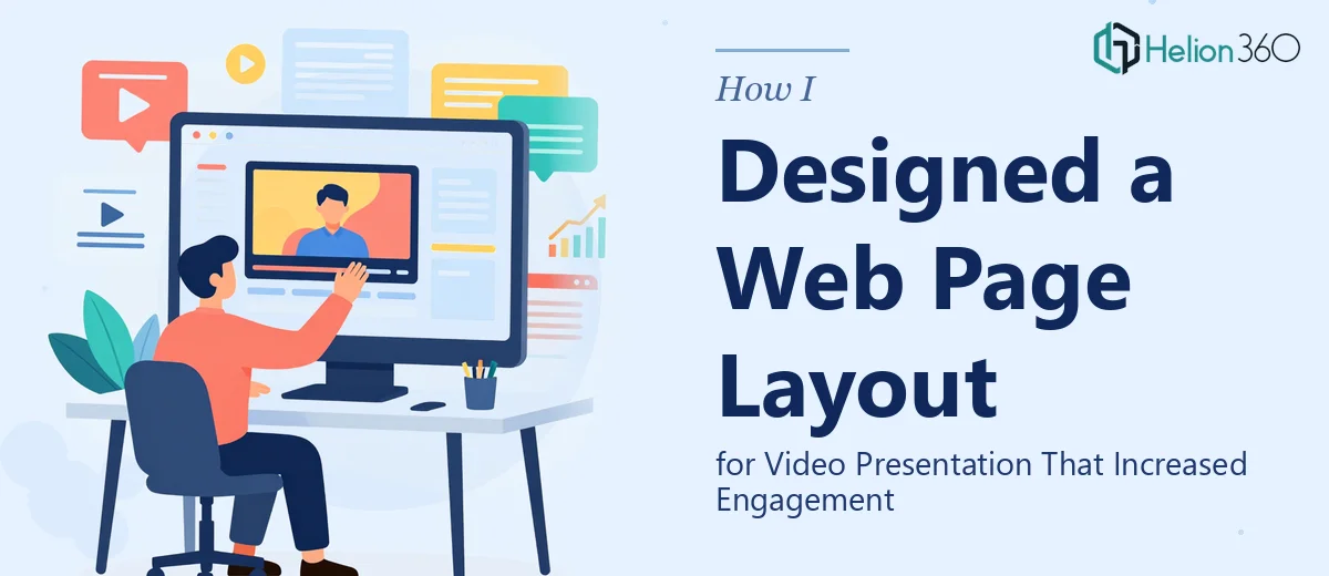
I was sitting on a video presentation that had solid content — a clear core message, decent footage, the right talking points. What it didn't have was a web page that could hold it together visually and keep viewers engaged long enough to actually watch it. The page where the video lived was flat, unstructured, and doing nothing to support the story the video was trying to tell.
The stakes were real. This wasn't an internal recording. It was going out to an audience that would make a judgment about our brand within the first few seconds of landing on that page. If the layout felt generic or cluttered, the video would get skipped. If the visual hierarchy didn't guide the eye toward the player, people would bounce before pressing play.
I knew immediately that getting the web page layout for a video presentation right wasn't a matter of shuffling some elements around in a template. It needed proper design thinking — and it needed to be done before the presentation went live.
What I Found the Work Actually Required
Once I started researching what a well-designed web page layout for video presentation actually involves, the complexity showed up fast. The first thing I noticed was that this wasn't just a visual problem — it was a structural one. The page needed to answer several questions at once: Where does the eye land first? What context does a viewer need before they hit play? What happens after the video ends?
The second signal of real complexity was the relationship between the video player and the surrounding content. Done well, the layout uses spatial hierarchy to make the player the undeniable focal point while supporting elements — headlines, supporting copy, calls to action — do their job without competing for attention. That balance is harder to achieve than it looks.
The third thing that stood out was responsiveness. A layout that works on a desktop widescreen has to translate cleanly to a tablet and a mobile screen without the video getting buried or the supporting content falling apart. Each breakpoint is its own design problem. It was clear to me that this wasn't a weekend project — it required someone who does this work at depth, regularly.
What the Design Work Actually Involves
The right approach to UI presentation graphics design starts with a structural audit of the content hierarchy. This means mapping out what information the viewer needs at each stage — before the video, during, and after — and deciding how the layout guides them through that journey. A well-executed page typically uses a clear above-the-fold zone that includes the video player, a headline no longer than 10–12 words, and a single supporting statement, all sitting inside a contained content column that's roughly 60–70% of the viewport width on desktop. Getting that initial structure right is foundational, and it takes real back-and-forth between content intent and spatial logic before a single visual element is placed. Rushing this phase produces pages that look busy even when they're minimal.
Visual mechanics are where the layout either comes together or falls apart. A properly built grid for this kind of page typically uses an 8-point spacing system to create consistent rhythm between the player, supporting text, and any secondary content blocks below the fold. Typography hierarchy matters here: a hero headline at 48–56pt, a subheadline or descriptor at 24–28pt, and body or caption text at 14–16pt. Color usage needs discipline — no more than two accent colors alongside a neutral base, applied consistently across the player surround, CTA buttons, and section dividers. Practitioners setting this up from scratch in a real web environment spend significant time reconciling the design system with what the platform will actually render without breaking.
Polish and cross-device consistency are where the work becomes genuinely time-consuming. Each responsive breakpoint — typically 1440px desktop, 768px tablet, and 375px mobile — requires its own layout review. The video player aspect ratio (almost always 16:9) needs to scale fluidly without letterboxing or overflow. Supporting content that stacks gracefully on mobile often needs explicit reordering logic so the headline doesn't end up below the player on a small screen. Implementing and testing these states, checking that fonts don't reflow awkwardly, and ensuring interactive elements hit minimum 44px tap targets adds hours to even a clean initial design. This is the phase that trips up most people who attempt it without a systematic workflow already in place.
Why I Brought in Helion360 to Handle It
I didn't attempt this myself. Once I understood what proper web page design for a video presentation actually required — the structural planning, the grid work, the responsive states — it was clear that trying to execute it in the time I had would have meant cutting corners on every phase that mattered.
Helion360 handled the full project end-to-end. That meant the content hierarchy mapping, the grid-based layout build, the typography system, the responsive breakpoint work, and the final polish pass — all of it. They turned it around quickly, in a fraction of the time it would have taken me to work through the learning curve and get to a production-ready result on my own.
What made the difference was that this is the kind of work they do constantly. The tooling is already in place, the design decisions they face every day on projects like this are the same decisions that would have taken me days to research and resolve. It was done in days, not weeks, and the output was at a level I wouldn't have reached on my own.
The Outcome and What I'd Tell Anyone in My Spot
The delivered page gave the video the stage it needed. The layout made the player the clear focal point, the supporting content reinforced the message without cluttering the view, and the mobile experience held up cleanly across devices. The presentation went out looking like it belonged to a brand that takes its visual communication seriously — which is exactly the impression it needed to make.
The content didn't change. The video didn't change. What changed was the context around it, and that context did real work in how the audience received the presentation.
If you're looking at a similar situation — a video presentation that deserves a web page layout built to match it — and you want it handled end-to-end without the weeks of trial and error, Helion360 is the team to engage. They delivered fast, with the kind of execution depth this work requires.