

When the Data Work Got Bigger Than the Team
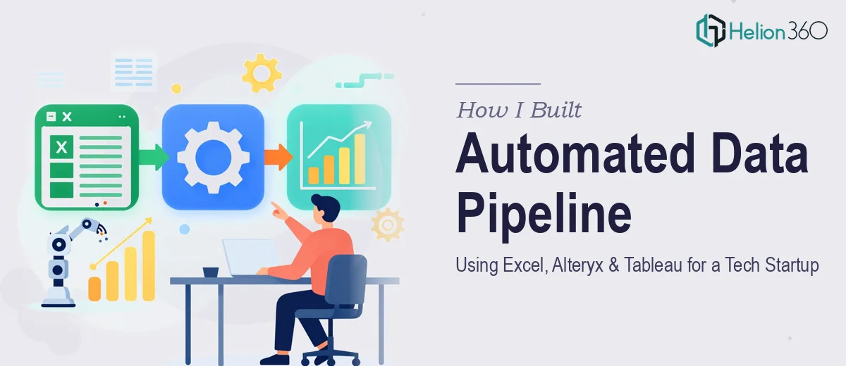
We were a small but fast-moving tech startup. Every week, our operations team was manually pulling data from multiple sources, cleaning it in Excel, and then building Tableau dashboards from scratch — again and again. It was repetitive, error-prone, and eating hours we did not have.
I took it on myself to fix the process. I had a working knowledge of Excel and had used Tableau before. The plan seemed straightforward: map the data sources, clean and structure the inputs, and build a set of reusable dashboards that the team could actually rely on.
Where the Process Started Breaking Down
The Excel side was manageable at first. I set up structured templates, used Power Query to pull in data from a few internal sources, and got some basic reporting in place. But the real bottleneck was the middle layer — the data transformation step between raw inputs and Tableau-ready outputs.
That is where Alteryx came in, at least in theory. I had heard it was the right tool for automating data blending and complex transformation workflows without writing full scripts. But building a reliable Alteryx workflow from scratch, while also maintaining the Tableau dashboards and keeping the Excel inputs clean, was more than I could manage alongside everything else on my plate.
The dashboards I was producing in Tableau were functional but not polished. The Alteryx workflows I attempted kept breaking when input formats changed slightly. And the data visualization we needed — the kind that could communicate trends clearly to non-technical stakeholders — required more structured design thinking than I had bandwidth for.
Bringing in Outside Expertise
After a few weeks of patching things together, I reached out to Helion360. I explained the situation: we needed a proper automated pipeline that moved data from Excel inputs through Alteryx transformations and into clean, reliable Tableau dashboards. I also wanted the visual output to actually communicate something useful, not just display numbers.
Their team asked the right questions upfront — about data sources, refresh frequency, how the dashboards would be used, and who the end audience was. That gave me confidence they understood the full scope, not just the technical pieces in isolation.
What the Build Actually Looked Like
Helion360 structured the workflow in a way I had not quite mapped out myself. The Alteryx pipeline was designed to handle variable input formats without manual intervention, which solved the biggest recurring problem I had been running into. The Excel templates were standardized on the input side so data flowed cleanly into Alteryx without requiring cleanup each time.
On the Tableau side, the dashboards went through a real design pass. Filters were intuitive, chart types were matched to the actual data story, and the layout made sense for someone scanning quickly in a meeting. The data visualization was no longer just accurate — it was readable and useful at a glance.
The whole pipeline was documented clearly enough that our internal team could maintain it without needing to call anyone for routine changes.
What I Took Away From This
The problem was never that the tools were too complicated. Excel, Alteryx, and Tableau are all powerful on their own. The issue was that building a coherent, automated data pipeline across all three — while making sure the output actually communicated something — required a level of integrated expertise and focused time that I could not commit to alone.
Once the pipeline was in place, the time our team spent on weekly reporting dropped significantly. More importantly, the dashboards became something people actually opened and used, instead of something we apologized for during presentations.
If you are working through a similar data workflow challenge — trying to connect Excel, Alteryx, and Tableau into something that runs reliably without constant manual effort — Helion360 is worth a conversation. They understood the full picture quickly and delivered something that held up in real use.