

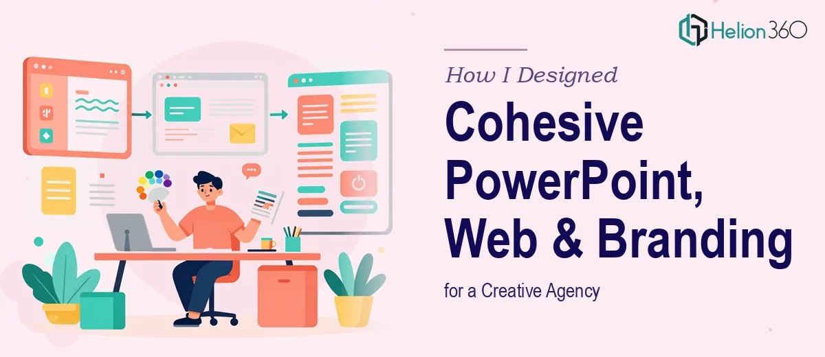
When One Project Became Three Simultaneously
I was brought on to support a fast-growing creative agency that needed design work across three distinct deliverables — PowerPoint presentations, responsive web designs, and branding materials. On paper, it sounded straightforward. In practice, it turned into one of the more demanding projects I had worked on.
The challenge was not producing individual pieces. The challenge was making all three feel like they came from the same creative mind, with consistent typography, color usage, and visual language across formats that behave completely differently.
Starting with the Brand Identity
I began where I always do — brand identity. Before touching a single slide or web layout, I needed to understand the agency's visual language. They had a loose color palette and a logo, but no formal brand guidelines. Font choices were inconsistent across their existing materials, and there was no defined spacing or hierarchy system.
I started building out a base brand framework: primary and secondary color values, type pairings using a clean sans-serif for headings and a readable body font, and a small set of graphic elements that could translate across formats. This part I was confident in. I had done it before.
But when it came to applying that framework consistently across three completely different design environments at once — presentation slides, web pages, and print-ready branding collateral — the complexity multiplied fast.
Where the Scope Outpaced What I Could Handle Alone
The presentations needed to be dynamic and structured, with master slide templates that the agency team could actually use without breaking the design. The website required responsive layouts that worked cleanly on mobile and desktop. The branding collateral included business cards, letterheads, and a brand kit document.
All of this needed to be delivered in parallel, not sequentially. I was managing color consistency across Adobe Illustrator, PowerPoint, and web stylesheets simultaneously, and the small inconsistencies were starting to add up. A shade of blue that looked perfect in print was rendering differently on screen. Slide layouts that felt balanced on a widescreen monitor looked crowded on a standard display.
I was capable of completing each piece individually, but the simultaneous scope — with zero margin for visual inconsistency — was pushing past what I could manage with full attention to quality.
That is when I reached out to Helion360. I explained where the project stood, what had been done, and where the gaps were. They asked the right questions, reviewed the existing assets, and came back with a clear plan.
How Helion360 Stepped In
Helion360 assigned a team that worked across the three workstreams in parallel. They took the brand framework I had started and formalized it into a proper brand guidelines document — one that defined exact hex codes, font sizes, spacing rules, and usage examples across digital and print formats.
From there, their designers built out the PowerPoint master slides with locked layouts, placeholder logic, and consistent iconography. The web design team worked on responsive layouts that respected the brand palette without looking rigid. The branding collateral was refined and made print-ready with proper bleeds and safe zones.
What stood out was how they kept the three outputs visually unified. When I reviewed the final files side by side — the slide deck, the web mockups, and the brand kit — they looked like they genuinely belonged together. The color usage was consistent, the type hierarchy translated across formats, and the graphic elements scaled appropriately depending on the medium.
What the Outcome Actually Looked Like
The agency received a complete design package: a master PowerPoint template with over fifteen slide layouts, a responsive web design with five core page layouts, and a brand kit that included logo variations, color swatches, typography specs, business cards, and letterhead.
More importantly, everything was documented well enough that their internal team could use it without constant design support.
For me, the experience reinforced something I already suspected — managing cohesive multi-format design at scale is genuinely difficult, and knowing when to bring in additional capacity is part of doing the job well, not a shortcut around it.
What I Would Do Differently Next Time
I would formalize the brand guidelines document at the very start, before any other work begins. Trying to reverse-engineer consistency after the fact costs more time than building the system first. I would also define a shared design token set — hex codes, font stacks, spacing units — that every format draws from, so nothing drifts during production.
And if the scope involves simultaneous delivery across three or more formats, I would loop in Helion360 from the beginning rather than mid-project. The handoff is smoother, the output is tighter, and the client gets a more consistent result.
Need Help Delivering Cohesive Design Across Multiple Formats?
If you are managing a project that spans presentations, web design, and branding materials all at once, Helion360 is the team worth talking to. They handle the complexity quietly and deliver work that holds together visually — whether it ends up on a slide, a screen, or a printed page.