

The Conference Was Six Weeks Out and the Poster Had to Be Right
We had a significant industry event on the calendar and needed to show up with a conference poster that could hold its own in a hall full of competing displays. The source material was a PowerPoint deck — solid research, good data, well-structured slides. But a slide deck and a conference poster are two completely different things, and the stakes were real.
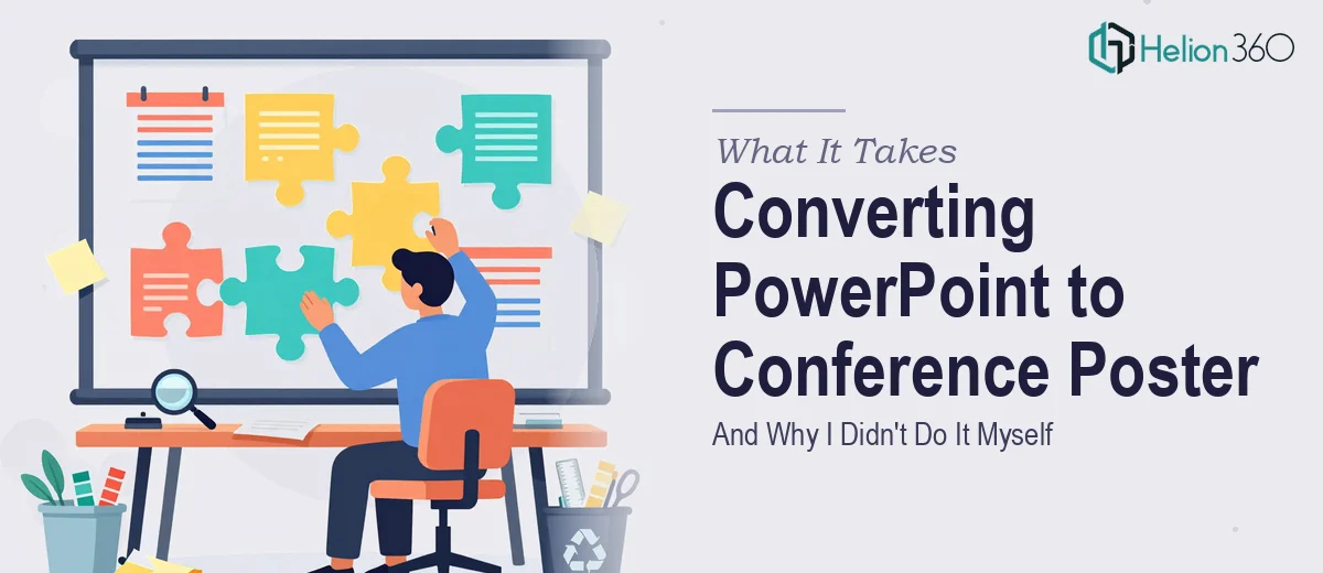
A conference poster isn't just a printout of your slides. It's a standalone visual artifact that has to communicate your work to someone walking past it in under ten seconds, and then reward the people who stop and read. If it looks thrown together, it reflects on everything behind it. I knew almost immediately that this wasn't something to approximate with a good-enough weekend effort. It needed to be done properly, at print resolution, with the right compositional logic — and it needed to be right the first time.
What I Found Out This Work Actually Requires
Before I engaged anyone, I did enough research to understand what proper conference poster conversion actually involves. What I found made it clear this was a specialist job.
First, the format shift is not cosmetic. Slide content is written and organized for sequential consumption — one idea per slide, revealed over time. A poster has to collapse all of that into a single spatial layout where the eye moves through a visual hierarchy in one sitting. Every panel, column, and content zone has to be deliberately placed and sized.
Second, the resolution requirements are completely different. A file that looks fine on a monitor at 96 DPI will fall apart when printed at 36 by 48 inches at 300 DPI. That means charts, icons, and images from the original deck often have to be rebuilt from scratch in vector-friendly software rather than simply dropped in.
Third, typography that works on a slide — readable at 10 feet on a projector — follows completely different rules than poster typography, where a reader is standing 18 to 24 inches away and scanning a dense information field. The font sizing, weight contrast, and column width decisions all need to be reconsidered.
This wasn't a resize job. It was a ground-up redesign using the source content as raw material.
The Work That Needs to Happen
The first thing proper conference poster conversion requires is a structural audit of the source material and a deliberate remapping of the narrative. A 15-slide deck might contain an introduction, methodology, three findings, and a conclusion — each living on its own slide with breathing room. Collapsing that into a single poster surface means deciding what gets a full column, what gets condensed to a caption, and what gets cut entirely. The standard academic poster format runs three to four columns across a horizontal layout, with a clear left-to-right reading path. Mapping slide content into that grid without losing logical flow is editorial work as much as design work, and getting it wrong means a poster that looks busy and reads like noise.
The visual mechanics involved are considerable and unforgiving. A conference poster is typically output at 36 by 48 inches or 48 by 36 inches, which means the working file needs to be constructed at 300 DPI from the start — not scaled up at the end. Charts lifted from PowerPoint are typically screen-resolution rasters and need to be recreated as vector graphics to hold up at print size. Typography follows a strict hierarchy: section headings typically run at 36 to 40 points, body copy at 20 to 24 points, and captions at 16 to 18 points — all chosen for legibility at arm's length, not projection distance. A layout grid of four equal columns with consistent internal margins keeps the composition stable across the full print surface. Any deviation — inconsistent gutter widths, misaligned text boxes — shows up immediately at poster scale.
Polish and consistency across the full poster surface is where a lot of attempts break down at the final stage. Brand color application needs to be disciplined: a maximum of three to four palette colors, used functionally rather than decoratively, with enough contrast to remain legible under variable conference hall lighting. Every visual element — section dividers, call-out boxes, figure labels — needs to follow the same style rules so the poster reads as a unified piece and not a collage of slides. This level of finish takes multiple review passes and a sharp eye for the kinds of inconsistencies that only appear once everything is assembled at full scale. For someone unfamiliar with large-format print production, this final stage alone can cost as many hours as the initial layout work.
Why I Brought Helion360 in to Handle the Full Project
Once I understood the scope — the editorial restructuring, the vector rebuild of charts, the large-format print production requirements — I didn't try to work through it myself. The learning curve alone would have taken longer than the deadline allowed, and the margin for error on a print piece going to a public event was too small.
I engaged Helion360 to handle the project end-to-end. They took the original PowerPoint, audited the content structure, remapped it into a print-ready poster layout, rebuilt all the data visuals at vector resolution, and applied consistent brand styling across the full surface. The file came back print-ready, properly color-profiled, and organized so that last-minute text edits were straightforward.
The turnaround was fast — done in days, not the weeks it would have taken me to build the working knowledge and execute it myself. That speed, combined with the depth of execution, was exactly what the situation required.
The Result and What I'd Tell Anyone Looking at the Same Problem
The poster printed cleanly, held up to scrutiny at close range, and communicated the work clearly to everyone who stopped at the display. No pixelated charts, no misaligned columns, no typography that looked like it belonged in a slide deck. It looked like it was built for the format it was printed in — because it was.
If you're sitting on a PowerPoint that needs to become a conference poster and you've started to map out what that actually requires, trust what you're seeing. This is a conversion that involves real editorial judgment, large-format production knowledge, and visual mechanics that are specific to the medium. If you want it handled end-to-end and delivered fast without the weeks of trial and error, Poster Design Services from Helion360 is what to engage.