

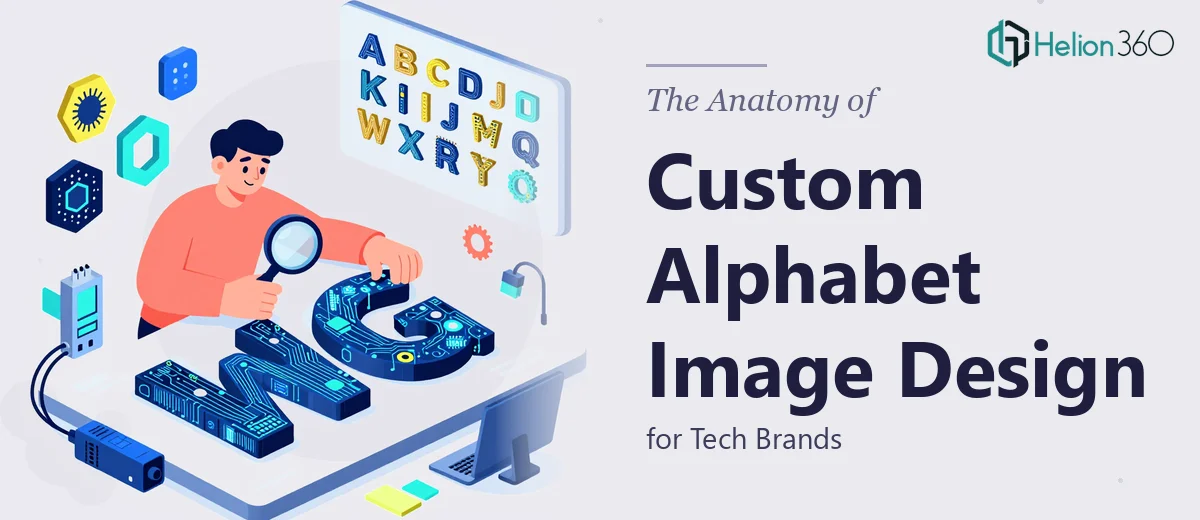
Why Custom Alphabet Design Is a Serious Brand Decision
For a tech startup trying to carve out a distinct identity, the visual language around its name and letterforms is not a decorative afterthought — it is often the first impression a potential customer, investor, or partner will have. Custom alphabet images occupy a specific and powerful space in brand design: they take the most fundamental unit of written language and transform it into a proprietary visual asset.
When this work is done casually — a font pulled from a free library, a quick letterform treatment applied without deeper thought — the result almost always looks like it belongs to any of a hundred other companies. The brand blends in rather than standing out. In a competitive technology market where product differentiation is already hard, visual sameness is an unnecessary liability.
Done well, a custom alphabet image system gives a brand repeatable, ownable visual elements. The letters become something a viewer associates specifically with that company. That level of recognition takes deliberate craft to achieve, and understanding what that craft actually involves is the first step to getting it right.
What This Kind of Work Actually Requires
Custom alphabet image design for a tech brand is not simply choosing a typeface and adjusting the color. The work sits at the intersection of typographic design, illustration, and brand systems thinking, and it requires competence in all three.
The first thing it requires is a clear conceptual brief. Before any tool is opened, the designer needs to understand what qualities the brand is meant to communicate — precision, playfulness, boldness, approachability — and which of those qualities the letterforms should carry. Abstract concepts like "innovation" are not actionable; specific visual cues like sharp terminals, rounded counters, or geometric modularity are.
The second requirement is technical command of vector tools. Custom alphabet work lives in Adobe Illustrator, not Photoshop. Letterforms are shapes built on anchor points and bezier curves, and every adjustment — the angle of a serif, the width of a stroke, the overshoot on a circular letter — needs to be geometrically consistent across the full character set. Photoshop enters the workflow later, for texture, depth, and compositing, but the structural work happens in vectors.
The third requirement is system thinking. A single striking letter is not a design system. The full alphabet needs internal logic: consistent stroke weights, a shared proportional framework, and optical corrections that make every letter feel like it belongs to the same family. That coherence is what separates a professional execution from an amateur one.
How the Design Process Actually Works
Establishing the Visual Direction
The process starts with a thorough exploration of the brand's existing visual territory — its color palette, any logo marks, the general aesthetic of its product or marketing materials. From that audit, a set of design parameters emerges. For a tech brand, those parameters often include a decision about geometric versus humanist letterforms. Geometric alphabets (think circles and straight lines as their building blocks) read as precise and modern. Humanist forms feel warmer and more approachable. Neither is universally right; the choice has to come from the brand's positioning.
A useful early exercise is to sketch five to seven conceptual directions at low fidelity — not full alphabets, but three or four key letters (typically A, E, O, and the first letter of the brand name) that test how each concept holds up under scrutiny. This narrows the field before committing hours to full-alphabet execution.
Building the Letterforms in Illustrator
Once a direction is selected, the structural work begins in Illustrator using a modular grid. A 12-unit-by-12-unit grid is a common and reliable foundation — it divides evenly, accommodates both geometric and organic forms, and makes optical alignment decisions easier to justify. Setting up guides at 1-unit increments before drawing anything saves significant rework later.
Stroke weight is one of the most consequential decisions in this phase. A consistent stroke-weight ratio — for example, a primary stroke at 100pt and a secondary stroke (as on the crossbar of an H or the arms of an E) at 60pt — creates visual hierarchy within each letter while maintaining coherence across the set. Deviating from that ratio even slightly on a few letters creates a family that feels uneven, even if the viewer cannot articulate why.
Overshoots matter too. Circular letters like O, C, and G need to extend 2–4% beyond the cap height and baseline to appear optically the same height as flat-topped letters like H and E. Skipping overshoots makes round letters look smaller and the overall alphabet look inconsistent.
For a tech brand that wants visual texture or dimension, Illustrator effects (gradients, inner glows, or layered fills using the Appearance panel) can be applied non-destructively at this stage. Keeping effects live — rather than expanding them — preserves editability through revision rounds.
Compositing and Finishing in Photoshop
Once the vector alphabet is finalized, individual letters or full-word lockups are exported as high-resolution PNGs (typically at 300 dpi for print-ready assets and 72 dpi at 2x for screen) and brought into Photoshop for environmental compositing or atmospheric finishing. A letter placed against a dark gradient background with a subtle light bloom behind it reads very differently than the same letter on white — and for a tech brand, those environmental treatments are often where the wow factor lives.
Layer organization in Photoshop matters here. A clean file uses grouped layers labeled by letter, with adjustment layers clipped to their targets rather than applied destructively. Smart Objects should be used for the imported vector letters so they remain scalable. A file that is well-organized at this stage can be updated quickly when a brand color changes or a new letter needs to be added.
What Goes Wrong When This Work Is Rushed
The most common failure mode is skipping the conceptual phase entirely and going straight into execution. Without a defined set of design parameters, the alphabet ends up as a collection of interesting letters that do not form a coherent system — each letter is locally attractive but the set has no unifying logic.
A second frequent problem is treating the full 26-letter alphabet as equally important from the start. In practice, a startup may only use five to eight letters in its brand name and key product names. Building those letters first, getting them right, and then extrapolating the system to the full set is more efficient and produces a more coherent result than trying to design all 26 simultaneously.
Inconsistent stroke weights across the set are nearly invisible to the untrained eye during design but become obvious at scale — on a billboard, a large-format display, or a presentation slide at 80 inches. A caliper-equivalent check in Illustrator, using the Transform panel to verify stroke widths numerically rather than visually, catches these discrepancies before they become expensive to fix.
Export settings are also frequently underestimated. Saving a vector alphabet as a flattened JPEG for delivery loses transparency, compresses edges, and makes the file far harder to use in downstream applications. The right deliverable is a layered Illustrator file, a set of SVGs for web use, and organized PNGs with transparent backgrounds at both 1x and 2x resolutions.
Finally, revision rounds tend to compound in alphabet design in a way they do not in single-asset projects. A single change to the stroke weight of the letter A — to fix a perceived inconsistency — can require corresponding adjustments in B, D, E, F, H, and anywhere else that stroke is load-bearing. Building the alphabet in a structured Illustrator file with shared graphic styles, rather than editing each letter independently, makes those cascading updates manageable.
What to Take Away From This
Professional graphic design work for custom alphabets is a craft-intensive, system-level undertaking. The visual appeal of the final output depends almost entirely on the rigor applied in the structural phase — the grid, the stroke ratios, the optical corrections — long before any finishing or compositing work begins. Getting that foundation right is the difference between a brand asset that holds up everywhere it appears and one that looks slightly off in ways that erode trust without anyone being able to name the cause.
If you would rather have this handled by a team that does this work every day, Helion360 is the team I would recommend.