

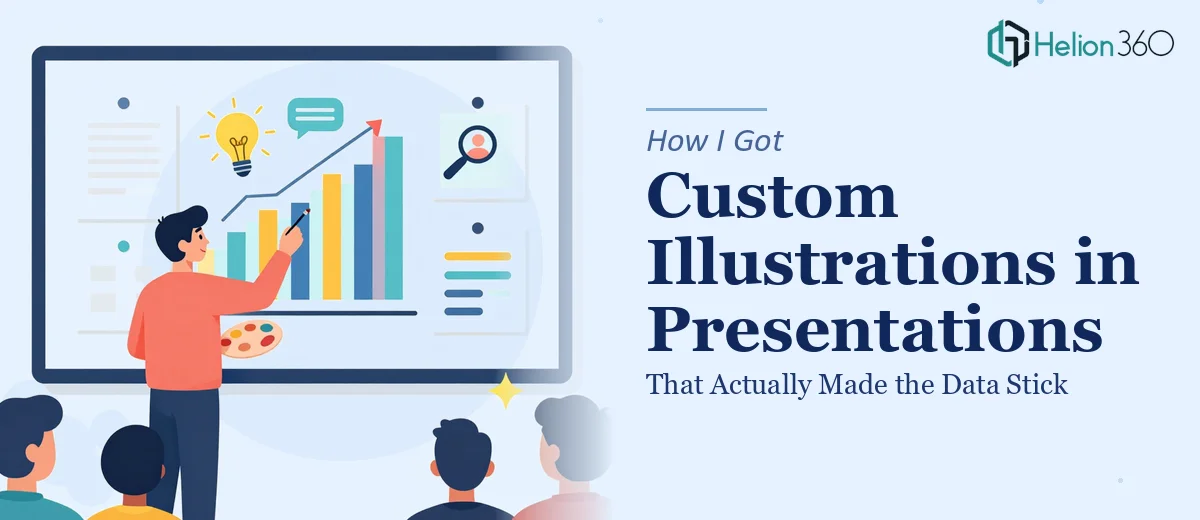
The Presentation Had the Data — But It Wasn't Landing
I had an upcoming presentation with real substance behind it — graphs, data points, process flows, and findings that genuinely mattered to the audience. The problem was obvious the moment I flipped through the slides: wall-to-wall text, generic charts, and nothing that gave the eye a place to rest. The content was solid, but the slides weren't going to hold anyone's attention past the third minute.
The stakes were real. This wasn't an internal check-in — it was a high-visibility presentation where the impression I made mattered as much as the information I was sharing. I'd seen presentations at major conferences where custom illustrations transformed dense content into something people actually remembered. That's the bar I needed to hit. And the moment I started thinking through what that would actually take to execute properly, I knew this wasn't something to attempt myself between now and the deadline.
What I Found the Solution Actually Required
My first instinct was to assume illustration work was mostly an aesthetic add-on — find a style you like, drop in some characters, done. That instinct was wrong.
The more I looked into what those polished, TED-style presentation illustrations actually involve, the more specific the requirements became. The style has to sit in a very particular range — playful enough to break up dense content, but professional enough that it doesn't undermine credibility with a serious audience. Getting that tonal balance wrong in either direction is easy to do.
Beyond style, the illustrations have to be functionally integrated. Each one needs to support the specific slide it lives on — reinforcing a data point, embodying a process step, or giving a concept a visual anchor. That means the illustrator has to understand the content, not just the aesthetic brief. And with 10 to 12 unique illustrations across a consistent deck, there's also a significant production challenge around maintaining visual coherence across every slide without any piece looking like it came from a different project.
What the Work Actually Involves
The foundation of this kind of project is a structural and narrative audit before a single illustration gets made. The right approach starts with mapping each slide's core message and identifying exactly what role the illustration needs to play — is it explaining a concept, humanizing a data point, or simply providing visual relief? That diagnostic pass typically covers the full deck and results in a brief for each of the 10 to 12 pieces. Skipping this step is where most attempts fall apart: illustrations get made that look fine in isolation but don't serve the actual slide, and the deck ends up feeling decorative rather than purposeful.
The visual mechanics of illustration-integrated presentation design require disciplined decision-making around scale, line weight, color palette, and figure style. A consistent approach means locking in a maximum of 3 to 4 brand-aligned colors for the illustration set, maintaining uniform stroke weights across all characters and icons, and ensuring that every illustration sits within the same spatial grid as the slide's other elements. The execution friction here is significant — even small inconsistencies in line weight or color value across 12 illustrations read as amateur at full-screen projection size, and catching those issues requires someone with a trained eye reviewing every asset at presentation scale.
Polish and cross-slide consistency is the final and most time-consuming layer. Each illustration needs to look like it belongs to the same visual family as every other one in the deck — same character proportions, same shading logic, same level of detail. When there are multiple data slides mixed with concept slides and process diagrams, maintaining that coherence requires a master style reference that gets applied rigorously to each new asset. For someone without an established illustration workflow and a library of reusable components, building that consistency from scratch across a full set of custom pieces takes considerably longer than the initial creation work itself.
Why I Brought in Helion360 to Handle It
Once I understood what the work actually involved — the upfront content mapping, the style system, the production discipline across 12 unique pieces — it was clear this wasn't a weekend effort. The combination of illustration skill, presentation design knowledge, and the operational consistency required to hold a full deck together is a specific capability set. I didn't have the time to develop it, and the deadline didn't leave room to figure it out by trial and error.
Helion360 handled the full project end-to-end and turned it around quickly. That meant the narrative audit across all slides, the illustration brief for each piece, the full custom illustration set built to a consistent style system, and final integration into the PowerPoint templates I provided. What would have taken me weeks of learning curve and iteration was handled in a fraction of that time — by a team that does exactly this work every day with the tooling and creative infrastructure already in place.
The Result and What I'd Tell Anyone Facing the Same Problem
What came back was a coherent deck — not a collection of slides with illustrations dropped in, but a presentation where every piece of visual work was doing a specific job. The data slides were easier to read. The concept slides had a visual anchor that made the idea land faster. And the illustrations held together as a set, which meant the deck felt like a single designed thing rather than a patchwork.
The audience response confirmed it. The content that had been getting glassy-eyed reactions in rehearsal was landing clearly. The custom artwork integrated throughout wasn't decoration — it was doing real communication work.
If you're looking at the same gap — a content-rich presentation that needs professional custom illustration work done properly and delivered fast — check out how complex data becomes visual storytelling.