

The Problem with Our Existing Presentation Materials
For a long time, our team's presentation materials were held together by good intentions and copy-paste habits. Every pitch deck looked slightly different. Proposal templates carried mismatched fonts, inconsistent color blocks, and logos that hadn't been updated after our rebrand. When we were presenting to investors or walking a potential partner through a proposal, the visual inconsistency was hard to ignore.
I knew the content was strong. The messaging was clear, the numbers were solid, and the story made sense. But the visual layer — the thing that shapes first impressions — wasn't doing us any favors.
I decided to take it on myself.
What I Tried to Do on My Own
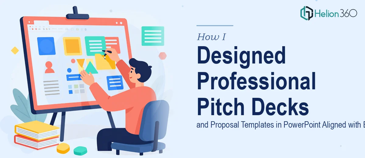
I opened Microsoft PowerPoint and started from scratch. I pulled up our new logo files, color codes, and brand guidelines. The plan was to build a clean master slide template that the whole team could use — something modular, with consistent layouts for title slides, content slides, data slides, and closing slides.
The technical side of PowerPoint wasn't the issue. I understood how slide masters worked, how to set up theme colors, and how to create reusable layouts. What I hadn't fully accounted for was the visual design judgment that separates a functional template from a compelling one.
I spent two days adjusting spacing, testing font pairings, and trying to get the hierarchy right on the proposal cover slides. Every version looked acceptable but not polished. The pitch deck slides, in particular, needed a kind of visual rhythm I couldn't quite nail — the kind that keeps an audience engaged slide after slide without feeling repetitive.
Beyond aesthetics, I also had no reliable way to test whether the designs would hold up across different screen sizes, projectors, and printed handouts. That gap mattered because our presentations were used in multiple settings.
Bringing in the Right Support
After two days of incremental progress and mounting frustration, I reached out to Helion360. I explained the situation — we needed a complete set of branded PowerPoint pitch deck templates and proposal templates that reflected our updated logo and color scheme, and they needed to work across all our presentation scenarios.
Their team asked the right questions upfront. What was the primary use case for each template? Who was the audience — investors, clients, internal teams? What level of visual complexity were we comfortable maintaining on our own after delivery?
Those questions shaped everything. Instead of producing one generic deck, they designed a structured system: a pitch deck template with dedicated investor-facing slide layouts, a proposal template built for client-facing contexts, and a master slide library that our marketing team could actually manage without breaking the design.
What the Final Deliverables Looked Like
The pitch deck template came back with clean section dividers, a strong cover layout anchored to our new logo, and slide layouts that balanced text and visuals without overcrowding. Each slide had a clear focal point. The color palette was precisely matched to our brand, and the typography hierarchy made it easy to scan key information quickly.
The proposal template was built differently — more structured, with defined sections for executive summaries, scope of work, and pricing. It was still visually consistent with the pitch deck, but the layout logic was adapted for longer-form reading rather than live presentation.
All files were delivered as fully editable PowerPoint files with properly organized slide masters. Our marketing team could swap out content, adjust sections, and apply new slides without disrupting the overall design system.
What I Took Away from This
The process taught me something I should have recognized earlier. Building a functional template in PowerPoint and designing a professional, brand-aligned presentation system are two different things. The first is a technical task. The second requires visual design experience, an understanding of audience psychology, and the discipline to apply brand identity consistently across multiple document types.
Helion360 handled the second part efficiently and without overcomplicating the handoff. Our team now presents with materials that actually reflect the quality of our work — and we spend far less time fixing inconsistencies before each meeting.
Let Helion360 Handle the Heavy Lifting
If your pitch decks and proposal templates are inconsistent, outdated, or simply not reflecting your brand well, Helion360 can step in and build a complete, editable presentation system in PowerPoint — one your team can actually use and maintain.