

The Brief Was Simple. The Execution Was Not.
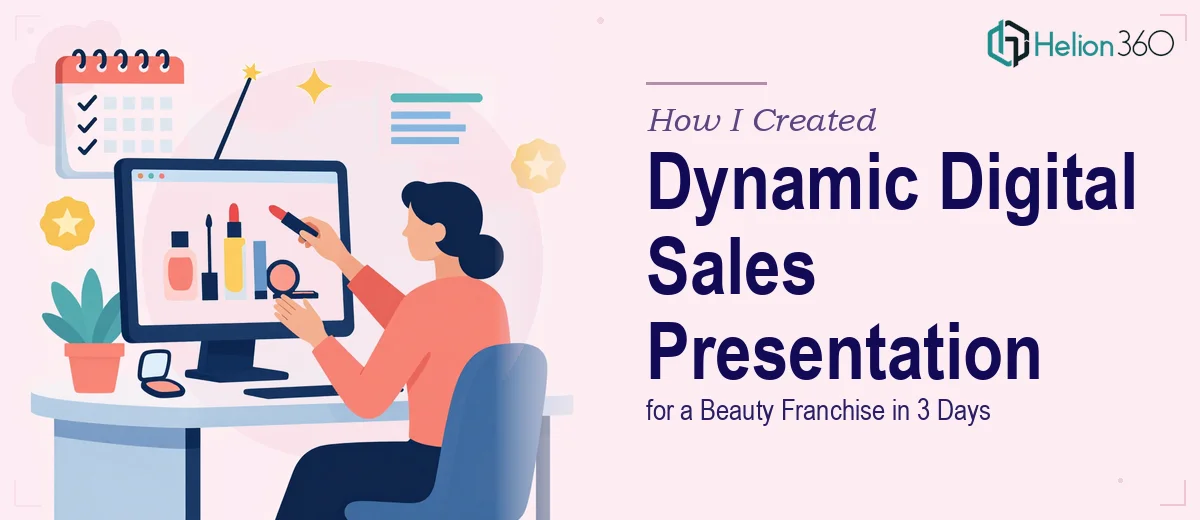
When I took on the project of building a digital sales presentation for a growing beauty franchise, the brief sounded straightforward enough. The brand sold natural, organic skincare products for a wide range of skin types, and they needed a deck that would work as a sales tool — something that could be shared on SlideShare, exported as a PDF, and also opened in PowerPoint without losing its visual integrity.
The timeline was three days. I said yes.
What I underestimated was how much ground a presentation like this actually needs to cover. Product benefits, unique selling points, skin concern mapping, client case studies, team testimonials, and a visual language that felt premium but approachable — all of it packed into a format that had to look polished on a screen and clean on paper.
Where It Started Getting Complicated
I started by sketching a slide structure. Introduction, brand story, product range, before-and-after case studies, testimonials, and a closing call to action. Straightforward enough on paper.
Then came the real work. The brand had a warm, earthy identity — greens, creams, soft botanicals — but no consistent design system I could pull from. I had to make visual decisions about typography, iconography, and layout from scratch while also making sure everything stayed on-brand.
The animations and transitions were another layer entirely. The client wanted the presentation to feel dynamic, not static. That meant thinking through entrance effects, slide flow, and how content would reveal itself without looking overdone. Getting animations to enhance the story rather than distract from it takes more iteration than most people expect.
By the end of day one, I had a structure and a rough first pass. But looking at it honestly, I knew the design quality was not where it needed to be for a sales tool this important. The layout worked, but it did not feel elevated. And with only two days left, I did not have the time to rebuild it cleanly.
Bringing In the Right Support
That is when I reached out to Helion360. I explained what I had built, what the brand needed, and where the gaps were — particularly around visual design consistency, animation execution, and making sure the deck translated well across PowerPoint, PDF, and SlideShare formats.
Their team picked it up immediately. I shared my structure and rough slides, and they took it from there. Rather than starting over, they elevated what I had — refining the layout grid, building out a proper color and font system based on the brand's existing materials, and replacing my placeholder graphics with clean, custom visuals that actually reflected the organic skincare positioning.
The case study slides were redesigned with a clear before-and-after structure that was easy to read at a glance. The testimonials were styled as visual callout cards rather than plain text blocks. And the animations were rebuilt so that each slide felt intentional — content sliding in at the right moment, key product claims appearing with just enough emphasis to land without feeling like a slideshow from 2010.
What the Final Deck Looked Like
By day three, the presentation was ready. It ran to just over 30 slides and covered every section the client had asked for. Visually, it held together as a single coherent piece — the same color palette, type hierarchy, and layout logic across every slide.
It was exported in three versions: a full animated PowerPoint, a static PDF for email, and a compressed version optimized for SlideShare upload. All three looked consistent. The animations only lived in the PowerPoint version, so there was no risk of broken formatting in the other exports.
The client came back with one round of minor text edits and approved the deck the same day.
What I Took Away From This
Building a sales presentation for a brand in the beauty space is more demanding than it looks. The visual bar is high, the content structure needs to guide a reader through a clear journey, and the technical requirements — multi-platform compatibility, animation, brand consistency — all need to be handled at the same time.
I could manage the content strategy and the overall structure, but the design execution needed more than I could deliver alone in that timeframe. That gap is exactly where Helion360 stepped in, and the quality of the final output reflected it.
If you are working on a sales presentation that needs to look professional and perform across multiple formats, Helion360 is worth reaching out to — they handle the hard design and production work so the final deck actually does its job.