

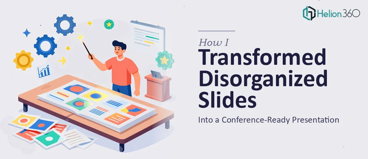
The Slides Were a Mess — And the Conference Was Weeks Away
Our company was going through a significant internal shift, and I had been asked to represent that work at an upcoming industry conference. The problem was the slides. Dozens of them. Some were pulled from old decks, some were newly written notes dropped into PowerPoint without much structure, and others were dense with technical content that made sense to our internal team but would lose a general audience in seconds.
I knew the information was valuable. The research was solid, the data was real, and the story we needed to tell was important. But the presentation itself? It was scattered, inconsistent, and nowhere near ready for a professional stage.
What I Tried First
I started by going through the slides myself, trying to impose a logical flow. I reorganized sections, tried to group related content, and rewrote a few slide titles to be more audience-friendly. But every time I thought I had a structure that worked, I would review it again and find that the narrative still didn't hold together. Technical clarity and visual clarity are two different things, and I was struggling to manage both at the same time.
The formatting was also inconsistent throughout. Some slides had walls of text. Others had charts with no explanation. A few used different fonts or color schemes that clearly came from different source files. Even with my best effort over a weekend, the deck still felt like it had been assembled rather than designed.
I also realized I was too close to the content to make objective decisions about what to cut, what to simplify, and what deserved more visual treatment.
Bringing in Outside Help
After hitting a wall with my own attempts, I came across Helion360. I reached out, explained what I was working with — a technically dense PowerPoint deck that needed to be restructured, cleaned up, and made presentable for a major conference audience. Their team asked the right questions upfront: Who is the audience? What is the one thing they should walk away understanding? What parts of the content are non-negotiable?
Those questions alone helped me think more clearly about what the deck actually needed to accomplish.
What the Redesign Process Looked Like
Helion360's team took the existing slides and began with a content restructuring pass before touching any design elements. They mapped out the logical flow of the presentation, identified which slides were doing too much work, and flagged sections where the information needed to be split across two slides rather than crammed into one.
Once the structure was settled, the visual enhancement work began. Dense bullet-heavy slides were converted into cleaner layouts with clear visual hierarchy. Charts were reformatted to highlight the key takeaway rather than showing raw data without context. Consistent typography, spacing, and a unified color palette were applied across the entire deck.
The technical content stayed intact — nothing was dumbed down — but it was now presented in a way that a conference audience could actually follow without prior knowledge of our internal systems.
How the Final Deck Performed
When I reviewed the final version, the difference was immediate. The deck had a clear opening that set context, a middle section that built the case with data and visuals working together, and a close that landed the key point without overstaying its welcome. It felt like a real conference presentation, not an internal report that had been projected onto a screen.
Presenters from my team who reviewed it said it was the clearest they had seen our work communicated externally. The feedback from the conference session itself was positive — people engaged with the content instead of trying to decode it.
What This Experience Taught Me
Technical knowledge and presentation design are genuinely separate skills. Being close to the subject matter can actually work against you when it comes to deciding what an outside audience needs to see. A good slide redesign is not just about making things look better — it is about restructuring information so it communicates effectively under time pressure, in a room full of people who are encountering your work for the first time.
If you are working with bland presentations and a real deadline, Helion360 is worth reaching out to — they handled the complexity that I could not manage alone and delivered a deck that was genuinely ready for the stage.