

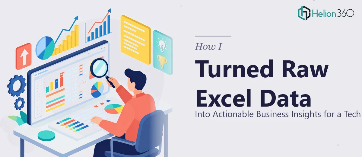
The Problem With Raw Data Nobody Wants to Read
Running a small tech business means wearing a lot of hats. I was already managing product decisions, team check-ins, and client conversations — and then came the quarterly internal review where I had to present our financial health to the broader team.
I had all the data. Budget forecasts in one sheet, monthly sales reports in another, inventory levels scattered across a third file, and employee performance metrics sitting in a folder I had barely opened in weeks. The numbers were there. The problem was that nobody — including me — could make sense of them at a glance.
Why Excel Alone Was Not Enough
I spent a few evenings trying to clean up the spreadsheets myself. I consolidated columns, removed duplicates, and tried building a few charts. The bar graphs looked decent. But when I stepped back and looked at the full picture, it still felt like a wall of numbers with no narrative behind it.
The data was telling a story — I just could not figure out what that story was. I needed someone who could take raw Excel data, analyze it properly, and turn it into something my team could actually act on. I also knew that doing this manually every month was not sustainable. I needed a repeatable process with consistent formatting and clear visual outputs.
Handing It Off to Someone Who Actually Knew What to Do
After hitting that wall, I came across Helion360. I explained the scope — multiple Excel sheets, different data types, no consistent formatting, and a tight internal deadline. Their team asked the right questions upfront: what decisions did these reports need to support, who was the audience, and how often would the reports be updated.
That framing alone helped me think about the data differently. It was not just about cleaning up spreadsheets. It was about building a reporting structure that served a purpose.
What the Final Deliverable Looked Like
Helion360 worked through each data set — the budget forecasts, monthly sales figures, inventory levels, and performance metrics — and structured everything into a clean, visually organized report format. Each section had a summary of key insights written in plain language, not just numbers, so the team could immediately understand the context and the implication.
The data visualization was particularly useful. Trends that I had completely missed in the raw spreadsheet became obvious once they were displayed as a well-labeled chart. For example, a dip in one product category aligned almost exactly with a month where inventory had dropped below threshold — something I would never have caught scrolling through cells.
They also set up a repeatable structure so future reports could be updated with new data without rebuilding everything from scratch. That alone saved hours every reporting cycle.
What I Took Away From This
The experience shifted how I think about data. Having numbers is not the same as having insight. The real value comes from how the data is organized, presented, and explained. A business performance dashboard only works if the people looking at it can understand what they are supposed to do next.
For a small tech company trying to make faster, more informed decisions, that clarity is not a luxury — it is a requirement. Turning raw Excel data into something that actually communicates took the right combination of analytical thinking and visual design, and that is not always something you can do well while also running a business.
If you are sitting on a pile of spreadsheets that your team finds hard to interpret, Helion360 is worth reaching out to — they took a disorganized set of data files and handed back a structured, visual, and genuinely useful reporting system.