

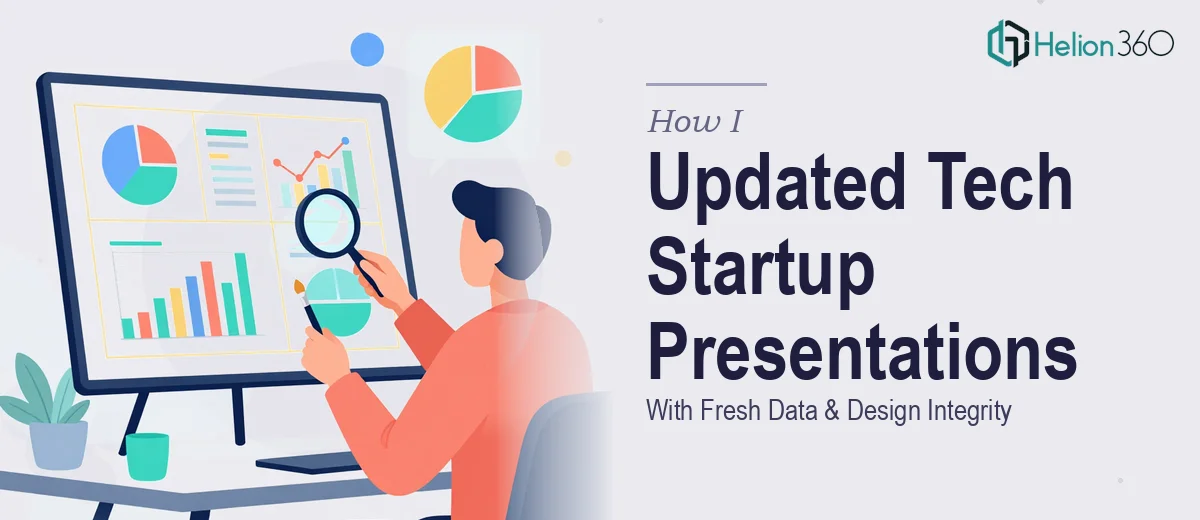
When Updating a Presentation Is Harder Than Building One From Scratch
I always assumed that updating an existing presentation would be simpler than creating one from the ground up. After all, the structure is already there, the branding is set, and the story has been told before. All I needed to do was swap in the new numbers and move on.
That assumption fell apart pretty quickly.
Our tech startup had been using the same core presentation deck to communicate progress to stakeholders for about a year. The deck was solid — well-designed, clearly structured, and had done its job well. But we had a full year of new data to incorporate: updated growth metrics, revised projections, product milestones, and team expansion figures. The presentation needed to reflect where we actually were, not where we had been twelve months ago.
The Problem With Just Swapping in New Numbers
I started the update myself. I went slide by slide, replacing old figures with new ones. But almost immediately, the visual balance started breaking down. Charts that were sized for shorter data labels suddenly looked cluttered. A slide that had three clean data points now had five, and the layout no longer held together. Text that had been concise and punchy at the time was now either outdated in tone or simply didn't match the new numbers it sat next to.
Beyond the visual issues, there was a deeper problem. Some of the new data told a meaningfully different story than the old data — in a good way, since we had grown — but the slide logic and narrative flow hadn't been updated to match. The presentation was saying one thing structurally while the new numbers were pointing somewhere else. That disconnect is exactly the kind of thing that erodes audience confidence, especially in a stakeholder setting.
I also realized I was spending far more time on this than I had planned. Between reviewing the old documents, understanding which slides needed content restructuring versus simple number replacements, and trying to maintain the original design quality, two weeks was starting to feel very tight.
Bringing in the Right Support
After hitting that wall, I came across Helion360. I explained the situation — existing presentations, fresh data, tight timeline, and a strong requirement to preserve design integrity. They understood the scope immediately and asked the right questions: What format were the source files in? Did I have brand guidelines? Which slides had the most structural change versus simple data updates?
That conversation alone told me they had done this kind of work before. I handed over the existing deck, the sample documents from the previous year, and a brief outlining the new data points and what each update needed to communicate.
What the Update Actually Involved
Helion360's team went through each slide methodically. Where a chart had changed scale significantly, they rebuilt the visualization so it still read clearly at a glance rather than just stretching the old one. Where a text block referenced outdated context, they rewrote it to match the current data narrative without losing the original tone or style. Slides that had grown more complex with additional data points were restructured so the layout still felt clean and scannable.
They also flagged a few slides where the new data actually warranted a different chart type entirely — not because the original design was wrong, but because the updated figures made a different format more persuasive. That kind of judgment, knowing when a number change also requires a presentation change, is what separated this from a simple find-and-replace job.
The final deck looked like a natural evolution of the original, not a patched version of it. The branding, tone, and overall flow were intact. The new data was integrated cleanly and presented in a way that actually strengthened our credibility rather than undercutting it.
What I Took Away From This
Updating a presentation with new data is genuinely skilled work when the deck matters. It is not just about replacing old numbers — it is about making sure the design still holds, the narrative still flows, and the audience still walks away with a clear and accurate picture of where things stand. Rushing that process, or underestimating what it involves, can do more damage than leaving the old version in place.
If you are in a similar position — an existing deck that needs a meaningful data refresh before a high-stakes stakeholder meeting — Helion360 is worth reaching out to. They handled the complexity of integrating new content into an existing design without losing what made the original work. For similar challenges, see how I approached restructuring multiple PowerPoint presentations into visually engaging decks.