

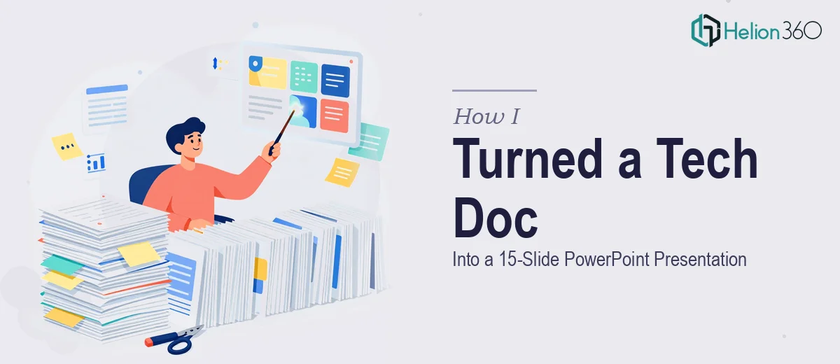
The Document Was Done. The Presentation Was the Problem.
I had a 4,000-word technical document — thorough, well-researched, and completely useless in the room where it needed to land. The audience wasn't going to read a report. They were going to sit in front of a screen for twenty minutes, and every slide either had to earn their attention or lose it. The stakes were real: this was a briefing for a senior leadership team making a budget decision, and first impressions on decks like this carry weight.
The document covered market data, competitive positioning, operational findings, and a set of recommendations. Dense, interconnected content. Not the kind of thing you can just copy and paste into a slide template and call it done. I knew immediately this needed to be done properly — structured, visual, and calibrated for an executive audience — not just summarized.
What I Found Out Converting a Document to a Deck Actually Requires
I spent a bit of time researching what a proper document-to-presentation conversion actually involves before deciding how to handle it. What I found made it clear this wasn't a formatting job.
The first signal was narrative architecture. A 4,000-word document has a logic built for readers who scroll and revisit. A 15-slide deck has a logic built for viewers who watch once. Those are structurally different problems. Collapsing a report into slides without rethinking the story arc produces decks that feel like compressed documents — which is exactly what this couldn't be.
The second signal was data visualization. This document had findings buried in paragraphs. Translating those into charts, comparison layouts, and visual hierarchies that actually communicate meaning — rather than decorate a page — requires real judgment about chart type selection, data labeling, and layout proportion.
The third signal was consistency and brand application across every slide. A coherent 15-slide deck needs a master layout system, not fifteen individually formatted slides that drift in spacing and type size. That kind of discipline across a full deck takes time and a practiced eye.
What the Actual Work Involves
The work starts with a full structural audit of the source document — mapping which content belongs on its own slide, which content should be compressed into a single supporting visual, and which content should be cut entirely. A 4,000-word document typically contains enough material for thirty or forty slides if treated literally. Getting it to fifteen means making deliberate editorial calls: what is the core argument, what is supporting evidence, and what is background that doesn't need a slide at all. Practitioners working through this establish a slide-by-slide beat structure — problem, context, data, implication, recommendation — before a single design element is touched. Skipping this step produces decks that look designed but feel disorganized.
Visual mechanics are where the technical complexity compounds. Proper presentation layout works on a grid — typically a 12-column structure with defined content zones — so that text, charts, and images align consistently across all slides. Typography follows a strict hierarchy: title text at 36pt, body headers at 24pt, supporting copy at 16pt or below, with no more than two typefaces in use across the deck. Chart selection follows rules too: bar charts for comparisons, line charts for trends over time, scatter plots for correlations, never pie charts with more than four segments. Getting these decisions right requires knowing the rules and applying them without drift. For someone setting this up from scratch in PowerPoint, propagating layout changes through a master slide system alone can consume several hours before a single content slide is built.
Polish and consistency across a 15-slide deck is where most self-managed projects quietly fall apart. Palette discipline means no more than four brand colors in use, applied to specific roles — primary for headings, accent for callouts, neutral for backgrounds — and enforced slide by slide. Icon sets need to come from a single family so visual language stays coherent. Spacing margins need to stay identical across every slide. These details take under a second to notice when they're wrong and require methodical review passes to get right. A practitioner doing this professionally works with a final QA checklist that covers alignment, color consistency, font rendering, and slide transitions — typically the last two to three hours of a project like this.
Why I Brought in Helion360 to Handle It
I looked at what this project actually required — narrative restructuring, visual design, data visualization decisions, and end-to-end consistency across fifteen slides — and recognized immediately that attempting it myself wasn't the right move. I didn't have the tooling configured, I didn't have the time to build and test a master slide system, and I didn't have the practiced judgment to make the editorial calls quickly.
Helion360 handled the full project end-to-end: structural story mapping from the source document, slide-by-slide layout design, and chart and data visualization execution. The turnaround was fast — done in days, not weeks, and handled in a fraction of the time it would have taken me to learn and execute it at this level. The team does this kind of work consistently, which means the expertise and the workflow were already in place from the first brief.
The Result and What I'd Tell Anyone Looking at the Same Problem
What came back was a 15-slide deck that felt like it was built for the room, not extracted from a document. The story arc was clean — problem framing in the first three slides, evidence and analysis in the middle, clear recommendations at the close. Every chart was purposeful. Every slide held to the same grid, the same palette, the same type hierarchy. The leadership team engaged with it immediately, and the conversation moved to the recommendations rather than getting lost in the material.
The presentation delivered the outcome the document was always meant to support — it just needed to be in the right format for the right audience.
If you're sitting on a dense document that needs to become a presentation people will actually engage with, and you want it handled properly and turned around quickly, Helion360 is the team to engage — they took the full project off my hands and delivered exactly what the work required. Learn more about converting research into compelling presentations and how data-driven presentations transform research insights into action.