

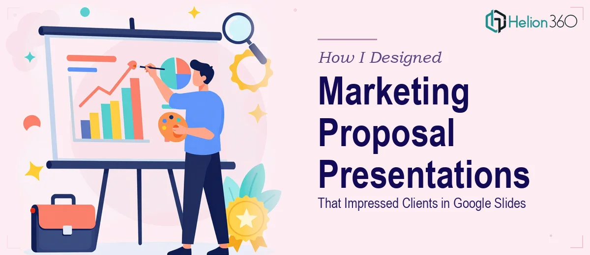
When a Marketing Proposal Needs to Do More Than Just Inform
I had a pitch coming up with a potential client and the stakes were high. The marketing proposal itself was solid — the strategy was clear, the numbers made sense, and the team had done solid research. But when I opened up Google Slides to start building the presentation, I ran into something I had not fully anticipated: translating a dense, text-heavy proposal into something visually engaging is a completely different skill set.
This was not about lacking knowledge. The content was there. The challenge was making it look the way it needed to look for a room full of decision-makers.
The Gap Between a Good Proposal and a Great Presentation
I started building the slides myself. I picked a clean template, set up some brand colors, and dropped in the key sections. It looked... fine. Professional enough, maybe. But it did not feel like something that would hold attention in the room or make the proposal feel as strong as it actually was.
Marketing presentation design in Google Slides sounds straightforward until you are trying to balance brand consistency, visual hierarchy, data visualization, and a logical narrative flow — all at once, all within a platform that has real limitations compared to more design-focused tools.
I tried adjusting layouts, hunting for better icons, reworking the charts. Every change I made seemed to create a new problem somewhere else. The slides were inconsistent. Some sections felt heavy and crowded, others looked sparse. The proposal deserved better than what I was producing.
Bringing in the Right Support
After spending two evenings going in circles, I reached out to Helion360. I explained the situation — a marketing proposal that needed to be transformed into a polished, client-ready Google Slides presentation that reflected the quality of the strategy behind it.
Their team asked the right questions upfront: What was the brand identity? Who was the audience? How many slides? What was the deadline? Within a short time, they had a clear picture of what was needed and took over the design work entirely.
What the Final Presentation Looked Like
The difference was immediate and obvious. Helion360 structured the proposal presentation with a clear visual flow — an opening that set context, sections that built logically on each other, and data presented through clean, readable charts rather than raw tables. The branding was consistent across every slide, from color usage to font choices to spacing.
Slides that had previously felt cluttered were redesigned with intentional white space. Complex strategy sections were broken into digestible visual segments. The overall deck felt like it matched the quality of the proposal itself, which is exactly what a client-facing presentation needs to do.
They worked directly in Google Slides as required, which meant no conversion issues and no compatibility headaches on the day of the presentation.
What the Outcome Taught Me
The presentation landed well. The client commented on how organized and clear everything was, which is what good design does — it gets out of the way and lets the content speak. The proposal moved forward.
What I took away from this experience was a clearer understanding of where presentation design expertise actually matters. Writing the strategy and designing the slides to communicate that strategy are two separate disciplines. Knowing one does not mean you can automatically execute the other under deadline pressure.
For marketing proposals specifically, where the first impression carries real weight, the visual quality of the Google Slides deck is not a secondary concern. It is part of the pitch.
If you are in the same position — a strong proposal ready to go, but the presentation design is not where it needs to be — Helion360 is worth reaching out to. They handle the design side with the kind of attention it deserves, so the work you have already done gets presented the way it should.