

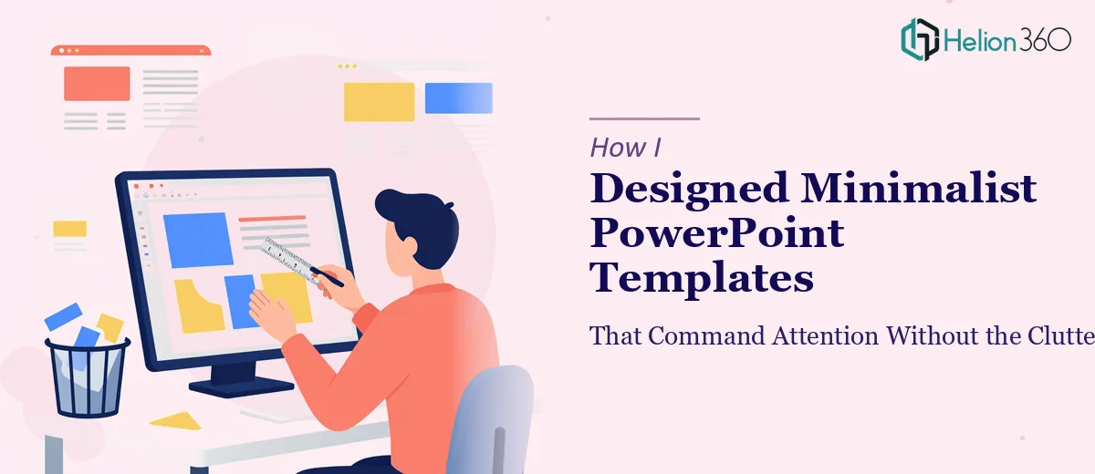
The Brief Was Simple. The Execution Was Not.
When our startup decided to build a proper presentation system, the mandate was clear: clean, modern, no clutter. We wanted minimalist PowerPoint templates that felt intentional — slides where every element earned its place and nothing competed for attention.
I took on the project myself. I had a working knowledge of PowerPoint, a strong sense of what we wanted visually, and enough confidence to think I could pull it off in a week or two.
I was wrong about the timeline.
Where the Design Process Started Breaking Down
The first few slides looked fine in isolation. A white background, clean sans-serif type, one accent color. But as I built out the full template — title slides, content layouts, data slides, quote slides — the inconsistencies started to show.
Spacing felt off on some layouts. The typography hierarchy that looked balanced on a laptop screen turned awkward on a projector. I kept adding small elements to "fix" things, and before long, the clean design I intended was starting to feel crowded in exactly the ways I was trying to avoid.
Minimalist slide design is harder than it looks. It is not about removing things. It is about knowing precisely what to keep and where to put it. That level of visual judgment — knowing when a slide needs more breathing room, when a single font weight change communicates hierarchy better than a size increase, when white space is doing more work than any graphic could — takes real experience to develop.
I had the concept right. The execution was where I kept getting stuck.
Bringing in the Right Expertise
After several rounds of revisions that were not moving the work forward, I reached out to Helion360. I explained what we were building — a full set of minimalist PowerPoint templates for a startup, grounded in simplicity and designed to scale across different presentation types.
Their team asked the right questions immediately. What was the brand palette? How many master layouts did we need? Would these templates be used internally, client-facing, or both? Within a short briefing session, it was clear they understood not just the design ask but the business context behind it.
I handed over my draft files, the brand references, and a notes document I had built up over weeks of trying to solve this myself.
What the Final Templates Actually Looked Like
What came back was a genuinely well-structured template system. The master slides were clean without feeling sparse. The typography used two weights of a single typeface, and somehow that was enough to create clear visual hierarchy across every layout. The accent color appeared sparingly — on dividers, on data labels, on key callout text — and because it appeared so rarely, it actually did command attention when it did appear.
The content layouts handled text-heavy slides without looking cluttered, because the grid work underneath was solid. The modern presentation design principles they applied were not decorative — they were structural. Every slide had a logic to it that made the template easy to use even for someone who was not a designer.
That last part mattered. We needed templates our whole team could work with, not just a designer.
What I Took Away from the Process
Minimalist design in PowerPoint is a discipline, not just an aesthetic preference. Getting clean PowerPoint design right requires understanding layout grids, typographic scale, and color restraint in a way that goes beyond having good taste. I had the vision. I did not have the technical foundation to execute it at the level the project needed.
The templates Helion360 delivered became the foundation of every pitch deck, internal update, and partner presentation we ran that year. They were used dozens of times without needing redesign work, which told me the system was genuinely built to last.
If you are working on a similar project and finding that the gap between what you envision and what you can produce keeps widening, consider Template Design Services — they handled the complexity I could not and delivered exactly what the brief called for.
For more inspiration on custom template design approaches, see "How I Designed Custom PowerPoint Templates That Actually Work for Marketing Campaigns" and "How I Built a Professional PowerPoint Template for an Online Learning Platform".