

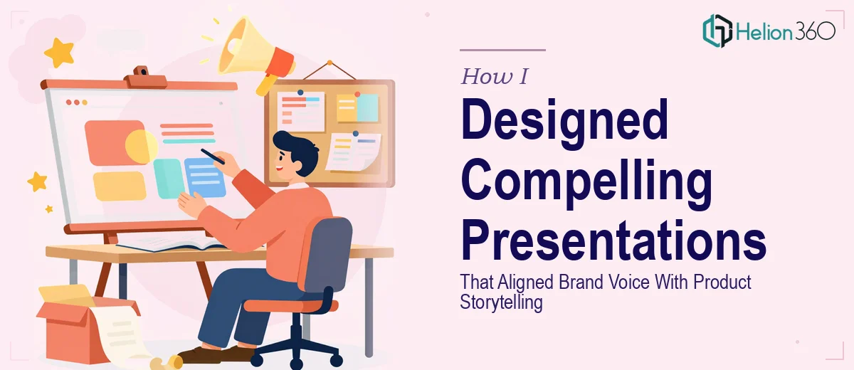
When Content Writing and Presentation Design Have to Work Together
I picked up a project that seemed straightforward at first — create a series of PowerPoint presentations for a New York-based startup that needed to communicate their product offerings clearly and consistently. The brief was clean: write content, design slides, keep everything aligned with their brand voice. Simple enough on paper.
But the moment I started pulling everything together, I realized how much was actually moving at once.
The Gap Between Writing Content and Designing for It
I can write. I can structure a narrative and make sure the words serve a purpose. But when you are also responsible for translating that content into visually compelling PowerPoint presentations — ones that need to reflect a startup's energy, match brand colors and typography, and still communicate product value clearly — the scope expands fast.
I started by building out a slide structure. I drafted the content first, then moved into PowerPoint to start designing. That is where I hit the wall. The slides looked functional but flat. The messaging was right, but the visual weight was off. Some slides felt text-heavy even after I trimmed them. Others had space that I did not know how to use effectively without making them look empty.
The startup had a distinct brand personality — modern, ambitious, innovation-focused — and every slide needed to carry that without me explicitly saying it. That kind of visual storytelling is a specific skill, and I knew I was stretching past my comfort zone.
Bringing In the Right Support
After spending two days reworking the same five slides and still not feeling confident about the direction, I reached out to Helion360. I explained the situation — I had the content drafted and a rough deck started, but the presentation design itself needed someone who could handle brand alignment and slide aesthetics at a professional level.
Their team took the brief seriously. They reviewed the content I had written, asked a few focused questions about the brand tone and the audience for these presentations, and then got to work. I did not have to start from scratch or hand off everything — they worked with what I had built and elevated it.
What the Final Deck Actually Looked Like
The difference was visible immediately. The slides were structured with clear visual hierarchy. The content I had written was formatted in a way that made it scannable without losing depth. Product information was paired with layout choices that guided the eye naturally — not just decorative design, but design that served the message.
The brand voice came through consistently across every slide. The typography, the use of space, the way data points were presented — it all felt cohesive. For a startup trying to look credible and polished in front of partners or early customers, that consistency matters enormously.
Helion360 also made small but meaningful adjustments to how certain content sections were introduced on the slides, which made the storytelling flow better across the deck. That kind of feedback loop — where the design team understands content and not just aesthetics — made the collaboration genuinely productive.
What I Took Away From This
PowerPoint presentation design is not just about making things look good. It is about making content land with the right audience in the right way. Writing the words and designing the container for those words are two different disciplines, and trying to do both simultaneously under a deadline is where quality suffers.
For this project, getting the content right was my contribution. Getting the presentation to look and feel like something that matched the startup's ambition required a team with real design depth.
If you are working on a project where the content is solid but the presentation design is not coming together the way it needs to, Helion360 is worth reaching out to — they handled the part I could not get right and delivered something I was genuinely confident sending forward.