

The Situation I Was Staring Down
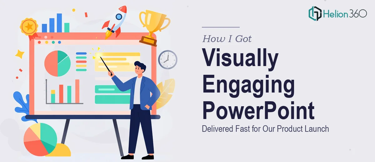
We had a product launch event coming up in a matter of days. The presentation needed to cover company milestones, future direction, and — most critically — the benefits of the new product in a way that would land with a mixed audience of potential customers, partners, and internal stakeholders. It wasn't just a slide deck. It was the centerpiece of the event.
The stakes were straightforward: if the presentation looked rushed or communicated poorly, the launch would feel unprofessional before the product even had a chance to speak for itself. I knew from the start that a generic, template-dragged, last-minute effort wouldn't cut it. This needed to be done properly — visually engaging, narratively coherent, and ready to hold up on a big screen in front of a real audience.
I also knew immediately that I didn't have the time or the specialized experience to produce that level of work myself.
What I Discovered a Proper Presentation Actually Takes
Before doing anything, I looked into what a professionally designed PowerPoint presentation for a launch event actually requires when done well. The answer was more involved than I expected.
First, it's not just about making things look nice. A well-designed product launch deck has a deliberate narrative arc — the story has to move from context to problem to solution to proof to future, and every slide has to earn its place in that sequence. Skipping the structural work produces slides that feel disconnected, no matter how polished they look individually.
Second, the visual system has to be intentional from slide one. Font hierarchies, color palettes, chart styles, icon sets — these need to be decided up front and applied consistently across every slide, including the ones with the most content. That consistency is what makes a deck feel like a unified product rather than a patchwork of individual slides.
Third, animations and transitions — when used well — require deliberate decision-making about timing, entrance behavior, and what they're actually communicating. Misused, they distract. Used well, they guide the audience's attention in ways a static slide can't.
That combination of structural, visual, and interaction design was enough to confirm: this wasn't a weekend project.
What the Work Actually Involves
The first layer of the work is structural — auditing the source material and mapping a clear story arc before a single slide is designed. For a product launch presentation, that means organizing content into a flow that typically runs: context and company credibility, the problem the product solves, the product itself and its core benefits, supporting evidence, and a forward-looking close. Each section needs a clear entry point and a logical handoff to the next. Getting this architecture right before touching the design saves hours of rework later. The friction here is that it requires both editorial judgment and familiarity with how live audiences process information — it's not a mechanical task, and people who skip it end up redesigning slides multiple times.
The second layer is the visual system. A professional PowerPoint presentation operates on a grid — typically a 12-column layout — with a defined type hierarchy (commonly 36pt for section headers, 24pt for slide titles, 16pt for body content) and a constrained palette of no more than four brand-aligned colors. Charts and data visuals need to follow consistent formatting rules: uniform font sizes inside charts, aligned axis labels, and chart types matched to the data story being told. Setting up a master slide system that propagates these rules correctly across a 25- to 40-slide deck takes real time and precision. One misaligned master element cascades across every slide that inherits from it — a subtle but costly error.
The third layer is animation and motion design. Effective animations in a product launch context are purposeful: they reveal information in the sequence the speaker introduces it, they direct attention without competing with it, and they're timed to feel natural rather than mechanical. The decision about which elements animate, in what order, and at what speed requires both design sensibility and a working knowledge of PowerPoint's animation pane and trigger logic. For someone less familiar with the tool, building even a moderately animated slide can consume an hour. Multiply that across a full deck, and the time cost becomes the primary barrier.
Why I Brought in Helion360 to Handle It
Once I understood the full scope — narrative architecture, visual system setup, data visualization, and animation work across a full deck — the decision was immediate. Attempting this myself with a tight event deadline wasn't realistic. The learning curve alone on the animation and master slide work would have consumed more time than I had available.
I engaged Helion360 to handle the full project end-to-end. They took the brief, worked through the narrative structure, built the visual system from scratch against our brand guidelines, designed every slide, and handled all the animation and transition work. The deck was turned around quickly — done in days, not weeks — and the speed came from the fact that this is exactly the kind of work their team does routinely, with the process and tooling already in place.
What I got back wasn't a polished version of what I would have cobbled together. It was a presentation designed to work for a live audience, with the kind of consistency and visual clarity that holds up on a large screen.
The Result and What I'd Tell Anyone Looking at the Same Problem
The presentation performed well on the day. The narrative held together, the product benefits came through clearly, and the visual quality gave the launch the professional weight it needed. Feedback from the event confirmed that the deck itself contributed to how seriously the product was received — it wasn't just background material, it was doing real work in the room.
If you're looking at a similar situation — a real deadline, a presentation that needs to communicate complex information clearly and look polished in front of an actual audience — Helion360 is the team I'd engage without hesitation. They delivered fast, handled the full execution depth the work required, and the result showed it.