

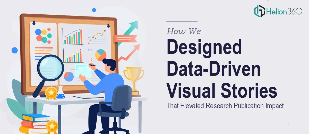
The Challenge of Making Research Data Readable
Research publications live and die on clarity. When data is dense and visualizations are inconsistent, even the most significant findings can fail to land. That was the situation we were brought into — an editorial team with strong research output but a visual presentation layer that was not keeping pace.
The datasets spanned multiple studies, each with different variables, timeframes, and audience expectations. The challenge was not just design — it was knowing how to interpret statistical complexity and render it in a form that would hold a reader's attention without sacrificing accuracy.
Building a Visual Language for Complex Data
Helion360 started by auditing the existing materials and meeting with the editorial team to understand their publication standards and reader demographics. From there, we built a systematic approach to visual design — one that matched each data type to the right chart format and maintained a consistent style across all outputs.
We worked with bar charts, line graphs, heat maps, and custom infographics depending on what each dataset demanded. Color palettes were chosen for both aesthetic coherence and accessibility. Typography and labeling followed a clear hierarchy so readers could extract key insights quickly, whether viewing in print or on screen.
Adobe Illustrator was the primary production tool, allowing us to deliver vector-based files suitable for high-resolution publishing. Every illustration went through a collaborative review cycle with the editorial team before final approval.
Results That Extended Beyond the Deliverables
By the end of the engagement, we had produced a full suite of data illustrations across multiple research articles. The visuals were well-received by both the internal editorial team and external peer reviewers, who noted improved comprehension of complex findings.
More importantly, the visual framework we established gave the team a repeatable system. Future research outputs could follow the same design logic without starting from scratch, compressing production timelines and maintaining quality consistency.
Our Visual Brand Identity Kit, interactive presentation suites, and approach to data-driven financial presentations were central to how we structured and executed this project.
Working With Helion360
If your research or editorial team is sitting on valuable data that isn't communicating its full weight visually, Helion360 is ready to help. We've handled projects like this before — where the complexity is real and the standards are high — and we know what it takes to deliver work that holds up in professional publication environments.