

Designing a Sustainable Brand Identity Across 8 Pages
When a brand is built around eco-conscious values, its print materials have to say so before a single word is read. Visual tone, layout structure, and design language all carry weight — especially in a presentation folder that may be the first physical impression a potential partner or customer receives.
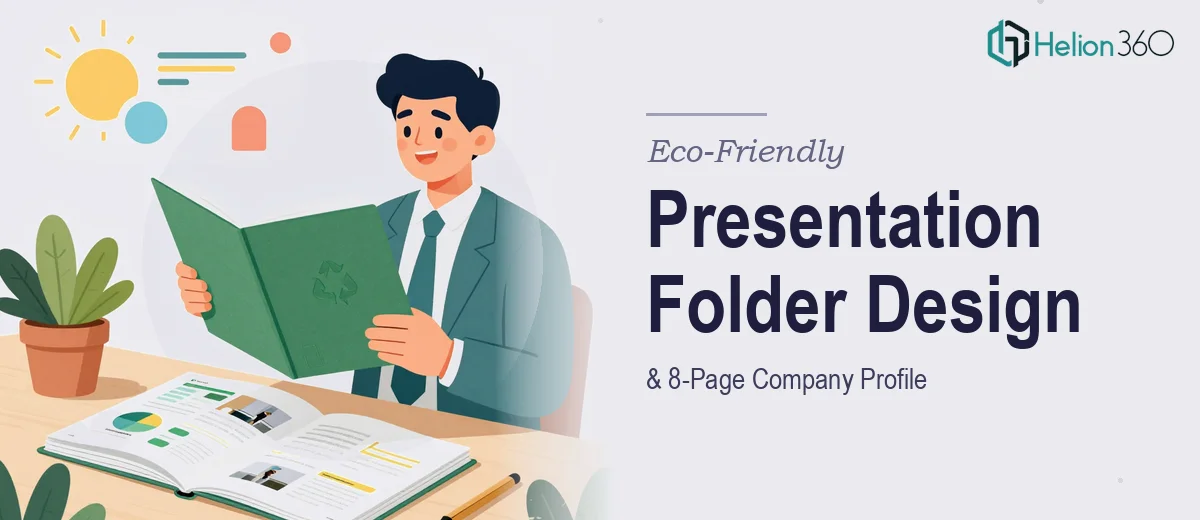
Our concealed client came to us at the start of a product line launch with a clear need: a professional, 8-page presentation folder combining their company profile and a product brochure, all unified under a sustainability-forward design identity. The timeline was urgent, the budget was defined, and the expectations were high.
The Complexity Behind a Seemingly Simple Brief
Eight pages sounds manageable until you account for everything they need to carry. A company profile covers history, values, and mission. A product brochure needs imagery, specifications, and persuasive copy. A presentation folder needs a cover that commands attention and an inside structure that guides the reader without overwhelming them.
Fitting all of that into a coherent, visually clean package required planning before design. We mapped each page to a specific content purpose before touching layout or typography. This upfront structure prevented the common failure mode of eco-friendly brand materials — pages that look earthy but read like a data dump.
Visual Direction Rooted in the Brand's Core Values
The design language we developed drew from the brand's sustainability positioning. Earthy neutrals, clean white space, and nature-influenced typographic choices formed the foundation. These weren't aesthetic preferences — they were intentional signals aligned with what the brand stood for.
Product pages used imagery and concise descriptors to let the products speak. Infographic elements reduced the need for dense paragraphs. The folder cover was designed to be immediately recognizable and shelf-worthy — something a distributor or retail buyer would notice.
Early Mockups, Fast Iterations
Given the rush timeline, we prioritized getting presentation folder mockups in front of the client early. Seeing the layout in a realistic format allowed them to give specific, actionable feedback rather than abstract direction. We incorporated revisions quickly and moved into final file preparation without losing momentum.
Helion360 structured the entire workflow around the client's urgency. Design reviews, file delivery, and print preparation were handled in sequence without unnecessary back-and-forth, keeping the project on track from brief to final output.
Delivered Within Budget, Ready for Print
The final deliverables included print-ready files for all eight pages, folder cover artwork, and digital mockups suitable for online presentations and internal use. Everything was packaged for professional printing and formatted to production specifications.
The project landed within the $300–$400 budget without compromising the quality or completeness of the output. The client walked away with a presentation asset ready to be placed in front of customers, partners, and distributors.
Working With Helion360
If you're launching a product line or repositioning a brand and need print collateral that actually reflects who you are, Helion360 is the kind of team that takes those projects seriously. We've handled tight timelines, fixed budgets, and complex content requirements — and we know how to deliver clean, professional results without dragging the process out.
If your brand needs a presentation folder, company profile, or brochure that does real work in the field, reach out. We've done this before and we know what it takes to get it right.