

The Communication Gap Behind the Design
Well-researched content can still fall flat when the design surrounding it is inconsistent or outdated. That was the situation we were brought in to address — a set of 10 infographics and 5 presentations that had accumulated visual drift over time, with icon styles, layouts, and formatting that no longer worked together as a coherent whole.
The problem was not a lack of information. It was a lack of visual clarity. Generic icons undercut credibility, and uneven formatting made it harder for audiences to follow the logic from one section to the next.
How We Approached the Redesign
Before touching a single file, we conducted a full audit of all 15 materials. We documented every inconsistency — mismatched icon families, competing color applications, unclear typographic hierarchies — and used that inventory to define a unified design system that could be applied across the entire body of work.
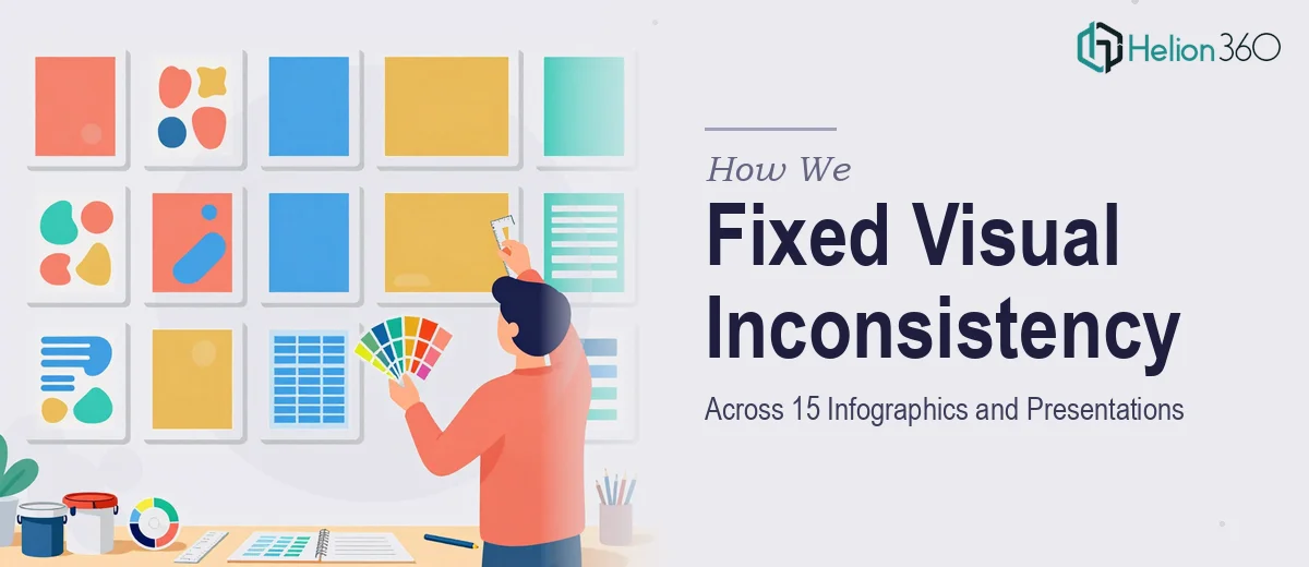
Helion360 then moved through each infographic and presentation systematically. Outdated or generic icons were replaced with modern, contextually appropriate alternatives selected to match the tone and subject matter of each piece. Layouts were restructured to establish clear visual flow, typography was standardized across heading levels and body text, and color was applied with intention rather than habit.
Every decision was framed around a single question: does this help the audience understand faster and more clearly?
What Was Delivered
All 15 materials were completed on schedule. The infographics now share a coherent icon language and layout logic. The presentations guide viewers through information without requiring additional verbal explanation to fill design gaps.
The improvement was immediately visible to the client's internal team. Materials that previously needed a presenter to carry the weight of interpretation now communicated on their own — which is exactly what well-designed presentation assets should do.
Working With Helion360
If your presentation materials have grown inconsistent over time — mismatched icons, unclear layouts, design that no longer matches the quality of your content — Helion360 is ready to step in. We've handled this kind of systematic redesign before, and we know what it takes to bring a full set of materials into alignment without losing the substance behind them. If you're facing a similar challenge, we know what it takes to get it right.