

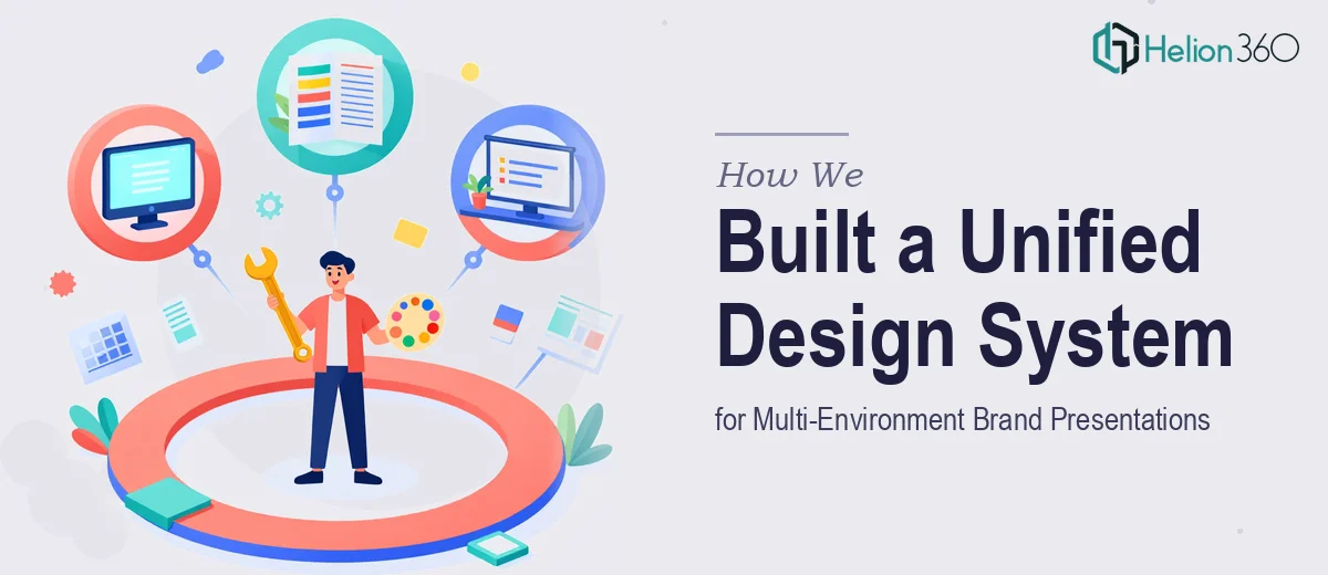
The Design Problem Worth Solving
Some presentation challenges are straightforward. This one was not. The client needed a design system that could carry their brand through both high-stakes live events and digital presentations — without losing coherence, elegance, or usability in either environment.
The existing materials were inconsistent. Brand elements were applied unevenly, navigation was unintuitive, and the overall visual tone did not match the professionalism the brand represented. The gap between what the client had and what they needed was significant.
Building a Unified Design Language
Helion360 approached this project by establishing a clear foundation before touching a single slide. We audited every available brand asset and used that research to define a design system — one that would govern typography, color application, spacing, and UI behavior throughout the entire presentation.
From that foundation, we designed each section with visual hierarchy as the primary driver. The audience needed to follow the content naturally, without being directed by text alone. Color became structural. The logo became an anchor. Every interactive UI element was designed with accessibility and ease of navigation in mind, tested across screen sizes to ensure consistent performance.
Presentation Design That Performs in Two Environments
One of the core complexities here was that the presentation had to work live and digitally. Layouts that function in a large-room projection setting behave differently on a laptop screen. We resolved this by designing with both contexts simultaneously — adjusting contrast, scale, and spacing to hold up in both formats without requiring two separate versions.
The UI design elements were treated with the same rigor. Transitions were smooth and purposeful. Navigation was simplified so that even a first-time viewer could move through the content without hesitation.
Outcome and Delivery
Helion360 delivered a complete presentation system — slides, UI components, and a supporting style guide — on schedule. The client's first major deployment of the new design received strong internal and external feedback. Brand perception shifted noticeably, and the presentation was described as the most polished the team had produced.
The style guide ensured the client's internal team could maintain design consistency going forward, which extended the value of the work beyond the initial delivery.
Working With Helion360
If your brand's presentations aren't reflecting the level of quality your work deserves, Brand Story Presentation Design Services from Helion360 is ready to help close that gap. We take on complex, multi-format design projects and build unified design language systems that hold up under real-world conditions — live events, digital platforms, and everything in between. Our experience with B2B marketing presentations demonstrates our commitment to visual consistency and brand alignment. We've done this before, and we know what it takes to get it right.