

The Problem With Slides That Look Like Documents
When a presentation relies entirely on text to do the heavy lifting, it loses the audience before the first point lands. That was the situation we were brought in to address. The client's existing slides carried strong content but were structured more like written reports than visual communication tools — dense, inconsistent, and difficult to follow in a live setting.
The challenge was not to rewrite the material but to redesign how it was presented. Mismatched visual elements, an absence of hierarchy, and no cohesive design language across the deck library were all working against the content's actual quality.
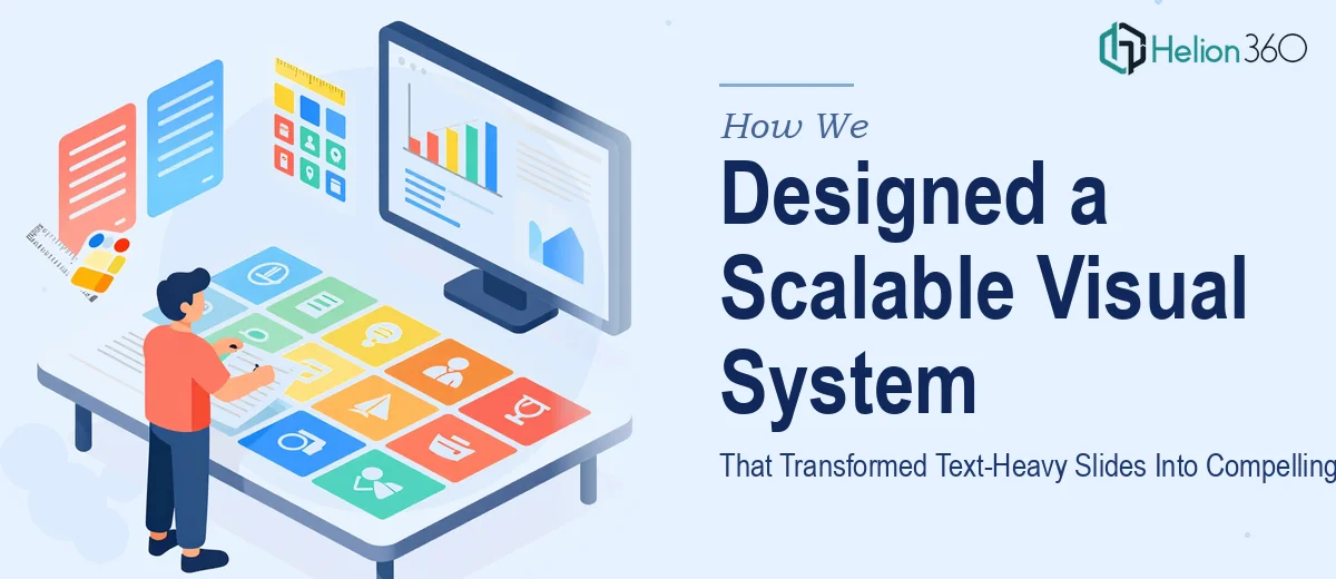
Building a Visual Framework That Scales
Our first step was a full audit of the existing slide library. We documented every inconsistency — font choices, color usage, layout structure, and the gaps where visual support was missing entirely. From that audit, we built a design system: a unified color palette, a typography scale, and a grid-based layout that could flex across different content types without losing coherence.
Helion360 then developed custom illustrations and graphic elements matched to the subject matter of each presentation. Working across PowerPoint and Adobe Illustrator, we turned abstract concepts into clear visual metaphors and raw figures into clean, readable data visualizations. Every design decision was tied to a communication goal — not just aesthetics.
Delivery and Outcome
The final presentations were sharper, faster to read, and easier to follow for audiences across different backgrounds and levels of familiarity with the subject matter. Slides that previously needed verbal scaffolding to make sense now stood on their own. The client noted stronger engagement from both internal teams and external audiences after the redesigned materials went live.
Every asset was delivered on schedule, formatted and ready for immediate use across multiple platforms. Beyond the individual decks, the client gained a reusable design system — a consistent visual foundation they could apply to future materials without starting from scratch each time.
Working With Helion360
If your presentation library has grown faster than your design standards, or if you have strong content that simply isn't landing the way it should, Helion360 is ready to step in. We've worked through exactly this kind of challenge before — diagnosing what's broken, building a visual system that holds across formats, and delivering polished assets on a real deadline. We know what it takes to get it right.