

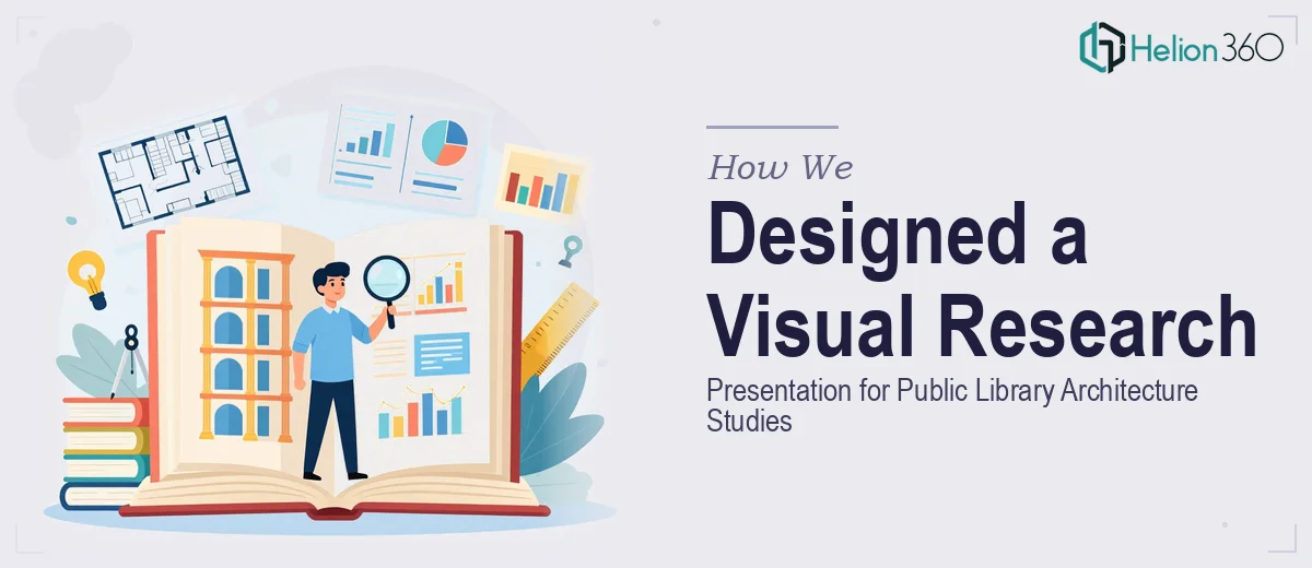
The Challenge: Dense Research, High Visual Standards
Architectural research presentations carry a specific burden. They must be technically rigorous and visually compelling at the same time — and for a public library study, that balance is especially important. The project involved a substantial body of work: site analysis, spatial programming, typological research, and design development. The content was thorough, but it existed without a visual framework capable of presenting it with the weight it deserved.
The reference point the client shared was clear. Architecture presentations at the gallery and thesis level treat graphic design as part of the argument itself — not decoration applied after the fact. Reaching that standard meant building a design system from the ground up, not simply formatting existing slides.
Our Approach: Design System First
At Helion360, we treat visual structure as a foundational decision, not a finishing step. Before designing a single slide, we mapped the full research arc and identified the different content types that needed to be communicated — contextual site data, analytical diagrams, spatial comparisons, and precedent studies.
From that audit, we built a unified design system: consistent layout grids, a typographic hierarchy that scaled from headline to annotation, and a restrained color palette that kept visual attention on the content. Each section of the presentation received a graphic treatment appropriate to its material. Site analysis pages used layered map diagrams with clear annotation. Spatial studies were expressed through section overlays and plan comparisons. Precedent references were curated and framed to support the research logic rather than simply fill space.
Every design decision was tied to legibility and argument — ensuring the graphics communicated rather than decorated.
What We Delivered
The completed presentation covered the full scope of the public library architecture research in a format that held together visually from the first slide to the last. The design system we established gave each section its own character while keeping the whole deck coherent — the kind of consistency that reads as intentional and professional in any review or portfolio context.
The client received a presentation ready for academic submission, thesis defense, or inclusion in a professional architecture portfolio. The research itself was strong. Our role at Helion360 was to make sure the visual execution matched that standard.
Working With Helion360
If you have architectural research, a thesis project, or a complex study that needs a presentation built to a high visual standard, Helion360 is ready to take it on. We understand what strong architecture graphics require and we know how to get there.