

The Project Had a Hard Deadline and a Real Audience
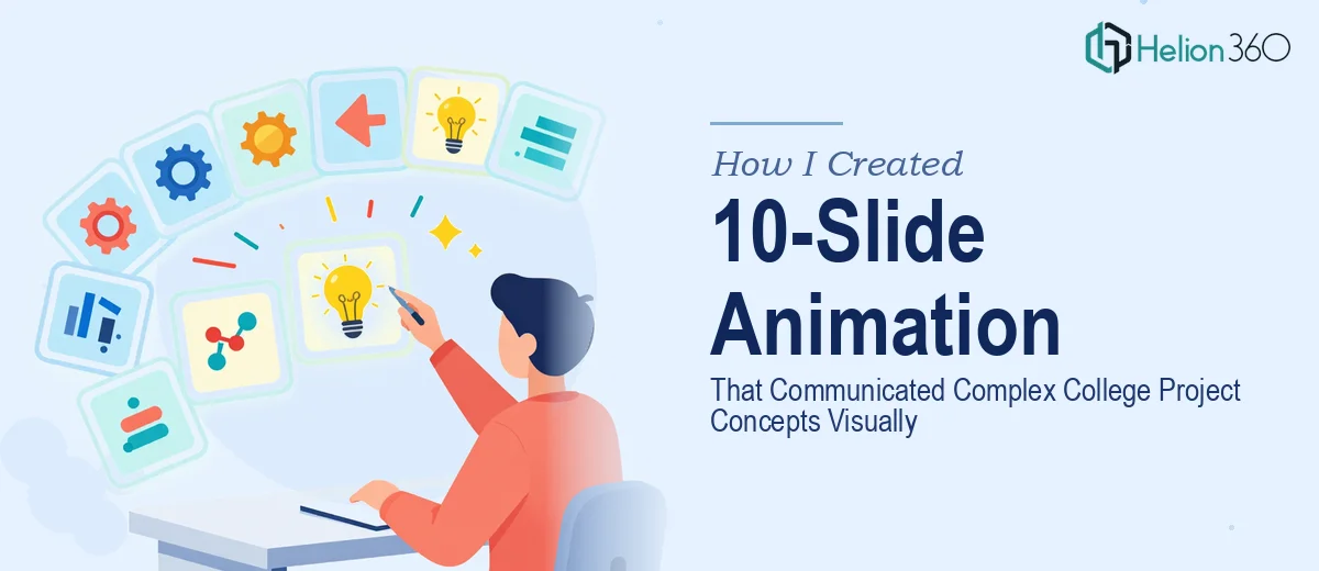
I was working on a college project that needed to land with a wider audience — not just a professor grading slides, but a room full of people who needed to actually understand the concepts being presented. A static deck wasn't going to cut it. The material was layered, the relationships between ideas weren't obvious at a glance, and the standard bullet-point format was going to bury the story entirely.
The decision to go with a 10-slide animated presentation wasn't a nice-to-have — it was the only format that could carry the complexity without losing the audience. Animations would guide attention, sequence information the right way, and make abstract concepts feel concrete. The stakes were clear: present this poorly and the work behind the project gets lost. Present it well and the ideas speak for themselves.
I knew immediately this needed to be done right, not just done quickly.
What I Discovered This Kind of Work Actually Requires
Once I started looking into what a properly built animated presentation involves, it became clear this was not a weekend task. The gap between a rough animated slide and one that actually communicates well is significant.
First, the animation has to serve the narrative — not decorate it. Each motion needs to be tied to a specific communication goal: revealing a concept in stages, connecting two ideas visually, or directing the eye to what matters next. Random transitions don't do that. Purposeful sequencing does, and mapping that out before touching any software is its own planning phase.
Second, the visual language has to be consistent across all 10 slides. That means a coherent color palette, matching motion styles, uniform timing curves, and a typographic hierarchy that doesn't shift from slide to slide. Inconsistency breaks the viewer's trust in the material without them even knowing why.
Third, the file itself has to perform. Animations that stutter, render slowly, or break during a live presentation are worse than no animation at all. Building animation that is both visually rich and technically stable is a craft problem, not just a design problem.
What the Work That Needs to Happen Actually Looks Like
The first layer of work is structural — mapping the narrative arc before a single animation is built. Done well, this means auditing all the source content, identifying the three to five core ideas the audience must leave with, and sequencing those ideas across exactly 10 slides so each one builds on the last. The decision a practitioner makes here is whether each slide is a reveal, a comparison, a summary, or a transition — because that drives every animation choice downstream. Getting this wrong means the animations will feel random even if they look polished, and reworking the sequence after animations are already built costs significant time.
The second layer is the visual mechanics of the animation itself. Proper slide animation uses easing curves — ease-in for entering elements, ease-out for exits — rather than flat linear motion, because linear motion reads as mechanical rather than intentional. Timing is typically set in the 200–400ms range for element entrances, with a 600–800ms hold before the next trigger fires, giving the eye time to process each beat. Typography hierarchy for a college presentation typically runs 36pt for slide titles, 24pt for primary statements, and 16pt for supporting detail. Building this across 10 slides with master slide logic rather than slide-by-slide overrides is what separates a maintainable file from one that falls apart the moment an edit is needed. For someone new to animation tooling, this layer alone can consume the better part of a week.
The third layer is polish and consistency across the full deck. A max of four brand or project colors applied with strict usage rules — one dominant, one accent, two neutrals — keeps the visual system coherent. Every icon set, illustration style, and motion behavior needs to match. Slide 1 and slide 10 should feel like they came from the same hand. The friction here is cumulative: small inconsistencies that seem minor slide-by-slide compound into a deck that looks unfinished at the presentation level. Catching and correcting those inconsistencies requires a review pass with fresh eyes and a detailed consistency checklist, which is often the step that gets skipped when time is short.
Why I Brought in Helion360 to Handle It
I did not attempt to build this myself. After understanding what the work actually involved — the narrative mapping, the animation mechanics, the consistency pass — it was obvious that the time required to learn and execute it properly was time I did not have before the presentation date.
Helion360 handled the full project end-to-end: the content structure and story sequencing across all 10 slides, the animation build with proper timing and easing, and the final polish pass to ensure visual consistency throughout. They turned it around quickly — done in days, not the weeks it would have taken me to climb the learning curve and produce something at this level.
What made the difference was that the tooling and the expertise were already in place. There was no ramp-up time, no trial-and-error on animation timing, no back-and-forth trying to figure out why the file was stuttering. The work got handled in a fraction of the time it would have taken me to execute it myself, and the output reflected genuine craft at every layer.
The Result and What I'd Tell Anyone Facing the Same Call
What came back was a 10-slide animated presentation that carried the project's concepts clearly — each slide sequenced intentionally, each animation tied to a specific communication beat, and the whole deck visually consistent from open to close. The audience followed the material without effort, which is exactly what good visual storytelling is supposed to do. The project landed well, and the presentation itself was a meaningful part of why.
If you're looking at a similar situation — complex material, a real audience, and a deadline that doesn't leave room for a learning curve — you might consider professional PowerPoint animation. Helion360 is the team to engage. They delivered fast, handled the full scope, and brought the kind of execution depth this work genuinely requires.