

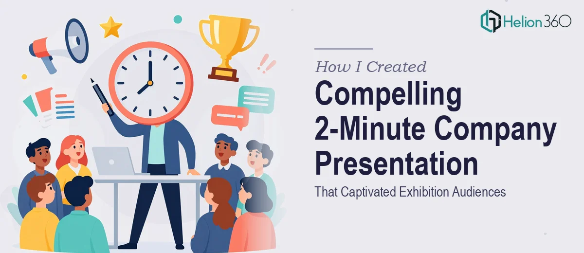
The Challenge: Two Minutes to Make an Impression
When I found out we had a booth at an upcoming industry exhibition, I was excited — until the reality sank in. We needed a company presentation that could communicate our key services, major achievements, and future direction in under two minutes. That is not a lot of time. Every second counts, every slide has to earn its place, and the visuals need to do a significant amount of the heavy lifting.
I started drafting it myself. I had the content — the milestones, the service breakdown, the vision — but translating all of that into a tight, engaging company presentation for an exhibition environment was a different challenge entirely. Exhibition audiences do not sit down and read. They glance, they absorb, they move on. The slides had to be designed to communicate almost instantly.
Where the DIY Approach Hit Its Limits
My first attempt was honest work. I organized the content into logical sections and put together a rough deck. But when I ran through it with a colleague, the feedback was clear: it felt like a report, not a presentation. The slides were text-heavy, the flow was not smooth, and nothing about it said "stop and pay attention."
The problem was not the content — it was the packaging. A compelling company presentation for an exhibition requires a very specific design sensibility. It needs dynamic visuals, a clear visual hierarchy, motion where motion adds value, and a structure that guides a viewer through the story in sixty to ninety seconds without them needing to read a single paragraph.
I knew I needed someone who actually specialized in this kind of work.
Bringing in the Right Team
After a bit of research, I came across Helion360. I explained the context — a live exhibition, roughly two minutes of screen time, an audience that would be standing and distracted — and their team immediately understood the brief. They asked the right questions about brand colors, tone, and which achievements and services were most important to lead with.
What followed was a back-and-forth that felt genuinely collaborative. They proposed a visual storytelling structure that opened with a strong brand moment, moved through our core services with bold iconography and minimal text, showcased two or three key achievements with clean data visuals, and closed with a forward-looking message and our contact details. Each section was timed to feel natural and unhurried, even within the two-minute window.
What the Final Presentation Looked Like
The finished deck was a significant step up from what I had put together. The slide design was modern and consistent — every screen felt like it belonged to the same visual world. The animations were purposeful rather than decorative, drawing the eye exactly where it needed to go at exactly the right moment.
The company profile came through clearly. Someone watching for thirty seconds would walk away knowing what we do. Someone who stayed for the full two minutes would understand our track record and where we are headed. That layered communication was exactly what an exhibition environment demands.
Helion360 also delivered the presentation in a format that looped cleanly, which was important for a booth setup where the deck would run on a screen throughout the day without anyone manually advancing it.
What I Took Away From This
Building a short presentation is deceptively hard. The constraint of two minutes forces every design and content decision to be deliberate. There is no room for filler slides, no tolerance for dense paragraphs, and no forgiveness for inconsistent visuals. Getting that balance right took expertise I did not have on my own — not because the task was beyond understanding, but because it required hands-on experience with exactly this type of delivery format.
The exhibition went well. The feedback on the presentation was positive, and more than a few people at the booth mentioned that the screen caught their attention before anything else.
If you are preparing a company presentation for an exhibition and find yourself in the same position I was — with solid content but a deck that is not landing the way it should — Helion360 is worth a conversation. They took what I had, rebuilt it with the right structure and visual design, and delivered something that genuinely worked in the room.