

The Assignment Looked Simple Enough
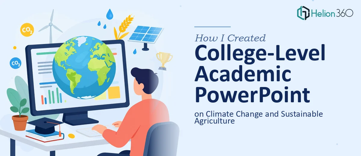
I had a college-level presentation to put together covering three interconnected topics: the impact of climate change on global agriculture, sustainable farming practices, and potential solutions for the future. The audience was academic, the tone needed to be informative yet engaging, and the final deck had to include proper references and data visualizations.
On paper, it sounded manageable. I had done presentations before. I figured I could pull together some research, drop it into PowerPoint, and call it done in a weekend.
That estimate was wrong.
Where the Complexity Crept In
The first challenge was the research itself. Climate change and agriculture is a genuinely dense subject area. There are peer-reviewed studies, conflicting data sets, regional impact differences, and a wide range of proposed solutions — from regenerative soil practices to precision irrigation and crop diversification. Pulling all of that into a coherent narrative that a college audience could follow without getting lost in jargon took far longer than I expected.
The second challenge was the visual design. Academic PowerPoint presentations tend to fall into one of two traps: walls of text that lose the audience, or oversimplified slides that strip out the substance. I needed something in between — slides that could carry data through charts and infographics without feeling like a lecture handout. Every time I tried to visualize something like temperature anomaly trends or yield loss projections, the charts looked either cluttered or amateurish.
The third issue was citations. Properly sourcing data on climate impact and sustainable farming practices across a 20-plus slide deck, while keeping the references formatted consistently and tied to the right slide content, was its own full-time task.
By the end of day two, I had a rough outline, a handful of slides, and a growing sense that the deck I was building did not match the quality the presentation required.
Bringing in the Right Team
After hitting that wall, I came across Helion360. I explained the scope — the three topic areas, the academic tone, the need for data visualization and properly cited sources — and their team took it from there.
What I appreciated most was that they asked the right questions upfront. They wanted to know the slide count target, the academic level, whether the references should appear inline or in a dedicated bibliography slide, and what visual style I had in mind. That conversation alone gave me more clarity on what I actually needed.
What the Final Deck Looked Like
The finished academic PowerPoint presentation covered the full arc — opening with the measurable impact of climate change on crop yields, water availability, and food security, then moving into sustainable farming approaches like agroforestry, cover cropping, and soil carbon sequestration, and closing with a forward-looking section on scalable solutions and policy frameworks.
The data visualization work was where the presentation really came together. Charts showing projected agricultural output under different warming scenarios, infographics comparing conventional versus regenerative farming outcomes, and regional maps illustrating drought and flood risk were all built cleanly and clearly labeled. Nothing felt decorative — each visual had a purpose and carried a specific point.
The references were handled properly too, with in-slide source callouts and a final bibliography slide formatted to academic standards.
What I Took Away From the Process
Building a well-researched academic PowerPoint presentation is not just a design task. It sits at the intersection of research synthesis, data visualization, and slide structure — and all three have to work together. Getting the research right does not automatically produce a clear visual narrative. Good design cannot compensate for weak sourcing. And a well-cited, well-structured deck still falls flat if the slides are not built to hold an audience's attention.
The topic of climate change and sustainable agriculture demanded all three done properly. I underestimated that going in.
If you are working on a research-heavy academic presentation and finding that the scope is larger than a solo effort can handle cleanly, our PowerPoint Redesign Services can help — we handle the full scope of what you need and deliver a deck you can confidently present.