

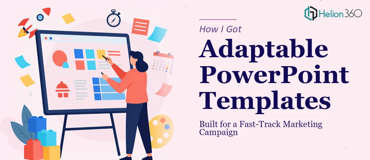
The Campaign Was Moving Fast and the Deck Was Not
I was in the middle of a marketing campaign rollout with a hard deadline and a slide deck that wasn't pulling its weight. The slides had the right content — product messaging, campaign positioning, supporting data — but they looked inconsistent, the charts were rough, and the layout made it hard for anyone to absorb the key points quickly. For a deck that was going to be seen by internal stakeholders, channel partners, and a few external audiences, that wasn't going to cut it.
The bigger issue was that this wasn't a one-time presentation. The deck needed to work as a template — something the team could adapt across multiple campaign touchpoints without breaking the design every time someone edited a slide. That changed the scope considerably. Getting it right mattered, and it mattered on a timeline that didn't leave room for trial and error.
What I Found the Work Actually Required
I spent some time understanding what a properly built, adaptable PowerPoint template actually involves — because what I initially thought was a quick cleanup turned out to be a much more considered piece of work.
First, the structural layer isn't just about making slides look nicer. A reusable template has to be built at the Slide Master level so that layout changes propagate correctly across every variant. If that foundation isn't set up right, every team member who opens the file and makes an edit creates a new visual inconsistency.
Second, adding charts the right way isn't cosmetic. Chart type selection, data labeling, axis scaling, and color assignment all have to follow a consistent logic — one that still holds up when someone swaps in new data for the next campaign wave.
Third, the visual system has to be locked in from the start. Font hierarchies, spacing rules, and brand colors need to be embedded into the template itself — not applied manually to individual slides. Without that, the deck degrades the moment someone touches it. I could see pretty quickly that this was not a weekend fix.
The Work That Needs to Happen
The right approach to a project like this starts with a structural audit of the existing deck. Every slide gets evaluated for content hierarchy — what's the lead message, what's supporting detail, and what's noise. The work involves mapping a clear narrative arc across the full deck before any visual decisions are made, because layout choices that don't follow a logical content structure create confusion no amount of polish can fix. Reorganizing content at this stage often means moving slides, splitting overloaded ones, and sometimes cutting material that undermines the main message. That alone can take a full working day on a deck of moderate length.
Visual mechanics are where the real technical depth sits. A properly built PowerPoint template uses a 12-column layout grid applied through the Slide Master, with a defined type scale — typically something in the range of 36pt for headlines, 24pt for subheads, and 16pt for body text — so hierarchy reads consistently across every slide variant. Chart types get selected based on the data relationship being communicated, not aesthetic preference: comparisons call for bar charts, trends call for line charts, and part-to-whole relationships call for stacked or donut formats. Getting these mechanics right across a full template, including linked data charts that update cleanly when content changes, is the kind of work that trips up anyone who hasn't done it repeatedly.
Polish and consistency across the full deck is the layer that most people underestimate. It means enforcing a palette of no more than four brand colors with assigned roles — primary, secondary, accent, and neutral — so no slide ever drifts. It means checking that icons, dividers, and graphic elements share the same stroke weight and visual style. It means reviewing every slide for alignment to the grid, consistent margin widths, and uniform spacing between elements. Done properly, this final pass takes as long as the structural work — and it's what separates a template that holds up in real use from one that falls apart after the first edit.
Why I Brought in Helion360 to Handle It
I recognized straight away that attempting this myself wasn't realistic. Not because the individual tasks are impossible to learn, but because doing them well — at the level this campaign required, on the timeline we had — demands a combination of design judgment, technical fluency, and template-building experience that takes time to develop. Time I didn't have.
Helion360 handled the full project end-to-end. That meant the structural audit and content reorganization, the Slide Master build with a proper grid and type hierarchy, the chart design with consistent formatting across every data slide, and the final consistency pass across the complete deck. The whole thing was turned around quickly — done in days, not the weeks it would have taken me to research, attempt, and iterate through it myself.
What made the difference was that this is the kind of work Helion360 does all day. The tooling is already in place. The judgment calls — which chart type, which layout variant, how to handle a slide with too much content — get made fast because they've been made hundreds of times before.
What Was Delivered and What I'd Tell Anyone in This Position
What came back was a fully built, brand-consistent PowerPoint template the team could actually use across the campaign lifecycle. The Slide Master was set up correctly so edits propagated cleanly. The charts were formatted consistently and linked in a way that made data updates straightforward. The visual system — colors, type, spacing — held up across every slide without manual intervention.
More importantly, the campaign moved forward without losing momentum while the deck was being handled. That was the real outcome: no time lost, no design debt accumulated, no team member stuck trying to untangle a broken template under deadline pressure.
If you're looking at a similar situation — a complete deck presentation that needs to work as a reusable template, on a timeline that doesn't allow for a learning curve — Helion360 is the team I'd engage. They delivered fast and handled the kind of end-to-end execution depth this work genuinely requires. You can see similar work in how teams have tackled turning draft PowerPoint into polished presentations.