

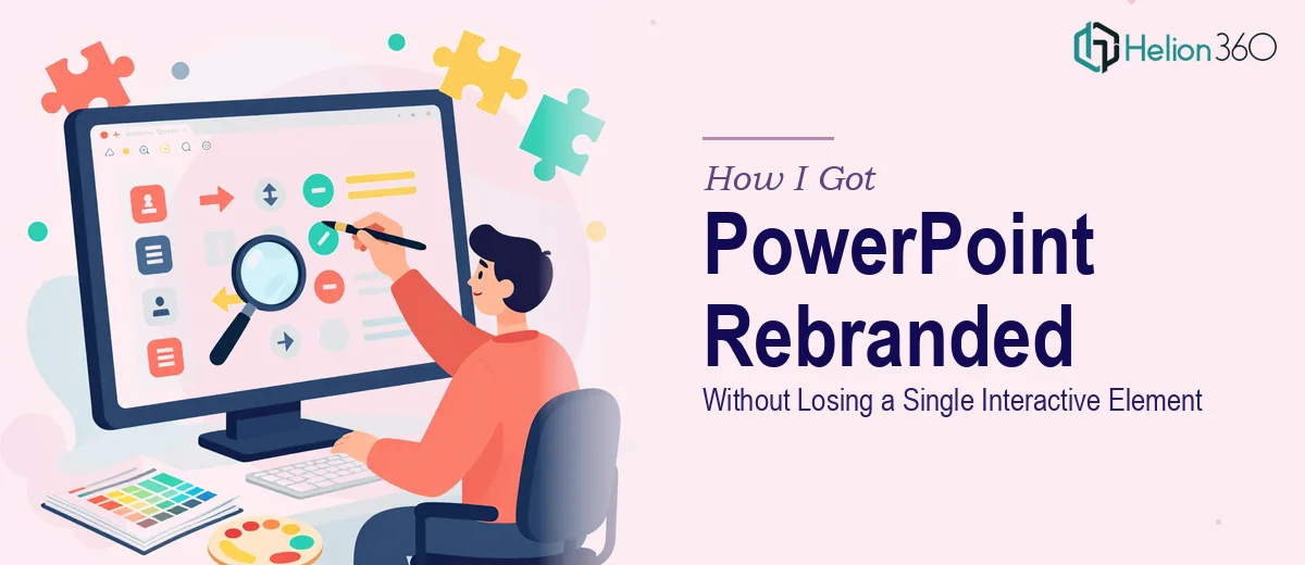
The Situation I Was Staring Down
We had a library of existing PowerPoint presentations — decks used across sales, internal communications, and client-facing meetings — that needed to be adapted to a new brand design. The rebrand had just landed, and with it came an updated color system, revised typography, new spacing rules, and a stricter visual identity framework. Every deck we owned was now off-brand.
The stakes weren't abstract. These presentations were going out to clients and stakeholders on a rolling basis. Sending anything that looked like the old brand felt like a credibility problem waiting to happen. And a few of the decks included complex data visualizations and interactive navigation elements that couldn't just be scraped and rebuilt from scratch without breaking things.
It was immediately clear this wasn't a formatting job someone could knock out in an afternoon. Getting this right — across every slide, across every deck — required real design discipline and PowerPoint expertise.
What I Found the Work Actually Requires
My first instinct was to scope the work myself. What I found was that adapting existing presentations to a new brand design is significantly more involved than it sounds on the surface.
The obvious layer is visual: swapping colors, updating fonts, applying new spacing. But done correctly, that work runs through master slides and slide layouts — not slide by slide. If the master slide structure isn't rebuilt properly, changes break every time someone edits the deck later. That alone is a meaningful technical task for someone who doesn't work in PowerPoint's backend regularly.
Then there's the data visualization problem. Charts and graphs in PowerPoint carry embedded formatting — axis colors, data label fonts, gridline styles — that don't inherit from the master. Each one needs to be touched individually, and each one needs to conform to the new brand palette without distorting the underlying data story.
Finally, there were interactive elements: hyperlinked navigation buttons, clickable table-of-contents slides, section jumps. Restyling those while keeping the logic intact requires someone who understands both the design layer and the linking mechanics simultaneously. One wrong move and a button looks right but goes nowhere.
What Doing This Well Actually Looks Like
The right approach starts with the master slide architecture. A properly rebuilt master uses a defined slide layout hierarchy — typically a title layout, a content layout, a section divider, and a blank — with brand colors mapped to the theme color slots (not hardcoded hex values applied directly to objects). Typography follows a clear scale: headline at 36pt, subhead at 24pt, body at 18pt, caption at 12pt, all set in the brand typeface with consistent line spacing. This structure is what makes every subsequent slide behave predictably. The friction here is real: rebuilding a master from an existing file without corrupting inherited formatting requires methodical work, and it's easy to introduce invisible inconsistencies that only surface when someone edits the deck months later.
Data visualizations are their own contained problem. Charts in PowerPoint don't inherit theme color changes automatically — each chart's data series, axis labels, gridlines, and background fill must be updated individually. The correct approach maps brand colors to a defined data visualization palette: typically a primary series color, a secondary series color, and a neutral for reference lines or gridlines. Font sizes on axis labels and data callouts should match the body text scale used elsewhere in the deck. The execution friction is volume and precision — a deck with fifteen charts means fifteen separate formatting passes, each one needing to be verified against the brand standards without introducing errors in the underlying data.
Interactive elements — hyperlinked buttons, section navigation, clickable table-of-contents slides — require careful handling during a redesign. The visual styling of each button needs to be updated: fill color, border, text color, hover state if applicable. But the hyperlink targets embedded in those objects must survive the redesign intact. The risk is that restyling a button sometimes means deleting and recreating it, which wipes the link. The right approach audits every interactive element before touching it, documents the link targets, and verifies functionality after every styling pass. This is detail-oriented work that takes longer than it looks.
Why I Brought in Helion360 to Handle It
Once I understood what a proper adaptation job actually involved — master slide rebuilds, chart-by-chart formatting passes, interactive element audits — it was obvious this wasn't something to attempt in spare hours between other priorities. The technical depth alone ruled that out, and the timeline didn't leave room for a learning curve.
I engaged Helion360 to handle the full project end-to-end. They took on the master slide architecture rebuild, applied the new brand system across every slide layout, updated all data visualizations to the correct palette and typography scale, and verified that every interactive element came through the redesign with its logic intact. The whole project was turned around quickly — done in days, not weeks — and at a level of consistency I couldn't have matched working through it myself.
What made the difference was that this is the kind of work they do continuously. The tooling, the quality control process, the familiarity with PowerPoint's backend — it was already in place.
What I'd Tell Anyone Looking at the Same Problem
The finished decks looked exactly like the new brand, behaved exactly as designed, and went out to clients and stakeholders without a single issue. Content structure was preserved throughout, data stories read clearly, and the interactive navigation worked cleanly across all devices used in presentations.
What I took away from the process was a clearer picture of what proper brand adaptation actually involves — and a sharper sense of how much can go wrong when it's done without the right expertise. Swapping colors on a surface level is easy. Rebuilding the architecture so the deck stays stable and on-brand through every future edit is a different kind of work entirely.
If you're looking at a library of existing presentations that need to be brought into a new brand design — especially with data visualizations and interactive elements in the mix — Helion360 is the team to engage. They handled the full scope fast, and the execution depth showed in every finished slide.