

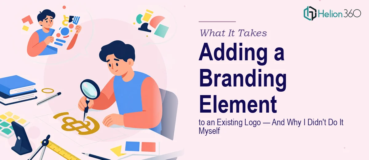
The Problem With a Logo That's Almost Complete
I had a logo for my tech startup that I genuinely liked. Clean, minimal, a stylized letter mark that felt modern. But it was missing something — a wordmark, a tagline, or some secondary element that would make it stand on its own when the icon wasn't enough context. On a business card or a website header, the symbol alone wasn't communicating what we did or who we were.
The stakes were real. We were moving into a phase where the brand would start appearing consistently across social media, pitch materials, and physical print collateral. Getting it wrong now meant either living with an inconsistent brand for months or paying to fix it later — neither of which made sense. I knew this needed to be done properly the first time, not patched together over a weekend.
What I Found the Solution Actually Required
My first instinct was to treat this as a small addition — just drop some text next to the icon and match the font. The more I looked into what actually makes this kind of update work, the more I understood it wasn't that simple.
The new element has to be optically balanced with the existing mark, not just mathematically centered. Visual weight distribution between a symbol and a wordmark is a judgment call that takes experience to get right. The wrong typeface choice, even at the correct size, can make the two parts look unrelated.
There's also the scalability requirement. A logo that works at 500px wide can fall apart at 40px — especially when a secondary element is added. Every combination of symbol, wordmark, and tagline needs to be tested across size breakpoints to confirm legibility holds. And then there's the format question: the final deliverables need to cover every context the brand will appear in, from print-ready vector files to optimized web formats. That's a real scope of work, not an afternoon task.
The Work That Needs to Happen
The structural work starts with auditing what the existing logo actually contains — its proportions, anchor points, spacing ratios, and the visual hierarchy it was built around. A well-executed addition respects the geometry of the original. That means defining a clear-zone rule (typically a minimum exclusion zone equal to the cap height of the wordmark), establishing the spatial relationship between symbol and text, and deciding whether the two elements sit horizontally, stacked, or in a lockup that adapts by context. Doing this without access to the original source file, or without understanding how the existing mark was constructed, means guessing — and guesses compound into visible inconsistencies across formats.
Visual mechanics are where the execution gets technical. Typeface selection for a wordmark isn't arbitrary — it needs to share formal qualities with the symbol (stroke weight, terminal style, geometric versus humanist construction) without being so similar that the two elements blend. A general rule of thumb is no more than two type families in a logo system, with the secondary element carrying no more visual weight than the primary mark. Size hierarchy typically runs the symbol at 120–140% of the wordmark cap height in a horizontal lockup. Getting those ratios wrong by even small margins produces a logo that looks assembled rather than designed, which is immediately readable to any trained eye.
Polish and consistency across deliverables is the final layer, and it's where most DIY attempts fall short. A complete logo update produces not one file but a system: full-color on light, full-color on dark, single-color, reversed, favicon crop, and print-ready EPS or PDF alongside screen-optimized SVG and PNG exports at multiple resolutions. Each variant needs to be tested in context — dropped onto a mock business card, a sales slide deck, a white slide background — before the system is considered done. That testing and export process alone takes several focused hours for someone who knows exactly what they're doing.
Why I Brought in Helion360 to Handle It
When I mapped out what proper execution actually looked like, it was clear that attempting this myself would have produced something that looked close but not quite right — and in branding, close enough is a problem. The precision required isn't about effort, it's about trained judgment and the right tooling already in place.
I brought Helion360 in to handle the full project end-to-end. That meant reviewing the existing mark and understanding its construction, designing and presenting multiple lockup directions for the new element, refining based on feedback, and delivering a complete set of production-ready files across every format we needed. It was handled in a fraction of the time it would have taken me to work through the learning curve myself — done in days, not weeks.
The speed mattered. We had a timeline tied to upcoming pitch materials and social profiles going live. Having a team that does this work every day, with the process already built in, meant we didn't lose time to iteration that shouldn't have been necessary.
The Result and What I'd Tell Anyone in the Same Position
What came back was a complete logo system — multiple lockup configurations, a clean tagline treatment that felt like it had always been part of the mark, and a full file package that covered every use case we had mapped out. The new element fit the existing symbol without overpowering it, and the whole thing held up across every size and surface we tested it on. Going into the next phase of the brand rollout, we weren't second-guessing anything.
The broader lesson I'd share is this: a logo addition looks like a small task until you understand what a good one actually requires. The gap between "something placed next to the icon" and "a complete, scalable brand lockup" is significant, and it shows. If you're looking at a similar situation and want it handled properly without spending weeks figuring out what proper even means, Helion360 is the team I'd bring in — they delivered fast, handled the full scope, and the result was something we could use immediately and confidently.
For similar projects where professional execution is non-negotiable, I'd also recommend reviewing what a professional trade show presentation actually requires — the principles of scalability and consistency across formats apply equally to presentation design work.