

The Brief Sounded Simple. It Wasn't.
I had two weeks to build a presentation on AI and blockchain technology. The goal was straightforward on paper: explain what these technologies are, show how they solve real business problems, and make it engaging enough for a mixed audience — people who live and breathe code alongside executives who just need to understand the business case.
I figured I could handle it. I know the subject matter. I've read enough about AI applications and blockchain use cases to hold a conversation. But sitting down to actually build the presentation exposed a gap I hadn't anticipated.
Where Things Started to Break Down
The first draft came together quickly. I had a structure — an intro to AI, a section on blockchain fundamentals, a few use cases, and a closing argument about business impact. On screen, it looked like a reasonable outline. But when I read it back, I realized it was doing too much in too many directions.
The technical sections were dense. The business sections were vague. The slides that tried to do both ended up doing neither well. I was writing for two audiences simultaneously without a clear sense of how to move between them.
Visually, the deck was flat. I had bullet points where there should have been diagrams. I had text-heavy slides where a single well-designed infographic would have done the job in seconds. The content was there, but the presentation design was not carrying its weight.
I spent a day trying to redesign slides myself — rearranging layouts, experimenting with icons, looking up how other AI and blockchain presentations were structured. None of it came together in a way that felt polished or cohesive.
Bringing in the Right Support
After hitting that wall, I reached out to Helion360. I explained the challenge: a technically complex topic, a dual audience, a tight deadline, and a draft that had good bones but no visual or narrative flow. Their team asked a few focused questions about the audience profile, the setting, and the key message I needed to land.
What followed was a clean handoff. I shared my draft and reference materials, and they took it from there. If you're facing similar challenges, business presentation design services can help transform raw content into polished, strategic decks.
What the Final Presentation Looked Like
A Narrative Built Around the Business Problem First
The team restructured the flow so that every technical concept — whether AI, machine learning, distributed ledgers, or smart contracts — was introduced in the context of a business problem it solves. That framing shift made the content accessible without dumbing it down. Technical viewers got the depth they needed. Non-technical stakeholders saw relevance immediately.
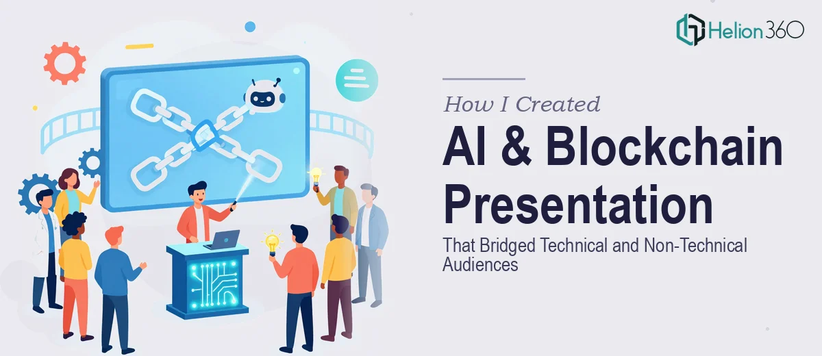
Visual Storytelling That Replaced the Bullet Points
Instead of slides packed with text, the AI and blockchain concepts were visualized through process diagrams, layered graphics, and side-by-side comparisons. Complex ideas like consensus mechanisms or predictive modeling were rendered as clean visual flows that a non-technical person could follow without a glossary.
The data visualization on business impact slides — cost savings, efficiency gains, adoption rates — was sharp and easy to read at a glance. Charts were styled consistently and labeled clearly, which is something I had not managed to do well on my own. This is similar to how high-impact business presentations turn complex data into compelling visuals.
Consistency Across Every Slide
One thing that stood out immediately was how unified the final deck felt. Typography, color palette, icon style, and spacing were consistent throughout. That kind of coherence is hard to achieve when you're building slides one at a time under time pressure. Helion360 treated the presentation as a single designed object, not a collection of individual slides.
What I Took Away from This
Building a presentation on emerging technology for a mixed audience is harder than it looks. The subject expertise matters, but it's not enough on its own. The structure, the visual design, and the way complex ideas are translated into digestible formats — that's a craft that takes time and skill to execute well.
I learned that knowing the topic and knowing how to present the topic are two separate problems. The first I could handle. The second needed a team that works in this space every day. As I explored in professional PowerPoint presentation work, the pressure of tight deadlines often reveals gaps that only professional design can close.
If you're in a similar position — strong on content but struggling to turn a technical topic into a presentation that actually lands with a broad audience — Helion360 is worth reaching out to. They took my rough draft and built something I could confidently put in front of any room.