

The Brief Was Clear, But the Build Was Not
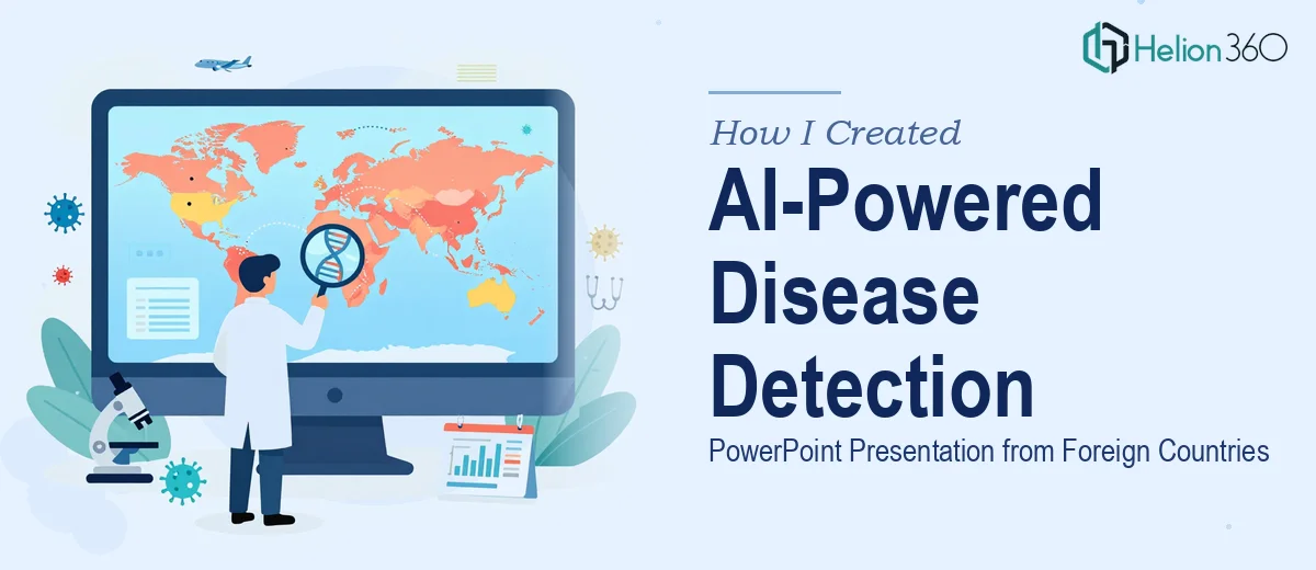
I had a deadline coming in fast. The task was straightforward on paper: create a PowerPoint presentation on how artificial intelligence can be used to detect diseases originating from foreign countries. The audience was mixed — part technical, part policy-oriented — so the slides needed to be informative without being overwhelming.
I knew the subject matter well enough to outline it. AI disease detection, cross-border health surveillance, machine learning algorithms, data collection from global health systems — these were all topics I had read about. But turning that into a clear, visually appealing AI disease detection PowerPoint that could hold the room's attention? That was a different challenge entirely.
Where My Own Attempt Started to Break Down
I started drafting slides on my own. The structure came together reasonably well. I had sections on AI algorithms used in disease surveillance, types of data collected from airports, international health databases, and biosurveillance systems. I included a slide on the challenges — things like data gaps from low-income countries, inconsistent reporting standards, and ethical questions around surveillance.
But when I looked at the slides as a whole, they felt flat. The content was dense. Some slides had too much text. Others had placeholder visuals that did nothing to support the message. The slide on cross-border disease surveillance had four bullet points that should have been a process flow. The one on AI algorithms needed a comparison chart, not a paragraph.
The technical depth of the content also made it hard to simplify without losing accuracy. Explaining how machine learning models get trained on epidemiological data, or how natural language processing pulls signals from health reports in different languages, requires the right balance of depth and clarity. I was struggling to hit that balance inside a tight timeline.
Bringing In the Right Help
After two rounds of revisions that still did not feel presentation-ready, I reached out to Helion360. I explained the project — the topic, the audience, the deadline, and the areas where the slides were falling short. Their team asked the right questions upfront: Who is presenting this? What level of AI literacy does the audience have? What is the single takeaway you want people to leave with?
Those questions helped sharpen the direction before any design work even began. Helion360 took my draft content and restructured it into a logical, audience-friendly flow. The opening slide framed the global health threat context. The following section introduced AI as a detection tool, with clean visual explanations of how algorithms process health data from foreign sources. A process flow replaced the cluttered bullet points. Icons and diagrams made the data collection methods easier to scan at a glance.
What the Final Presentation Covered
The finished AI disease detection PowerPoint covered several key areas, all laid out in a way that was clear and visually consistent.
How AI Algorithms Work in Disease Surveillance
The slides explained how supervised machine learning models are trained on historical outbreak data to identify patterns. They also covered how natural language processing scans foreign news reports, social media, and health bulletins to pick up early signals of emerging diseases.
Data Collection Methods Across Borders
This section showed how data flows from international airports, WHO reporting systems, national health ministries, and satellite-based environmental sensors. A visual flow diagram made this section immediately understandable — even for non-technical viewers.
Challenges in Cross-Border AI Disease Detection
This was one of the more nuanced sections. The slides addressed data quality issues, language barriers in health reporting, infrastructure gaps in developing countries, and the ethical dimensions of health surveillance. Helion360 presented these as a structured grid rather than a list, which gave it much more visual weight.
Real-World Applications and Case Studies
The final slides grounded everything in real examples — systems like HealthMap and BlueDot that have successfully used AI to flag outbreaks before official alerts were issued.
What I Took Away From This Experience
The content for this kind of presentation is genuinely complex. It is not just about knowing the subject — it is about translating technical material into something a mixed audience can absorb in under thirty minutes. That translation is a skill in itself, and it involves both structural thinking and visual design.
Helion360 handled both. The slides they delivered were cleaner, more logical, and far more presenter-friendly than what I had put together on my own. The deadline was met without cutting corners on quality.
Need a complex presentation built on a tight timeline? Helion360 steps in when the work gets difficult.