

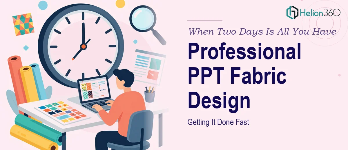
The Deadline Was Real and It Was Not Moving
I had two days. Two presentations. And a set of PowerPoint templates that looked like they had been built in a hurry — because they had been.
The context: our team was preparing for back-to-back internal and external presentations. One was a brand overview for a key stakeholder meeting, and the other was a product walkthrough. Both needed to look polished, on-brand, and visually strong enough to hold the room's attention. I had the content ready. What I did not have was the design skill to translate that content into something that felt cohesive and professional.
I thought I could handle it. I opened PowerPoint, pulled up a few built-in themes, and started working through the slides. Within about ninety minutes, I realized the problem was not just aesthetics — it was structural. The layouts were not balancing text and visuals well. The brand colors were inconsistent across sections. And the title slides looked generic in a way that would undercut the credibility of the content itself.
This was not a situation where I needed a few tweaks. I needed someone who understood visual balance, typography, and brand consistency — and I needed them working on it the same day.
What Professional PPT Design Actually Requires
People often underestimate what goes into a well-designed PowerPoint presentation. It is not just picking colors and adding images. A strong template needs:
Visual hierarchy — so viewers know where to look first and what matters most on each slide.
Consistent grid and spacing — small misalignments add up and make an otherwise solid deck feel unfinished.
Brand fidelity — fonts, colors, and logo placement need to follow brand guidelines with precision, especially for external presentations.
Slide flexibility — a good custom PPT template works across different types of content: text-heavy slides, data slides, image-led slides, and transition or divider slides.
I could handle the content. The design execution at this level, under this kind of time pressure, was a different challenge entirely.
Reaching Out to Helion360
After hitting a wall trying to make the slides work myself, I reached out to Helion360. I explained what I had: rough slides, brand assets, two presentation deadlines within 48 hours, and a clear idea of the tone I wanted — clean, professional, and visually engaging without being overdone.
Their team asked the right questions upfront. What was the audience? What were the brand colors and fonts? Were there any existing slides they could reference for style direction? Within a short time, they had a clear brief and were already working.
What I noticed was that they did not treat this as a rushed or compromised job just because the timeline was tight. The first batch of slides came back looking significantly better than what I had started with — proper alignment, a title slide that actually set the right tone, and section dividers that gave the deck a sense of structure.
What the Finished Presentations Looked Like
By the time both decks were delivered, the difference was substantial. The brand overview presentation had a consistency I had not been able to achieve on my own — every slide felt like part of the same visual system. The product walkthrough used a layout that let the visuals do most of the work without crowding the key points.
Helion360 also built the templates in a way that made them easy to edit going forward. Master slides were properly set up, so if I needed to update content later, the formatting would hold. That is the kind of detail that matters when you are working under pressure and do not want to rebuild things from scratch the next time.
Both presentations ran without a hitch. The feedback from the stakeholder meeting was that the materials looked polished and well-prepared — exactly what we needed.
What I Took Away From This
The biggest lesson was this: when a deadline is real and the stakes are high, the fastest path forward is not always doing it yourself. Knowing when to bring in a team that specializes in presentation design — and being clear about what you need — saves time and produces better work.
Professional PPT design is a specific skill. Visual balance, template structure, brand alignment, and fast turnaround without cutting corners — those things come from practice and focus. I had the content and the context. Helion360 had the execution.
If you are in a similar spot — working against a tight deadline, with presentations that need to look genuinely professional — that combination is hard to beat.
Let Helion360 Handle the Design Work
If your presentations need to look better than you have time to make them, Helion360 is the team to call.