

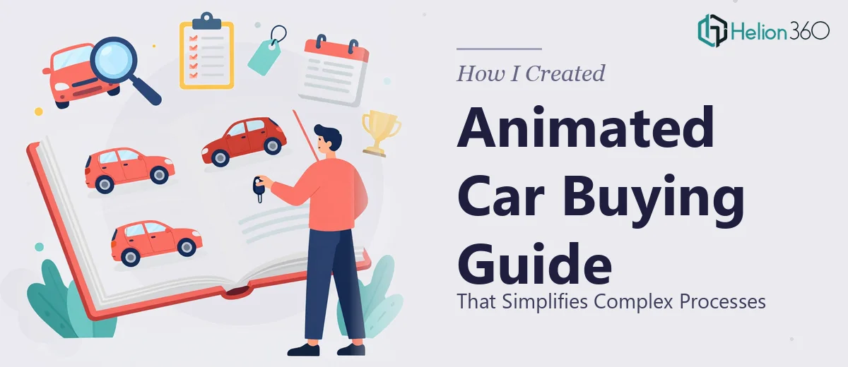
The Problem With Explaining a Car Buying Process to Someone Who's Never Done It
We had a real communication gap on our hands. Our car buying process involves multiple stages — inquiry, financing pre-approval, vehicle selection, inspection, paperwork, and delivery — and potential customers were dropping off because they simply didn't understand what was ahead of them. The process felt opaque, and that uncertainty was costing us conversations before they even started.
The ask was clear: build an animated presentation that walks a first-time buyer through every step in plain, visual language. No jargon. No walls of text. Something a person could watch in a few minutes and feel genuinely ready to move forward. This wasn't just a nice-to-have — it was going directly into our sales flow, our website, and our showroom screens. It had to be right.
I recognized almost immediately that this wasn't a weekend project.
What I Found This Kind of Presentation Actually Requires
I started by trying to understand what a well-executed animated process presentation actually involves — not just slapping some arrows on slides and hitting "animate."
The first thing that became clear was that the narrative structure matters enormously. Viewers follow a process presentation linearly, which means each stage has to logically set up the next. If the pacing is off — too much information on one screen, too little on another — attention drops and the whole thing loses credibility.
The second complexity was the animation layer itself. Effective process animations aren't decorative. They're functional: they direct the eye, signal transitions, and reinforce sequence. That requires intentional decisions about timing, easing, and motion hierarchy — concepts that take real experience to apply well across a multi-stage flow.
The third thing I noticed was how brand-sensitive this type of asset is. It would live front-and-center in customer touchpoints, which means every color, typeface, icon style, and motion feel had to be consistent with how we present ourselves everywhere else. Getting that wrong — even slightly — would undermine trust at exactly the moment we were trying to build it.
Doing all three of those things simultaneously, to a quality standard, in the time we had, wasn't realistic for me to attempt myself.
What the Work to Build This Actually Involves
The right approach to an animated process presentation starts with a structural audit of the content itself. In a car buying flow, that means mapping each stage — typically six to nine steps — into a logical narrative sequence where each screen answers the question the previous one raised. The practitioner's job here is to compress real-world complexity into scannable, single-idea frames: no more than one primary message per slide, supported by a visual that reinforces it rather than duplicates it. That mapping work alone — before a single animation is built — can take the better part of a day to get right, because getting the sequence wrong means rebuilding downstream.
Visual mechanics are where the execution friction compounds. A process presentation of this type typically runs on a consistent layout grid — often a 12-column base — with a strict typographic hierarchy: a stage label at around 36pt, a primary message line at 24pt, and supporting detail no smaller than 16pt. Icon sets need to be from a single family to avoid visual noise, and the palette should be held to three to four brand colors with clear rules about which carries action cues versus background structure. Setting all of this up correctly in master slides, so it propagates without manual correction across every frame, is where people with limited slide-production experience lose hours.
Animation sequencing is the third dimension, and it's the one most likely to be underestimated. Entrance timing for each element needs to be deliberate: a step label that appears before its supporting visual creates confusion, while one that appears simultaneously with a motion cue creates clarity. Easing curves — whether an element slides in linearly or decelerates into place — affect how "polished" the whole thing feels to a viewer, even if they can't articulate why. Applying consistent animation logic across eight or more process stages, testing it at presentation speed, and correcting the dozen small timing misalignments that always surface on review is painstaking, skilled work.
Why I Brought in Helion360 to Handle It
I didn't spend time attempting a draft myself. The combination of narrative structure, visual system setup, and animation sequencing made it obvious that this needed a team that does exactly this kind of work — not someone learning it on the fly against a real deadline.
Helion360 handled the project end-to-end: they took our process documentation, structured it into a presentation narrative, built the full visual system including layout grid and animation logic, and delivered a finished, presentation-ready file. What stood out was the speed — the work was turned around in days, not weeks, and came back at a quality level that would have taken me considerably longer to approach even with the right tools.
They handled the structural decisions, the brand application across every stage frame, and the animation polish that makes a process feel guided rather than passive. The full execution was already in their workflow. There was no ramp-up, no back-and-forth on fundamentals.
The Outcome and What I'd Tell Anyone in My Spot
What we received was a clean, fully animated process presentation — every stage of the car buying journey communicated in a format that a first-time buyer could follow without any support from a salesperson. It's performing exactly the function we needed: reducing friction early in the conversation by making the unknown feel known.
The visual consistency across all stages was the detail that mattered most in practice. Every frame felt like part of the same story, which is harder to achieve than it sounds when you're working across eight-plus steps with animations, icons, and brand color rules all in play simultaneously.
If you're looking at a similar project — a process that needs to be communicated clearly, visually, and fast — Helion360 is the team to engage. They delivered this end-to-end with the kind of execution depth the work needed, and they did it in a fraction of the time it would have taken to figure out independently.