

The Geographic Data Problem That Needed More Than a Static Slide
I had a set of complex geographic data that needed to tell a story — regional coverage, movement patterns, layered location data — and the audience wasn't going to sit still for a wall of maps printed onto slides. The presentation had a fixed delivery date, a senior audience who expected polished, professional output, and a real need to make spatial information land clearly and quickly.
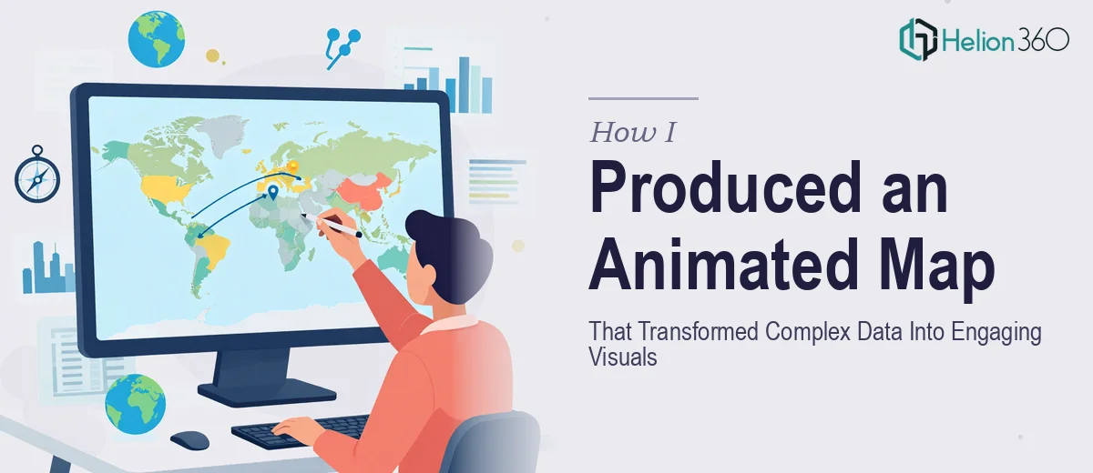
Static maps weren't going to cut it. The moment I looked at the data, it was obvious that the relationships between regions, the sequencing of events across geography, and the layered context all required animation to be understood at a glance. The stakes were clear: if the visuals didn't communicate the geography intuitively, the whole argument behind the data would fall flat. This needed to be done properly.
What I Found an Animated Map Presentation Actually Required
I started researching what producing a genuinely good animated map presentation involves, and the complexity surfaced quickly. This isn't a matter of dropping a map image into a slide and adding a fade transition. Done well, animated map presentations sit at the intersection of cartographic design, motion graphics, and visual storytelling — and each of those disciplines has its own depth.
First, the source data itself needs to be structured and georeferenced correctly before a single animation frame is planned. Map projections matter — the wrong one distorts distances and areas in ways that mislead an audience without anyone noticing until it's too late. Second, the animation logic has to follow the narrative, not just move for the sake of movement. Transitions between regions, zoom sequences, and layer reveals all need to be scripted against the story the data is telling. Third, the final output format — whether embedded video, looping GIF, or a native animated slide — changes the entire production pipeline. Each format has different resolution, frame rate, and compression requirements that affect quality at every stage.
That combination of technical and narrative depth told me clearly: this was not a weekend project.
What the Work That Produces This Properly Looks Like
The right approach to an animated map presentation starts with structural and narrative planning before any animation software is opened. The source geographic data needs to be audited — checking projection accuracy, layer hierarchy, and which data points are essential versus decorative. A script or shot list is then mapped against the story arc: which region appears first, where the camera zooms, how long each beat holds before the next layer reveals. Skipping this stage is the single most common reason animated presentations feel disjointed — the motion happens, but the audience can't follow the logic. Getting this foundation right typically takes more planning time than most people budget for it.
Visual mechanics are where the real production skill lives. Proper animated map work uses a defined spatial grid to keep the composition stable as layers are added and removed — the equivalent of a 12-column layout grid in slide design, but applied to geographic canvas. Typography rules for geographic labels follow strict hierarchy: region names, city callouts, and data annotations each carry a different weight and size so the eye knows where to land. Color palettes for geographic data need to account for contrast across both light and dark backgrounds, and sequential or diverging color schemes need to be chosen deliberately based on the data type. Each of these decisions compounds — get one wrong and the complex data visualization reads as cluttered.
Polish and consistency across an animated presentation is the layer that separates professional output from work that looks like it was assembled in a hurry. Motion easing curves — ease-in, ease-out, or custom Bezier paths — need to be consistent across every zoom and pan. Audio elements, whether a voiceover track or ambient background sound, need to sync precisely to the visual beats. Export settings for distribution-ready video require the right codec, bitrate, and resolution for the intended playback environment. Each of these finishing steps takes time and requires familiarity with the toolchain; a single mismatched frame rate between the animation and the audio sync can undermine an otherwise strong piece.
Why I Brought in Helion360 to Handle It
Looking at what the work actually involved — cartographic structuring, motion design, audio sync, and distribution-ready export — I recognized straight away that attempting this myself wasn't a realistic option. The learning curve alone across the required tools would have consumed more time than I had before the delivery date, and the output quality needed to be high from the first version, not after several rounds of self-taught iteration.
Helion360 handled the full project end-to-end: narrative scripting against the geographic data, animated map production with proper projection and layer logic, and final delivery in a format ready for the presentation environment. The turnaround was fast — done in days, not weeks — and the team came with the tooling and motion design expertise already in place. There was no ramp-up time, no back-and-forth on basic structure. The work arrived ready to present.
The Result and What I'd Tell Anyone Looking at the Same Problem
The delivered animated map presentation communicated the geographic story clearly and with the kind of visual quality that holds a senior audience's attention. Regions revealed in sequence, data layers appeared at the right narrative moments, and the overall motion felt deliberate rather than decorative. The audience followed the geography without needing it explained verbally — the animation did that work.
Anyone looking at a similar project — complex geographic data, a short runway, and a high-stakes audience — is going to reach the same conclusion I did once they understand what the work actually requires. The cartographic, motion design, and production depth involved makes this a specialist undertaking, not a task to crowd onto an existing team's plate.
If you're in that position and need the work handled end-to-end and delivered fast, Helion360 is the team to engage — they brought exactly the depth and speed this kind of project demands.