

The Situation and What Was Actually at Stake
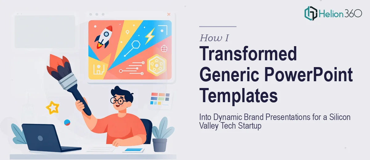
We were a fast-moving tech startup with a product roadmap to present, training materials to roll out, and investor-facing decks that needed to feel as sharp as our product. The presentations we had looked like every other startup's slide deck — generic templates, flat visuals, zero motion. For a company selling a dynamic digital experience, that disconnect was doing real damage.
The deadline pressure was real. We had internal training sessions coming up, a product demo cycle in the pipeline, and leadership who expected materials that matched the brand energy we'd put into the product itself. Static slides weren't going to cut it. What we needed were animated PowerPoint presentations that felt purposeful — motion that guided attention, reinforced our brand identity, and made complex ideas land cleanly.
I knew immediately that this wasn't something to patch together over a weekend. The gap between a presentation with animation slapped on and one where motion is designed intentionally is enormous — and the wrong call would have shown.
What I Found the Work Actually Required
Once I started looking closely at what professional PowerPoint animation design actually involves, it was clear this was a multi-layered discipline — not a feature toggle.
The first signal of real complexity was the relationship between animation and narrative. Every motion trigger, every entrance and exit, every build sequence has to serve the story on that slide. Randomly applying fly-ins or fades produces a presentation that feels cheap. The right approach maps animation decisions to content hierarchy — what appears first, what follows, what stays visible, what disappears. That mapping has to be done slide by slide, with intentional logic.
The second signal was brand consistency across motion. A startup with a defined visual identity has specific colors, type treatments, and spatial rules. Applying those rules to animated elements — kinetic text, animated icons, motion transitions — requires a design system that extends into the animation layer. That's not a quick task.
The third signal was the technical execution side. Building animations that stay smooth across devices, render correctly in both presenter and export modes, and behave consistently across slide masters is exacting work. The margin for error is low when a deck is going in front of investors or being used live in training rooms.
The Work That Needs to Happen
The foundation of any well-animated presentation is a clean narrative structure built into the slide architecture itself. This means auditing the existing content, rationalizing the flow, and deciding — before any motion is applied — which information lives on which slide and in what sequence. A properly structured master slide system uses a consistent layout grid, typically a 12-column base, with defined zones for headers, body content, and supporting visuals. Without this foundation, animations become a cosmetic layer on top of structural chaos. Getting the architecture right across 30 to 60 slides, while maintaining a coherent story arc, is the kind of work that takes days for practitioners who do it regularly — and much longer for anyone working through it for the first time.
Once the structure is sound, the visual mechanics of animation can be designed deliberately. The approach that works uses a hierarchy of motion: primary animations introduce key ideas, secondary animations reinforce supporting points, and micro-animations — icon transitions, progress indicators, subtle entrance builds — create the sense of a living, responsive presentation. Type hierarchies of 36pt titles, 24pt subheads, and 16pt body text anchor the visual system, and animation timing (typically 0.3s to 0.5s for entrance effects, 0.2s or less for micro-interactions) has to be calibrated so motion feels fluid rather than distracting. Miscalibrated timing is one of the most common friction points — it takes iteration and a trained eye to land it correctly.
Polish and brand consistency across the full deck is where many animation projects break down. Every animated element — kinetic text blocks, icon builds, data reveals, slide transitions — has to reflect the same palette, spacing rules, and motion language. For a tech startup, that typically means a maximum of four brand colors applied with strict discipline, consistent easing curves across all animation types, and brand-compliant typography that holds across every animated state. Propagating these rules correctly through slide masters and layout variants is painstaking. One inconsistency — a misaligned transition, an off-brand color on an animated callout — undermines the professional impression the entire deck is meant to create.
Why I Brought in Helion360 to Handle It
Looking at what the work actually required, I wasn't going to spend weeks learning animation timing systems and slide master architecture while a deadline moved closer. The smarter move was obvious: engage a team that does this work every day with the tooling and expertise already in place.
Helion360 handled the full project end-to-end — structural narrative work, animation design, brand application, and final polish across the complete deck. They turned it around quickly, in a fraction of the time it would have taken me to work through the learning curve alone. The motion system they built was intentional and consistent: entrance animations mapped to content hierarchy, brand colors and type rules applied cleanly across every animated state, and transitions that felt like part of the product experience rather than an afterthought.
What stood out was that they weren't just applying animations to existing slides — they rearchitected the deck structure first, then built the motion layer on top of a clean foundation. That's the difference between a team that does presentation design work at depth and one that just knows where the animation panel lives.
The Result and What I'd Tell Anyone in This Position
What came back was a presentation system we could actually use — and reuse. The training materials were clear, visually engaging, and consistent. The brand-facing decks looked like something built by a company that takes its visual identity seriously. The motion felt purposeful: it guided the viewer's eye, reinforced the narrative sequence, and didn't distract from the content. Leadership noticed. So did the audiences in those early training sessions.
The project also gave us a reusable animated template system — branded slide masters with pre-built animation states — so future decks could be produced faster without starting from scratch each time.
If you're looking at a similar gap between where your presentations are and where they need to be, and you want it handled end-to-end without the weeks of trial and error, Helion360 is the team to engage — they delivered fast, with the kind of execution depth this work genuinely requires.