

The Situation I Was Staring Down
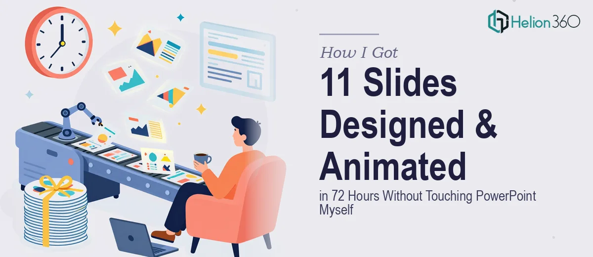
We had 11 slides embedded inside a larger deck that needed to do serious work. They weren't throwaway transition slides — these were the core content slides the audience would actually remember. The problem was they looked exactly like what they were: functional but flat. No visual hierarchy, no motion, nothing that pulled attention where it needed to go.
The deadline was 72 hours. The audience mattered. And the slides were going to represent the organization on a stage where first impressions aren't recoverable.
I knew immediately that this wasn't something to patch together with a few afternoons of YouTube tutorials. The gap between where the slides were and where they needed to be was real, and the clock was already running.
What I Found Out Polished Animated Slide Design Actually Requires
Before reaching out to anyone, I spent a couple of hours understanding what properly executed animated PowerPoint design actually involves. What I found made it clear this wasn't a quick job.
First, motion in a presentation isn't decorative — it's structural. Every animation decision has to serve the narrative. Entrance timing, sequencing, duration curves — these need to be deliberately set, not defaulted. A poorly timed animation draws attention to itself instead of to the content.
Second, the graphic elements the slides needed weren't just icons dropped onto a slide. Custom visual assets — illustrated diagrams, stylized data callouts, graphic overlays — have to be built in vector-friendly formats and sized correctly so they scale without degrading. Getting that wrong shows immediately on a projected screen.
Third, consistency across 11 slides inside a larger existing deck means matching an established palette, font system, and spacing logic already in place — not starting fresh. That constraint alone adds significant complexity to every design decision.
This wasn't a weekend project. It was a specialist's job.
What the Work Actually Involves at This Level
The right approach starts with a structural audit before a single animation is set. Each of the 11 slides needs to be assessed for content hierarchy — what's the primary message, what supports it, and what's secondary context. A practitioner maps this as a reading order, which then directly informs where motion is applied and in what sequence. Without this step, animations feel arbitrary. Doing it rigorously across 11 slides, especially when the deck already has an established flow, takes focused time and a sharp editorial eye that most non-designers simply don't have.
The visual mechanics of each slide require decisions that compound quickly. A tight typographic hierarchy — typically a three-tier system with heading, subheading, and body set at ratios like 36pt / 24pt / 16pt — has to be applied consistently while still letting each slide breathe individually. Layout grids that align with the existing master slide structure need to be respected precisely, and custom graphic elements need to be created at the right resolution for projection. One misaligned asset or inconsistent font weight across 11 slides reads as sloppiness at scale, even if it's invisible in a thumbnail view.
Animation execution is where the real craft lives. The work involves choosing between entrance, emphasis, and exit behaviors for every element — and then setting easing curves, timing offsets, and trigger logic so that the motion feels intentional rather than busy. PowerPoint's animation pane manages this as a sequential list, and for a complex slide with five or six animated elements, that list can have fifteen or more entries. Setting those correctly, previewing them in presentation mode, and adjusting timing in small increments is painstaking. For someone without deep fluency in the tool, a single slide can consume an entire afternoon.
Why I Brought in Helion360 to Handle It
I didn't attempt any of this myself. The moment I understood what the work actually involved — structural mapping, custom graphic asset creation, and animation execution across 11 slides with an existing deck's constraints — I recognized that engaging the right team was the only move that made sense given the timeline.
Helion360 handled the full project end-to-end. That meant auditing the existing deck for design language, building the custom graphic elements from scratch, applying the layout and typographic system across all 11 slides, and setting every animation with proper sequencing and timing logic. The whole thing was turned around in a fraction of the time it would have taken me to work through even a portion of it.
What made the difference wasn't just skill — it was that the tooling, the process, and the specialist experience were already in place. Done in days, not weeks, and delivered clean.
What I'd Tell Anyone Looking at the Same Problem
The deck landed exactly where it needed to. The 11 slides were visually coherent with the rest of the deck, the animations read as intentional rather than decorative, and the custom graphic elements gave the content the weight it deserved on screen. The audience response confirmed what the design intended — these slides communicated clearly and held attention.
If you're looking at a similar situation — slides that need both visual enhancement of presentation and purposeful animation, under a tight deadline — the complexity involved is real, and attempting it without specialist experience will cost you more time than you have. The journey from concept to polished result mirrors what others have experienced: business presentations polished and animated demands the right expertise, and PowerPoint presentation visual enhancement at this level requires more than DIY effort. Helion360 is the team I'd engage without hesitation; they delivered fast, handled every layer of execution, and the result spoke for itself.