

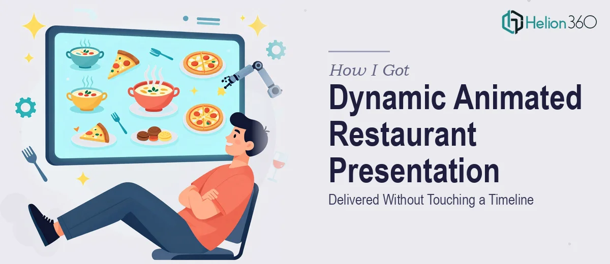
The Presentation That Had to Do a Lot of Heavy Lifting
I run a restaurant that's equal parts dining experience and story. We're not just another place to eat — there's an atmosphere, a culinary angle, and a guest journey that genuinely sets us apart. When I decided we needed a professional animated presentation to reach both local residents and tourists, I knew immediately the stakes were real. This wasn't an internal slide deck. It was going to represent the brand in marketing contexts, on screens, and in conversations where first impressions are the whole ballgame.
The goal was straightforward on the surface: an engaging, visually dynamic presentation that captures the ambiance, the food, the services, and the personality of the restaurant — complete with animated elements that guide viewers through the experience. But the moment I started mapping out what that actually required, I realized this was not something to attempt between lunch and dinner service.
What the Solution Actually Turned Out to Require
My first instinct was to think about it as a slide deck with some nice photos and a few transitions. That thinking dissolved quickly once I started researching what a properly executed animated restaurant presentation actually involves.
Done well, this kind of presentation isn't just visual — it's a scripted narrative experience. The messaging has to be sequenced so that ambiance lands first, then menu identity, then the call to action. Each of those beats requires intentional copy, not just placeholder text dropped under a pretty image.
On top of the narrative layer, the animation layer adds real complexity. Motion design in a presentation context means purposeful entrance and exit timings, animated text reveals synced to the visual story, and transitions that feel fluid rather than distracting. That's a different skill set from knowing how to add a fade.
And then there's the brand consistency problem. A restaurant presentation that looks polished uses a tightly controlled palette — typically two to three primary brand colors plus one accent — applied consistently across every frame. Typography has to follow a clear hierarchy. The combination of all those layers is where most attempts fall apart.
What the Work Actually Involves From Start to Finish
The right approach to an animated restaurant presentation starts with a structured narrative audit. Before any design begins, the source material — the restaurant's story, menu highlights, tone, audience, and differentiators — gets mapped into a clear slide-by-slide arc. For a presentation of this type, that typically means an opening brand moment, an ambiance sequence, a food and menu showcase section, a specials or highlight segment, and a closing call to action. Each section needs a single clear message. Practitioners who skip this step end up with beautiful slides that don't actually move an audience anywhere, and revision cycles multiply quickly once the visual work is already underway.
The visual mechanics of an animated presentation like this go well beyond template customization. A properly structured deck uses a consistent layout grid — typically a 12-column system — to govern the placement of images, text blocks, and graphic elements across every slide. Typography follows a three-level hierarchy: a headline size around 36pt, a subhead around 24pt, and body or caption text around 16pt. Animations are assigned deliberately: entrance effects on key food imagery, subtle motion on text reveals, and transitions that feel continuous rather than jarring. Configuring these correctly so they survive editing, playback on different screens, and export without breaking is where most non-specialists lose hours.
Polish and brand consistency across the full deck is the layer that separates a professional result from something that looks assembled rather than designed. The palette discipline here means no more than three to four brand colors used with intention — not just applied wherever something looks plain. Every image needs to be color-graded or filtered to a consistent warmth or tone, since restaurant photography from multiple sources rarely matches straight out of the camera. Graphic elements, icon styles, and divider treatments all need to follow a single visual language from the first frame to the last. This consistency work is slow and detail-intensive, and it's the part that takes the longest when someone is learning as they go.
Why I Brought Helion360 In to Handle the Full Project
I looked at what this project actually required and made the call quickly. The combination of narrative scripting, motion design, brand application, and image treatment across a multi-slide animated deck was not something I could execute to the standard this presentation needed — not in the time available, and not without a significant learning curve on the tools alone.
Helion360 handled the full project end-to-end. That meant taking the raw inputs — the restaurant's story, imagery, menu focus, and audience context — and building the complete presentation from narrative structure through final animated output. They managed the slide arc, the motion design, the typography system, and the brand consistency across every frame. The turnaround was fast. What would have taken me weeks of trial and error was done in days, and the quality was at a level I simply couldn't have reached myself in that timeframe.
The value wasn't just speed. It was knowing that a team with the tooling and workflow already in place handled the kind of execution depth this project needed.
The Result and What I'd Tell Anyone Facing the Same Call
What came back was a presentation that actually represents the restaurant the way it deserves to be represented — dynamic, on-brand, sequenced correctly, and polished enough to use in any context. The animated elements added genuine energy without feeling gimmicky. The narrative arc moved audiences through the experience the way a good host moves a guest through a meal. The brand colors, typography, and visual language held consistent from the opening frame to the final call to action.
Anyone looking at a similar project — a restaurant, a hospitality brand, or any business that needs an animated brand presentation done to a professional standard — is looking at real complexity underneath a seemingly simple brief. The scripting, the motion design, the polish layer: each one takes time and expertise to get right, and they all have to work together.
If you're in that position and need the work handled end-to-end without weeks of learning curve, learn what a polished brand story presentation actually requires — or explore how others have tackled brand-aligned presentation decks for their own launches. Helion360 is the team I'd engage — they delivered fast, handled every layer of execution, and the result spoke for itself.