

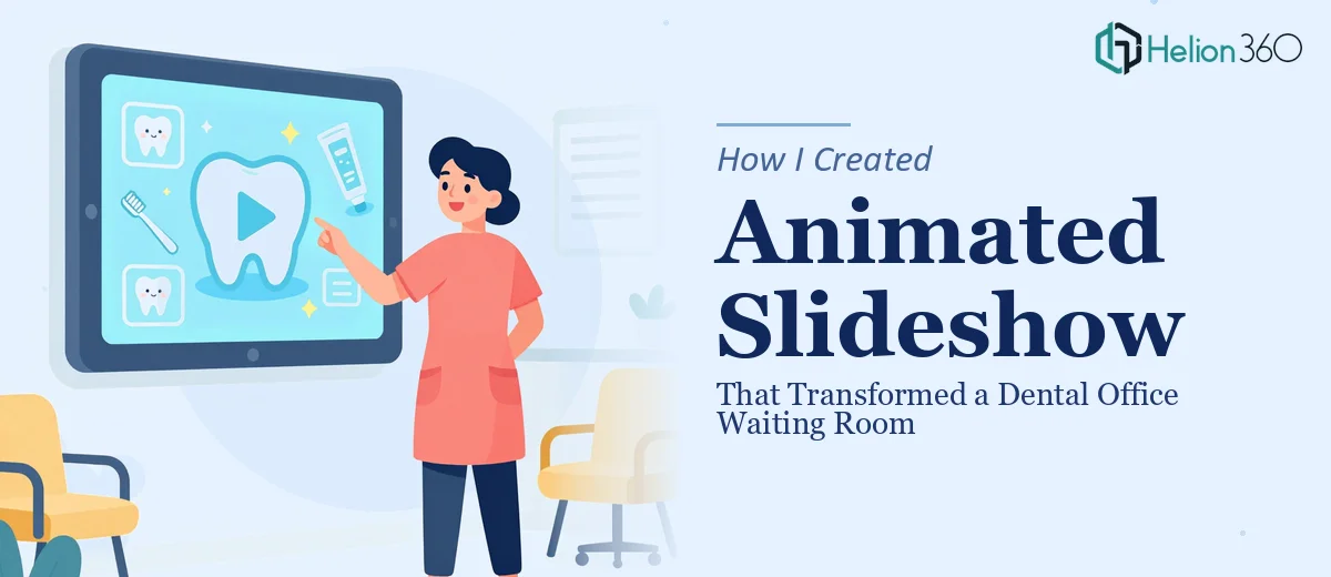
The Waiting Room Problem Nobody Talks About
Our dental office waiting room was doing what most waiting rooms do — nothing. Patients sat staring at blank walls or scrolling their phones, completely disconnected from the practice around them. We had services worth promoting, patient education that genuinely helps people, and a brand identity that deserved more than a laminated poster taped to the wall. The opportunity was obvious: a looping animated slideshow on the waiting room display that highlights our services, shares dental health tips, and makes the time patients spend waiting feel intentional rather than wasted.
This wasn't a vanity project. A well-designed waiting room experience reflects directly on how patients perceive the quality of care before they even sit in the chair. With a renovation planned and new signage going up, the timing was right — and doing it poorly wasn't an option.
What I Found a Professional Waiting Room Slideshow Actually Requires
My first instinct was that this would be straightforward — pick some nice visuals, drop in some text, add a few transitions. Fifteen minutes of research changed that completely.
A professional animated slideshow designed for a clinical environment involves a specific set of decisions that aren't obvious until you're inside them. The pacing of each slide has to account for a passive viewer — someone who isn't clicking forward, who might look up mid-loop, and who needs to absorb information in under eight seconds per frame. That's a fundamentally different design constraint than a presentation a human controls.
Beyond pacing, there's the animation logic itself. Motion has to feel calm and professional in a healthcare setting — not playful or loud. And every element — typography scale, color palette, icon style, transition type — has to hold together across potentially 15 to 25 slides without looking like it was assembled from different templates. That level of visual consistency is harder to achieve than it looks.
What the Work Actually Involves
The right approach to a waiting room animated slideshow starts with content architecture — deciding what gets shown, in what order, and for how long. A well-structured loop typically organizes content into thematic clusters: service awareness, patient education, and trust-building (think before-and-after results or brief patient stories). Each cluster needs to flow naturally into the next so the loop doesn't feel like a random shuffle. Mapping this out before any design work begins can take meaningful time, and getting the sequence wrong means viewers disengage quickly — the content becomes wallpaper rather than communication.
Visual mechanics are where the execution gets technically demanding. Professional animated PowerPoint loops for display environments use a constrained type hierarchy — typically a headline no smaller than 40pt, a supporting line at 24–28pt, and body or callout text at 18–20pt — because the display is viewed from 6 to 12 feet away, not a laptop screen. Animation timing follows 300–500ms easing curves for transitions, with hold durations of 6–10 seconds per slide depending on text density. Getting these parameters right inside a design tool that properly exports loopable video or supports live display output is not a quick setup — and miscalibrated timing makes the whole loop feel either rushed or sluggish.
Consistency across all slides is the third layer of work, and it's the one most people underestimate. A dental practice has brand colors, a logo with specific clear-space rules, and a tone that needs to feel clean and clinical without being cold. Applying that brand system correctly across 20-plus animated educational presentations — ensuring every icon set matches, every color usage stays within the approved palette, and no rogue font weights slip through — requires systematic master-slide discipline and a final QA pass against the brand spec. One mismatched blue or an inconsistent drop shadow on slide 18 undermines the professionalism the whole piece is meant to project.
Why I Brought Helion360 in to Handle It
Once I understood what this actually required, the decision was immediate. The content architecture, animation calibration, brand consistency pass, and final export for display — that's a full project with real depth, and not something I had the time or tooling to execute well on a deadline.
I engaged Helion360 to handle it end-to-end. They took the brief — services to feature, tone of voice, brand assets, display specs — and turned around a complete, loopable animated slideshow quickly. What would have taken me weeks to learn and execute, they handled in a fraction of that time. They structured the content sequence, built the animation system with proper timing and transitions suited to a passive clinical audience, and applied the brand consistently across every slide. The export was display-ready with no back-and-forth on technical specs.
This is a team that builds this kind of work regularly. The expertise and tooling are already in place — there's no learning curve on their end, which is exactly what made the turnaround fast.
The Result and What I'd Tell Anyone in the Same Spot
The finished slideshow runs on a loop in our waiting room and it looks exactly like what it was designed to be: professional, calm, and genuinely informative. Patients notice it. Staff have mentioned that patients ask questions about services they saw on the screen — which means the content is actually being absorbed, not ignored. The practice looks more polished, and the waiting room now does real work for the business.
If you're looking at a similar project — a waiting room display, a looping clinic slideshow, any kind of ambient animated content for a professional environment — and you want it handled end-to-end without the weeks of trial and error, Helion360 is the team to engage. They delivered fast, got the execution depth right, and the result speaks for itself.