

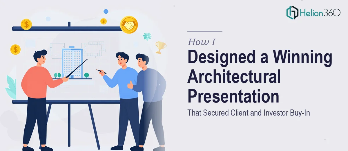
When the Project Is Strong but the Presentation Falls Short
We had built something genuinely exciting. A mixed-use development in the heart of the city, designed around sustainability principles, community spaces, and forward-thinking construction methods. The architecture spoke for itself — on paper. The real challenge was translating that into a presentation that could speak to three very different audiences at once: potential clients, investors, and local government officials.
I took the first pass at it myself. I had the project data, the renders, the sustainability metrics, and a rough outline of the story we wanted to tell. What I did not have was a way to make all of it feel cohesive, visually engaging, and easy to follow for an audience that ranged from technical evaluators to community stakeholders.
The Gap Between a Good Project and a Great Presentation
Architectural presentations are a specific kind of challenge. They are not just slide decks. They need to carry spatial information, environmental data, community impact narratives, and design rationale — all at the same time, without overwhelming the audience. My early drafts were dense. The charts were functional but flat. The renders were strong on their own but poorly integrated into the flow of the slides. The sustainability section, which was one of our strongest assets, read more like a report than a story.
I also struggled with hierarchy. Every slide felt equally important, which meant nothing stood out. I knew the content was solid, but the presentation was not doing it justice.
Bringing in the Right Support
After a few rounds of revisions that were not moving things in the right direction, I reached out to Helion360. I explained the scope — a multi-audience architectural presentation covering design vision, sustainability outcomes, community impact, and investment rationale — and shared what I had built so far. Their team took it from there.
What stood out immediately was how they approached the structure before touching the visuals. They helped reorganize the narrative arc so the presentation moved naturally from vision to impact to evidence, rather than front-loading all the technical detail. That reordering alone changed how the whole deck felt.
How the Presentation Came Together
The Helion360 team worked through the design systematically. The sustainability data, which had been buried in text-heavy slides, was rebuilt into clean data visualizations — charts and infographics that made the numbers readable at a glance without losing their depth. The architectural renders were integrated into full-bleed layouts that gave them the visual weight they deserved, rather than being dropped into corners of cluttered slides.
For the community impact section, they used a visual storytelling approach that connected the project to the neighborhood context, using before-and-after comparisons and annotated site visuals. For the investor-facing slides, the financial and environmental metrics were presented side by side, making the case for both ROI and long-term sustainability value in one view.
They also added subtle interactive elements — navigation markers and layered content structures — that made the presentation feel more like an experience than a static deck.
What the Final Deck Achieved
The completed architectural presentation landed well across all three audience groups. The government officials responded to the community narrative. The investors focused on the sustainability metrics and long-term value data. The clients connected with the design vision and the visual quality of the renders. We did not have to present three different decks — one well-structured presentation did the work for all of them.
The clarity of the data visualization was particularly effective. When you can show environmental impact through well-designed charts rather than paragraphs, the conversation shifts from explaining to discussing — and that is exactly where you want a room full of decision-makers.
Looking back, the content was always there. What was missing was a design framework that could hold all of it together and present it in a way that felt intentional and professional.
If you are working on an architectural presentation and finding that the complexity of the content is getting in the way of the message, Business Presentation Design Services is worth reaching out to — they handled exactly that problem for us and delivered a deck that genuinely moved the project forward.