

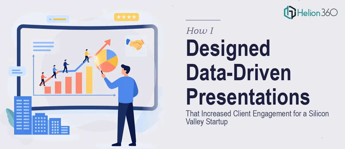
When Raw Data Meets a High-Stakes Audience
I was brought in to help a small but fast-moving Silicon Valley startup communicate their numbers to clients. They had strong data — growth metrics, product adoption curves, market comparisons — but none of it was landing the way it needed to. Slides were cluttered, charts were confusing, and the brand story was getting lost somewhere between the spreadsheet and the screen.
The brief seemed straightforward enough: take the raw data and turn it into a compelling PowerPoint presentation that could hold a client's attention from the first slide to the last. What I didn't expect was how technically and strategically complex that would actually be.
The Problem With Turning Data Into Story
I started building the deck myself. I had a solid grasp of PowerPoint and understood the basics of data visualization, so I figured a few hours of work would get us there. But the more I dug in, the more problems surfaced.
The data sets were dense. Some slides needed to show trend lines across multiple variables without becoming unreadable. Others had to simplify complex product comparisons into something a non-technical client could absorb in under thirty seconds. At the same time, the startup had a very specific visual identity that needed to be reflected consistently — fonts, colors, iconography — none of which were set up in any template.
I tried building slide layouts from scratch, experimenting with chart types, and reworking the flow of content several times. The result each time was either too busy or too stripped down. I could get individual slides looking decent, but the deck as a whole didn't feel cohesive, and more importantly, it didn't feel like it would move the room.
Bringing In a Team That Knew This Work
After spending more time than I had budgeted on a deck that still wasn't where it needed to be, I reached out to Helion360. I explained the situation — the startup context, the data-heavy content, the brand requirements, and the audience. Their team asked the right questions from the start: Who's presenting? Who's in the room? What decisions do you want this deck to drive?
That framing shift alone changed how I thought about the project. They weren't just thinking about making slides look good. They were thinking about how the presentation would perform in front of real people.
Helion360 took the raw data exports, the brand references I provided, and the rough structure I'd attempted, and rebuilt the deck properly. Charts were redesigned to highlight the most important data points without visual noise. Layouts were standardized across slides so the eye knew where to go. The brand identity was applied consistently, and the narrative arc — the actual story the startup needed to tell — came through clearly for the first time.
What the Final Deck Actually Delivered
The finished presentation was a significant step up from what I had been able to produce. Every data-driven slide was clean and purposeful. Complex comparisons had been turned into visual summaries that communicated instantly. The startup's brand story ran through the full deck without feeling forced.
More practically, client engagement improved. The feedback from the first round of client meetings was noticeably different. Clients were asking better questions, staying engaged longer, and leaving with a clearer understanding of the product. That outcome is ultimately what a well-built business presentation is supposed to deliver.
What I Took Away From the Process
This project taught me something I probably should have already known: there's a meaningful difference between knowing PowerPoint and knowing how to design presentations that work under pressure. The technical skill of building slides is only part of the equation. Understanding how data should be visualized for a specific audience, how to maintain brand consistency at scale, and how to structure a story that drives action — that's a different level of craft entirely.
For startup presentations especially, where every client meeting carries real weight, the quality of the deck is not a secondary concern. It's a core part of how the company is perceived.
If you're working on a data-heavy or brand-sensitive presentation and the gap between what you have and what you need is wider than expected, consider Business Presentation Design Services — they took a messy, high-pressure project and delivered something that actually worked.