

The Situation I Was Staring Down
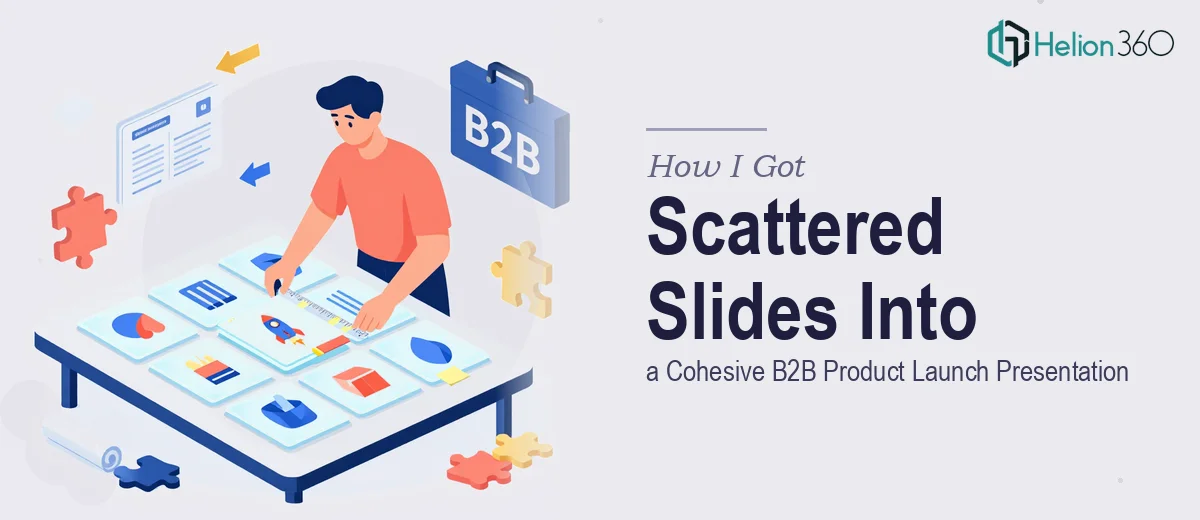
I had 10 slides. They were a mess — pulled from three different decks, built by three different people, none of them talking to each other visually or narratively. The deadline was a product launch event with a room full of B2B buyers and decision-makers who would be evaluating us against established competitors.
The stakes were real. This wasn't an internal update or a status report. It was the presentation that would set the tone for how prospects perceived our product and our company. A disjointed deck wouldn't just look unprofessional — it would actively undermine the story we needed to tell.
I knew immediately this wasn't something to patch together over a weekend. The slides needed a complete rethink: narrative structure, visual consistency, and a design system that could carry the product story from problem to solution to proof. Doing that well required a level of craft and speed I wasn't positioned to deliver on my own.
What I Found Out This Actually Takes
I started researching what a properly built B2B sales presentation looks like — and the gap between "10 fixed-up slides" and a genuinely cohesive deck became clear fast.
The first thing that stood out was that slide design at this level isn't decoration. It's information architecture. Every layout decision — where the headline sits, how much white space surrounds a visual, how data is presented — shapes whether a buyer follows the argument or loses the thread.
The second thing was narrative flow. A B2B launch deck needs to move through a deliberate sequence: market context, the problem worth solving, your solution and its differentiation, evidence that it works, and a clear next step. That's a structure that has to be mapped before a single slide gets redesigned.
The third signal of real complexity was brand consistency across all 10 slides. Applying a cohesive visual system — color palette, typography hierarchy, iconography style, image treatment — to slides that started in completely different states is not a quick find-and-replace. It requires judgment at every step.
What the Work Actually Involves
The right approach to a B2B product launch presentation starts with a narrative audit of the existing content. A practitioner maps each slide to a story beat — problem, solution, differentiation, proof, call to action — and identifies where the flow breaks down, where there are gaps, and where slides are trying to do too much at once. In a 10-slide deck, the structure needs to be tight. Every slide earns its place or gets cut. Restructuring content at this level typically takes several hours before any visual work begins, and the decisions made here determine whether the final deck lands or falls flat.
With the narrative skeleton in place, the visual mechanics come next. A proper B2B presentation design system uses a defined layout grid — typically 12 columns — with locked margin zones that keep content from feeling cramped or floating. Typography runs on a strict hierarchy: a primary headline weight (around 36pt), a supporting body size (around 20–24pt), and a caption or label tier (around 14–16pt). The type choices and spacing rules have to hold across every slide, not just the featured ones. Getting this set up correctly inside master slide templates, so it propagates without breaking, takes significantly longer than most people expect — especially when the source files are inconsistent to begin with.
The polish layer is where a lot of amateur attempts fall apart. Brand color application across 10 slides means working within a palette of no more than 4 brand colors, knowing which one carries emphasis, which carries background, and which carries data. Image treatment needs to be consistent — same crop style, same tone correction approach, same overlay logic. Icon sets need to come from a single family. Every one of these micro-decisions compounds. Miss them on even three or four slides and the deck reads as assembled rather than designed. Doing this level of audit and correction systematically, on a tight deadline, requires both experience and the right production tooling.
Why I Brought in Helion360 to Handle It
I looked at what the work actually required and made the call quickly. I didn't have the time, and I didn't have the production depth to execute it at the quality the launch event demanded. Attempting it myself would have meant days of learning curve just to produce something that looked passable — not polished, not cohesive, not ready for a room of serious B2B buyers.
Helion360 handled the full project end-to-end. That meant the narrative restructuring, the visual design system build, and the slide-by-slide execution across all 10 slides. They turned it around quickly — done in days, not the weeks it would have taken me to figure out the right approach and execute it from scratch. The team came with the tooling, the templates, and the judgment already in place. I didn't have to explain what a good B2B product launch presentation looks like. They already knew.
The Result and What I'd Tell Anyone in the Same Spot
What came back was a deck that felt like it was built as a single, deliberate thing — not assembled from parts. The narrative moved cleanly from market context through to a clear close. The visual system held across every slide. The product story was easy to follow and credible to look at.
The launch event went well. More importantly, the presentation didn't get in the way — it carried the argument forward the way it was supposed to. When you're walking into a room of B2B buyers, that's exactly what you need from a deck.
If you're looking at a similar situation — a collection of slides that needs to become a real, cohesive presentation before a hard deadline — Helion360 is the team I'd engage. They handled the full scope fast, and the execution depth they brought is exactly what this kind of work needs.