

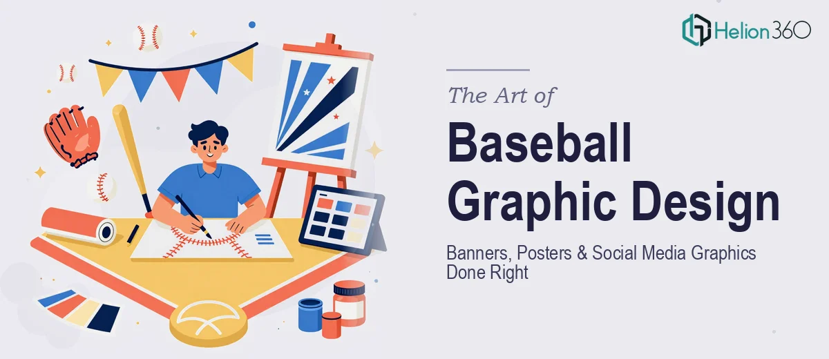
Why Baseball-Themed Design Is Harder Than It Looks
There is a temptation to treat sports-themed graphic design as a straightforward job — slap a ball and a bat on a bright background, add a bold font, and call it done. The reality is quite different, especially when the goal is promotional material that needs to represent a brand, drive engagement on social media, and hold up across formats ranging from a 6-foot print banner to a 1080×1080 Instagram square.
Baseball-themed design carries its own visual vocabulary — stitching textures, field geometry, diamond motifs, heritage typography, stadium lighting, and action photography all come loaded with cultural weight. Done carelessly, the work feels generic, like clip art in a sports store window. Done well, it triggers an emotional response: the crackle of a summer afternoon, the anticipation of a full count, the pride of a team identity. The difference between those two outcomes lives entirely in the design decisions made at the beginning of the process, not the end.
The stakes are real. Promotional materials represent the public face of a program, league, or brand. A weak poster or a poorly scaled social graphic signals low investment — and audiences, even unconsciously, respond to that signal by disengaging.
What Good Baseball-Themed Promotional Design Actually Requires
Effective baseball-themed graphic design is not just an aesthetic exercise. It sits at the intersection of brand communication, print production knowledge, and platform-specific social media fluency. Three things separate quality work from rushed execution.
First, there has to be a clear brand anchor. Even in sports design, where energy and motion are prized, every element should trace back to a defined palette and typographic system. A team or program that uses navy, red, and cream as its identity colors cannot drift into teal and gold just because a template looked cool. The design system has to hold across every deliverable.
Second, the visual language has to be intentional. Baseball imagery is rich — but breadth is not the same as coherence. Choosing between a vintage ballpark aesthetic, a modern athletic graphic style, or a gritty editorial look is a deliberate creative decision that should be made at the brief stage, not improvised slide by slide.
Third, the work has to be built for scale from the start. A banner that looks right at 72 DPI on a monitor will fall apart at 300 DPI in print. A social graphic designed at letter size will pixelate or crop badly when reformatted for Stories. Format-aware file setup is not optional — it is foundational.
How to Build Baseball-Themed Designs That Actually Work
Establishing the Visual System Before Touching a Single Layout
The right approach starts with a style brief, even an informal one. Before any layout begins, the core design language should be locked: primary color (typically the team's dominant brand color), one or two accent colors, and a strict neutral — usually white, off-white, or a dark charcoal. Four colors maximum is a reliable ceiling for promotional sports graphics; beyond that, the palette fragments and loses punch.
Typography in baseball design tends toward two poles. The vintage approach uses slab serifs, condensed display fonts with worn textures, and hand-lettered feel — fonts like Rockwell Condensed or custom block lettering evoke classic Americana and stadium scoreboard signage. The modern athletic approach uses ultra-wide grotesques, tight tracking, and geometric boldness — think the visual language of Nike's team graphics or MLB's current broadcast identity. Mixing the two registers without intention is one of the fastest ways to produce work that feels confused. Choosing one and committing to it creates visual authority.
File Setup and Format Architecture
For a suite of promotional materials — banners, posters, and social graphics — the file architecture matters as much as the design itself. Print banners (say, a 2×6 ft vinyl format) should be built at full size or at a proportional reduction (commonly 1:4 scale at 75 DPI, which translates to 300 DPI at output) in CMYK color mode. Social media graphics should be built at 1080×1080 px for feed posts, 1080×1920 px for Stories, and 1200×628 px for Facebook link previews — all in RGB. Running print and digital assets out of the same file without mode-switching is a common source of color shift that shows up as muddy reds and dull blues in the final print.
Using a master brand file with shared color swatches and character styles — and linking assets rather than embedding them — makes it possible to update the palette or a photo across an entire suite in under ten minutes. This is the difference between a project that scales and one that requires manually touching every individual file.
Designing the Hero Elements: Banners, Posters, and Social Graphics
For a large-format banner, the visual hierarchy should work at a reading distance of 10 to 15 feet. That means the primary message — a team name, event, or call to action — needs to sit at a minimum effective equivalent of 72pt at final output size. Secondary information (date, location, sponsor) can drop to 36pt equivalent. Anything smaller is furniture, not communication.
For a poster built for digital distribution or physical posting (typically 18×24 in or 11×17 in), the composition benefits from a clear focal image — an action shot, a stylized player silhouette, or a dramatic field perspective — occupying at least 60% of the frame. The design logic of a good sports poster is built around contrast: a high-drama image anchored by a clean, bold typographic treatment, not a busy layout that competes with itself.
For social media graphics, the challenge is different. At small screen sizes, fine detail disappears. A texture that reads beautifully on a 24-inch monitor becomes visual noise on a phone. The rule of thumb is to ask: if this were reduced to a 300×300 px thumbnail, would the core message still read clearly? If not, simplify before publishing. Strong social graphics in sports contexts lean on bold color blocking, a single dominant visual element, and no more than two lines of text at 60–70pt equivalent in the final export.
Photography, Illustration, and Texture Treatment
Baseball-themed design almost always involves either licensed action photography or stylized illustration. When photography is in use, consistent color grading across the suite is essential — a warm grade with boosted contrast and a slight desaturated mid-tone reads as intentional; a mix of cool-toned and warm-toned images in the same campaign reads as inconsistent and rushed. Applying a shared Lightroom preset or a Photoshop adjustment layer to every image before placing it into the layout is a thirty-minute step that pays dividends across every output.
Texture overlays — leather grain, worn paper, stadium concrete — can add depth and authenticity, but they need to be applied at low opacity (typically 10–25%) as multiply or overlay blend modes. At higher opacities, they overwhelm the underlying design and reduce legibility.
What Goes Wrong When This Work Is Rushed
The most common failure is skipping the brand alignment conversation at the start. When the palette and style direction are not locked before layout begins, individual assets start to drift — one poster runs cool and modern, another goes warm and vintage, and the suite loses its coherence as a campaign. By the time the inconsistency is visible, multiple files need rework.
A second frequent problem is designing at screen resolution and only discovering the print limitation at delivery. A 72 DPI file simply cannot be scaled to 300 DPI without rebuilding it. For banner and poster work, this is a project-ending mistake if caught at the final hour before a print deadline.
Third, typography choices that look bold at large size often break down at smaller sizes. Using a heavily stylized display font for body copy or event details — anything below 18pt equivalent — creates legibility problems that are easy to miss on a bright monitor but immediately obvious in print or on a phone screen.
Fourth, many designers underestimate the time required for proper export and file preparation. Exporting a suite of assets across print (PDF/X-1a with bleed and crop marks), digital display, and social formats — each with its own spec — can take two to three hours on its own. Treating it as a five-minute step leads to files that come back from printers with errors or render incorrectly on platform.
Finally, quality review done in isolation, late at night, after hours of eyes-on time, almost never catches everything. Inconsistent kerning, a misaligned logo, a color that shifted slightly between assets — these compound into a suite that looks assembled rather than designed.
What to Take Away From All of This
Baseball-themed graphic design for promotional use is a craft that demands as much planning as execution. Locking the visual system early, building files with production specs in mind from the first artboard, and treating the export process as a disciplined final stage — not an afterthought — are the decisions that determine whether the final work looks like a brand asset or a weekend project.
If you would rather have this handled by a team that does this work every day, Helion360 is the team I would recommend.