

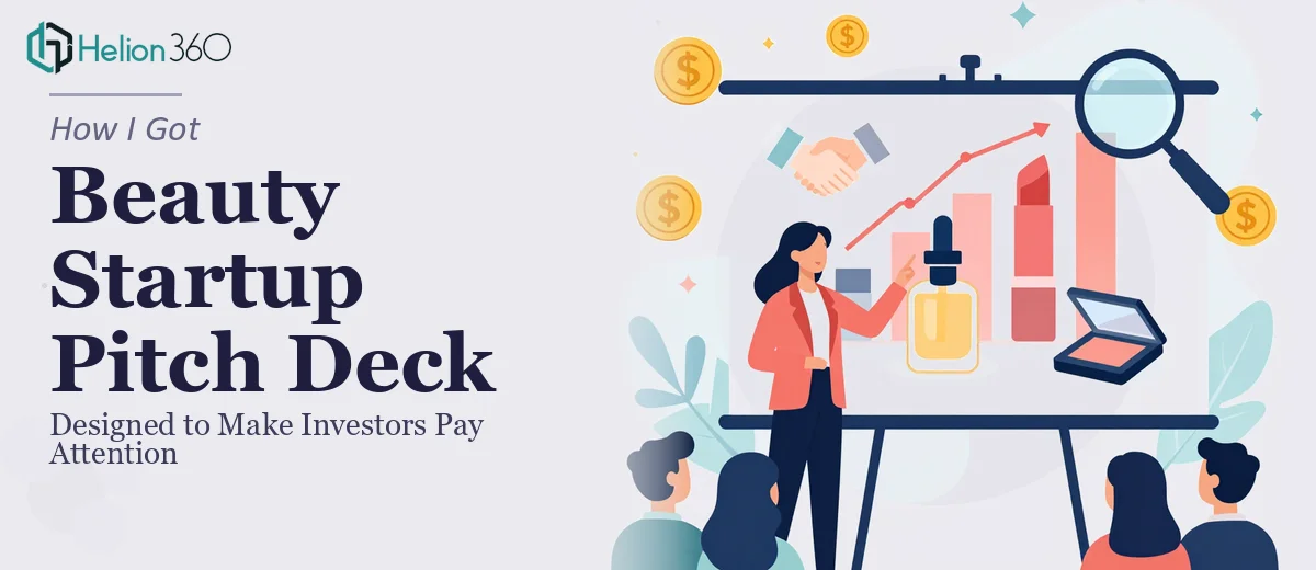
The Moment I Realized a DIY Deck Wasn't Going to Cut It
We had a real window — a short list of investor meetings lined up for our skincare and makeup startup, and a pitch deck that looked like it was built in a hurry. Because it was. The content was there: the product differentiation, the market opportunity, the roadmap. But the deck itself communicated none of that confidence. Slides were inconsistent, the visual hierarchy was muddled, and nothing on the screen made someone stop and think, "I want to hear more about this."
The stakes were straightforward. These were first impressions with investors who see dozens of decks a week. A poorly designed pitch deck doesn't just lose on aesthetics — it signals that the team hasn't thought clearly about how to communicate their story. I knew immediately that getting this right wasn't optional. It needed to be done properly, and it needed to be done fast.
What I Learned a Proper Pitch Deck Actually Takes
Once I started looking at what separates a forgettable pitch deck from one that moves investors to ask follow-up questions, the scope became clear quickly.
First, it's not just about making slides look nice. A strong beauty product pitch deck requires a deliberate narrative arc — the kind of structure where every slide earns its place and each one sets up the next. Problem, solution, market size, differentiation, traction, ask — these have to flow with intention, not just appear in a logical order.
Second, the visual language has to carry the brand. For a beauty company, the aesthetic choices aren't decorative — they're a signal of taste, credibility, and target market alignment. Color palettes, typography choices, and image treatment all communicate something to an investor before they read a single word.
Third, the data slides are their own challenge. Market sizing, revenue projections, competitive positioning charts — these have to be accurate, readable, and visually clean. A cluttered data slide does more damage than no slide at all.
That combination of narrative structure, brand-fluent visual design, and clean data communication isn't a single skill. It's several. And doing all of them well, simultaneously, under deadline pressure, is not a weekend project.
What the Work Actually Involves
The foundation of a strong pitch deck is a structural and narrative audit of the source content. This means mapping each business claim to a slide purpose — not just "here's our product" but "here's the problem, here's the gap, here's why we're positioned to own it." A well-built deck runs 12 to 18 slides with a defined story arc: hook, problem, solution, market opportunity, business model, traction, team, and ask. The friction here is that most founders have the content but not the sequencing. Untangling what to say, in what order, at what level of detail — and then making each slide deliver a single clear point — takes experienced editorial judgment, not just slide-building.
Visual mechanics are where the deck either signals credibility or undermines it. The right approach uses a consistent layout grid, typically a 12-column structure with defined safe zones, paired with a strict typographic hierarchy: a primary headline at around 36pt, supporting text at 24pt, and captions or labels no smaller than 16pt. For a beauty brand, the color palette should stay at 3 to 4 brand colors maximum — anything beyond that starts to feel chaotic rather than vibrant. The execution friction is that maintaining grid discipline across 15-plus slides, while adapting layout for varied content types, requires fluency with master slides and layout logic that takes real time to set up correctly.
Data visualization on a pitch deck has its own rules. Market sizing slides need to present TAM, SAM, and SOM in a format that's instantly scannable — typically a funnel or nested circle diagram, not a table. Competitive landscape grids must use consistent axis logic so comparisons are valid and defensible. Charts need to be rebuilt natively within the deck rather than pasted as images, because image-pasted charts lose resolution and can't be updated cleanly. Getting all of this right across multiple data-heavy slides, with correct visual weight and brand-consistent styling, is where self-built decks most commonly fall apart.
Why I Brought in Helion360 to Handle the Full Project
I looked at the scope — narrative restructuring, full visual design system, brand-consistent data slides — and made the straightforward call that this wasn't something to attempt myself over a few evenings. The risk of getting it wrong, with real investor meetings on the line, was too high. And the time required to learn and execute it at the quality level this audience would expect simply wasn't available.
Helion360 handled the project end-to-end: they worked through the narrative structure with what I had, built out the full visual design system from the brand foundation, and handled every data slide with clean, native chart builds. The deck was turned around quickly — done in days, not the weeks it would have taken me to attempt even a fraction of this myself. What made the difference wasn't just speed. It was that the execution depth — the grid discipline, the typographic consistency, the slide-by-slide story logic — was already built into how they work.
What the Project Delivered and What I'd Say to Anyone in This Position
The final deck was a version of our pitch that we were genuinely confident putting in front of investors. The narrative held up. The slides communicated our differentiation clearly and quickly. The data was readable and visually clean. And the overall aesthetic matched the kind of brand we're building — considered, modern, credible.
Investors in the first round of meetings commented on how clear the deck was. That clarity didn't happen by accident. It was the result of disciplined design work applied to a real narrative, not just a cosmetic makeover.
If you're looking at a similar situation — real meetings, a content foundation that needs to be shaped into a compelling pitch deck, and not enough time to learn the craft from scratch — engage a team experienced in investor pitch decks. They can deliver fast, handle the full scope, and bring the kind of execution depth this work actually requires. Helion360 did exactly that, or consider exploring how others have tackled the narrative structure and visual design required to get investor attention.