

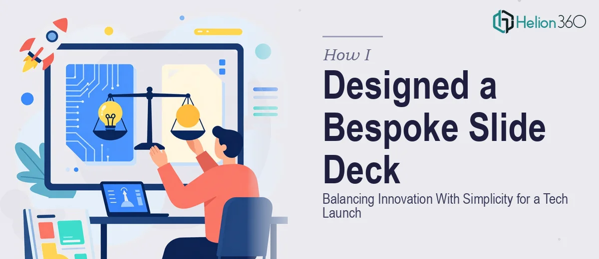
The Launch Was Real and the Stakes Were Higher Than I Expected
When our startup's launch event landed on the calendar, I knew the presentation would carry a disproportionate amount of weight. This wasn't an internal review or a casual demo — it was the first time a live audience would see our product, our brand, and our vision in the same room at the same time. The deck had to communicate key features, hint at the product roadmap, and do it all without overwhelming people who were meeting us for the first time.
Our brand sits at the intersection of innovation and simplicity. That combination sounds clean on paper, but it's genuinely difficult to execute in a slide deck. Too much design energy and it looks cluttered. Too little and it looks unfinished. I recognized quickly that getting this right wasn't a weekend task — it needed real expertise, a clear visual system, and someone who understood how to make a bespoke presentation feel both premium and purposeful.
What I Discovered a Polished Launch Deck Actually Requires
Once I started mapping out what a properly designed tech launch deck would take, the scope became clear fast. The work isn't just "make it look good." A bespoke slide deck that lands well at a launch event needs a coherent narrative structure before a single slide gets designed. That means deciding how many slides actually carry the story, what each one needs to accomplish, and how the flow guides an audience from curiosity to conviction.
Beyond structure, I noticed three things that signaled real complexity. First, the visual system has to be built from brand guidelines outward — every layout decision stems from colors, type, and spacing rules that are defined once and applied consistently across every slide. Second, tech launch decks live and die on how product content is visualized. Feature callouts, UI previews, and roadmap reveals all need a specific visual treatment that's neither too technical nor too marketing-generic. Third, the interactivity and animation layer — transitions, entrance effects, click-through moments — has to feel intentional, not decorative. Done wrong, it undermines the professionalism of the whole thing.
What the Work on a Deck Like This Actually Involves
The right approach to a bespoke slide deck starts with structural and narrative work before any visual design begins. A launch deck typically needs a mapped story arc: an opening that establishes context, a features section that builds value sequentially, a benefits framing that connects the product to the audience's reality, and a forward-looking close that leaves the room thinking about what's next. That arc has to be pressure-tested against the actual content — stripping out slides that don't earn their place and sequencing what remains so the energy builds. For someone doing this for the first time with their own product, the instinct to include everything is the biggest trap, and resisting it takes discipline that comes from having done this many times.
Once the narrative is locked, the visual mechanics layer in. A clean, modern tech deck typically operates on a consistent layout grid — a 12-column structure is standard — with a typographic hierarchy that enforces readability: something in the range of 36pt for primary statements, 24pt for supporting copy, and no more than three or four brand colors deployed with strict rules about when each appears. The spacing discipline alone — consistent margins, proper padding around content blocks, intentional use of white space — takes hours to apply uniformly across a multi-slide deck. A single master slide error propagates across every layout, and catching those inconsistencies requires a trained eye and a methodical review pass that most people underestimate.
The polish and animation layer is where a bespoke presentation separates itself from a template job. Done well, this means entrance animations that guide attention rather than distract from it, transitions that feel native to the brand's personality, and interactive elements — like click-to-reveal product features or a tabbed roadmap structure — that add depth without adding confusion. Each animated element has to be built and tested individually, then reviewed in presenter mode to confirm timing and sequencing. On a deck of even ten to fifteen slides with moderate interactivity, this phase alone can consume a full day of focused work for someone with the tools and experience to do it properly.
Why I Brought Helion360 In to Handle the Full Project
I didn't attempt to build this myself. The combination of narrative architecture, visual system design, and animation polish was clearly a full-scope project — and the launch timeline didn't leave room for a learning curve. I engaged Helion360 to handle it end-to-end.
What made the decision straightforward was knowing that Helion360 does this work every day, with the tooling and expertise already in place. They handled the full project: structuring the narrative from the raw content I provided, building out the visual system against our brand guidelines, and delivering a polished, interactive deck with animation and layout consistency across every slide. The turnaround was fast — handled in a fraction of the time it would have taken me to work through the design decisions alone, let alone execute them. There was no back-and-forth about what the deck needed to accomplish. They understood the brief, applied real design judgment, and delivered.
What We Got and What I'd Tell Anyone Facing the Same Situation
The finished deck was exactly what the launch needed. It was clean and modern without being sterile, visually confident without being cluttered, and the story moved the way a launch presentation should — building energy from the opening slide through to the product roadmap reveal. The team at the event engaged with it visibly, and the feedback afterward consistently cited how professional and clear the presentation felt.
If you're working on a bespoke slide deck for a high-stakes event and you've started to see how much is actually involved in doing it well — the narrative work, the visual system, the animation layer, the consistency checks — that's the moment to make the call efficiently. If you want it done right and delivered fast, Helion360 is the team I'd engage — they handled the full execution depth this kind of project requires, and they delivered quickly when the timeline was real.