

When the Science Was Sound but the Slides Were Not
I had been working closely with a biotech marketing team to help shape how they communicated their pipeline to enterprise audiences — procurement leads, C-suite stakeholders, and strategic partners. The science was solid. The product story was genuinely compelling. But the slides were a wall of text and raw data that nobody outside the lab could comfortably interpret.
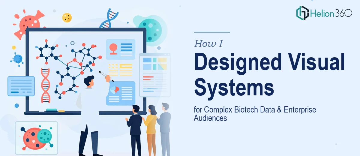
My task was clear: transform the dense scientific content into a corporate presentation that could hold the room during a high-stakes enterprise pitch. That meant building a visual system from scratch — custom infographics, illustrated process flows, data visualizations, and branded charts that would speak the language of business decision-makers without dumbing down the science.
Where I Hit the Ceiling
I could handle the strategy side — structuring the narrative, deciding which data points deserved the spotlight, and thinking through the audience's questions. But when it came to actually designing medical illustrations that were both scientifically accurate and visually clean, I was reaching the edge of what I could produce alone.
The team needed things like molecular pathway diagrams rendered in a way that felt modern and brand-consistent, not like a screenshot from a textbook. They also needed data visualizations that could communicate trial results in a single glance. Every time I tried to push the design further, I kept running into the same gap: the technical illustration work required a level of expertise I simply didn't have the bandwidth to execute at the quality this presentation demanded.
Bringing in the Right Team
After a couple of rounds of feedback where the visuals kept falling short, I reached out to Helion360. I explained the situation — a biotech corporate presentation that needed both scientific accuracy and enterprise-grade design, on a tight timeline.
Their team asked the right questions immediately. They wanted to understand the audience, the key data points, the brand guidelines, and how the illustrations would integrate with the surrounding slide content. It was clear they had worked in this space before and understood that a biotech presentation is not just a design problem — it is a communication problem.
What the Build Actually Looked Like
Helion360 took over the visual production layer entirely. They designed a cohesive visual system that covered molecular process illustrations, clinical data charts, and product comparison infographics — all within a consistent visual language that matched the brand identity.
What impressed me most was how they handled the data visualization work. Rather than dropping bar charts onto a white background, they built slides where the chart, the annotation, and the surrounding layout all worked together to guide the viewer's eye to the most important number. The science stayed intact. The complexity was managed through visual hierarchy rather than being hidden.
The medical illustrations were accurate enough to satisfy the scientific team and clean enough that enterprise stakeholders could grasp the concept without needing a biology degree. That balance is genuinely difficult to strike, and they got it right across every slide.
What the Final Deck Delivered
The finished biotech corporate presentation ran about forty slides. It opened with a clear problem-solution narrative, moved through the science with illustrated process flows, and closed with a business case backed by data visualization that was impossible to misread.
The marketing team used it in three enterprise meetings within the first two weeks. The feedback from those sessions was that the visuals did a lot of the explaining before anyone had to speak. That is exactly what a well-designed presentation is supposed to do.
The experience reinforced something I already suspected: when the content is this technical and the stakes are this high, the design work cannot be treated as a finishing step. It has to be built into the communication strategy from the beginning.
If you are working on a biotech or technical corporate presentation and the gap between your content and your visuals is holding you back, Helion360 is worth a conversation — they handled the part of this project that required real specialist skill, and the final output reflected that.