

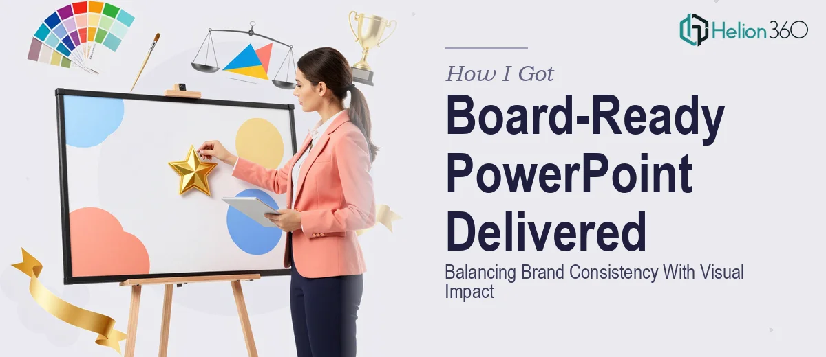
The Situation and What Was Actually at Stake
I had a presentation that needed to land in front of a senior leadership group, and it needed to do two things at once: hold up visually against a high-standard audience and stay rigorously on-brand across every single slide. This wasn't a rough internal update — it was the kind of deck where the formatting, the color discipline, and the story structure would all be judged before anyone got to the content itself.
The source material was scattered. There were slides from three different team members, each with slightly different fonts, inconsistent heading hierarchies, and charts that had been dropped in from different tools with no visual cohesion. The deadline was tight. I knew immediately that patching this together myself wasn't an option — not because the individual pieces were complicated in isolation, but because doing it properly, at the level this audience expected, required a specific kind of discipline and expertise I wasn't going to develop in the time available.
What I Found a Professional PowerPoint Presentation Actually Requires
Once I started looking at what a genuinely polished, board-ready PowerPoint presentation requires, the scope became clear fast. It's not a matter of making things look nice. It's a systems problem.
A deck built for a senior audience has to operate on a master slide architecture — meaning every layout, every placeholder, every margin is defined once and propagates correctly. If that foundation isn't right, inconsistencies creep back in the moment anyone edits a slide. Beyond structure, there's the visual hierarchy question: the relationship between a headline, a supporting label, and a data annotation has to be mathematically consistent, not eyeballed. And then there's brand application — not just using the right logo and colors, but ensuring that the palette behaves correctly in charts, on dark backgrounds, in call-out boxes, and across exported formats.
None of this is insurmountable for someone with the right background. But it's genuinely time-consuming, and getting it wrong at the board level carries real reputational cost.
What the Work Itself Actually Involves
The first thing a proper presentation build requires is a structural audit and narrative mapping. The right approach starts with reading every slide against a single question: does this earn its place in the sequence? Slides that exist because someone wanted to include data — rather than because they advance the argument — create drag. Done well, this stage produces a clear slide-by-slide brief: what each slide must communicate, what type of visual treatment serves it, and what the handoff point is between one idea and the next. This kind of structural work is slower than it looks. Reorganizing a 30-slide deck while keeping stakeholder intent intact, without losing content, takes careful judgment and usually several passes.
The visual mechanics layer is where most self-built decks fall apart under scrutiny. A board-ready deck uses a defined layout grid — typically a 12-column structure — with consistent safe zones, margin rules, and a typographic scale that doesn't vary. A well-executed hierarchy looks something like 36pt for primary headlines, 24pt for supporting headers, and 16pt for body and annotation text, with line spacing set deliberately rather than left at default. Charts require their own treatment: axis labels, gridline weight, and data label placement all follow rules that make the visual scannable in under five seconds. Getting this right across 25 to 40 slides, without a single slide breaking the system, is painstaking work even for someone experienced.
Polish and brand consistency at this level means more than applying a logo to a title slide. It means enforcing a palette of no more than four primary brand colors, ensuring those colors behave correctly on both light and dark slide backgrounds, and auditing every imported asset — icons, photography, chart fills — against the brand standard. Texture inconsistencies in icon weights, mismatched image aspect ratios, and off-brand chart accent colors are the details that signal to a senior audience whether this deck was built with intention or assembled in a hurry. Resolving them across a full deck is an hours-long process that requires both a trained eye and real familiarity with how PowerPoint's master slide system actually works.
Why I Brought Helion360 in to Handle the Full Project
I recognized quickly that the smart move wasn't to attempt this myself and iterate toward something good enough. The smart move was to hand the full project to a team that builds at this level every day.
Helion360 handled the project end-to-end — structural audit and narrative sequencing, full master slide rebuild, chart redesign, and visual presentations across every slide. The turnaround was fast: done in days, not the weeks it would have taken me to work through the learning curve on the master slide architecture alone. That speed wasn't luck — it came from a team that already has the tooling, the templates, and the process infrastructure in place. They didn't need to figure out how to do this work. They just executed it.
What I got back wasn't a lightly polished version of what I sent in. It was a fully rebuilt deck, built on a system that would hold up under editing and under the scrutiny of a senior audience.
The Result and What I'd Tell Anyone in the Same Position
The presentation went into the room looking exactly like the kind of material the audience expected from a team operating at that level. The brand was consistent, the hierarchy was clean, and the narrative moved without drag. The feedback was that the deck felt cohesive — which, at the board level, is exactly the right word. It meant the content got heard instead of the formatting getting in the way.
The bigger takeaway for me was about time. The hours that would have gone into rebuilding master slides, hunting down font inconsistencies, and second-guessing chart layouts were hours I didn't spend — and that mattered as much as the quality of the output.
If you're looking at a similar project and want a board-ready PowerPoint presentation handled end-to-end without the weeks of trial and error, Helion360 is the team to engage — they delivered fast, and the execution depth matched exactly what this kind of audience requires.