

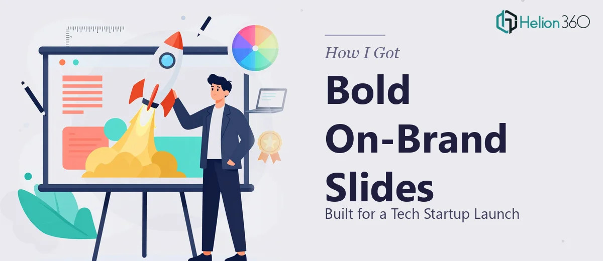
The Deadline Was Real and So Was the Pressure
We were three weeks out from our launch and the presentation problem had gone from "we'll deal with it soon" to urgent. The deck needed to carry the full weight of who we were as a brand — a fast-moving tech startup entering a crowded market — and it had to work across multiple contexts: internal alignment meetings, investor conversations, and a public-facing launch event. The slides weren't a formality. They were the first impression.
The brand identity was fresh. The logo was new. And everything in the deck needed to reflect that identity with precision, not as an afterthought. I knew immediately that cobbling something together from a generic template wasn't going to cut it. If this product launch presentation was going to do the job it needed to do, it had to be built properly from the ground up.
What I Found Out the Work Actually Required
I started mapping out what a proper tech startup launch presentation actually involves, and the scope became clear fast. This wasn't a matter of dropping content into slides. Done well, a launch deck for a tech brand requires a narrative architecture that earns attention from the first slide — a logical story progression that moves an audience from problem to solution to belief, without losing momentum.
Beyond structure, the visual execution had to be tight. A new brand identity — especially one that includes a freshly designed logo — needs to be applied with consistency across every slide. That means a controlled color palette, typographic hierarchy that holds at every screen size, and design decisions that reinforce the brand rather than dilute it. The third signal of real complexity: the assets themselves. A new logo going into a polished deck isn't just dropped in as a PNG. It gets placed within a visual system, and how that system is built determines whether the deck looks like a serious company or a side project.
What Building a Launch Presentation at This Level Actually Involves
The work starts with narrative architecture. A launch deck for a tech startup typically runs 15 to 20 slides, and each one has a job to do. The right approach maps the story arc before a single slide is designed — identifying the core message, the sequence of logical steps, and where visual emphasis is needed to reinforce a point rather than decorate around it. Skipping this step is what produces decks that look designed but feel disjointed. Getting the structure right is non-trivial work; it requires understanding both the business context and what the audience needs to believe by the end.
Visual mechanics are where complexity compounds. A professional launch deck is built on a consistent layout grid — typically a 12-column structure — with a typographic hierarchy enforced at the master-slide level: 36pt headlines, 24pt subheads, 16pt body copy as a common baseline. The brand's primary and secondary palette, usually capped at four colors to preserve clarity, has to be applied uniformly across every background, chart, icon, and accent element. Setting this up so it propagates correctly across all slide masters takes real time and precision. A single misaligned master means inconsistency bleeds through the whole deck, and fixing it retroactively is slower than building it right.
Polish and brand consistency at the asset level is where most in-house attempts fall apart. When a new logo enters a presentation, it needs to be sized, positioned, and placed according to the brand's spacing rules — not eyeballed. If the logo has a visual identity system behind it, that system defines how it sits relative to other elements on the slide. Beyond the logo, every icon set, every illustration style, every chart treatment needs to speak the same visual language. Achieving that consistency across 15 to 20 slides — with multiple slide types, varying content densities, and different visual formats — is the kind of detail work that adds up quickly.
Why I Brought in Helion360 to Handle It
The scope was obvious to me before I'd spent an hour mapping it out. I didn't have three weeks of design capacity sitting idle, and I wasn't going to acquire the expertise to execute this at the level it needed in the time available. The smart move was to engage a team that does this work every day and already has the tooling and process in place.
Helion360 took the full project end-to-end. They handled the narrative structure — auditing what we had and mapping it into a presentation arc that actually told our story in sequence. They built the visual system from our brand identity, applying the palette and typographic hierarchy correctly across every slide master. And they brought the logo and brand assets into the deck with the kind of precision that made the whole thing look like it came from one coherent source. The turnaround was fast — done in days, not the weeks it would have taken me to learn and execute it at this standard.
What Came Out of It and What I'd Tell Anyone in My Position
The delivered deck was cohesive, on-brand, and presentation-ready across every context we needed it for. It held up in the boardroom, on screen at the launch event, and as a leave-behind. The brand identity that had only existed as a logo and a set of guidelines came to life as a full visual experience across 18 slides. More importantly, the story was clear — the audience understood who we were, what we were solving, and why it mattered, without us having to explain it in the room.
The result wasn't just a nice-looking deck. It was a business asset that worked. If you're facing a similar launch window with a new brand identity that needs to show up properly in a high-stakes presentation, don't spend your runway trying to execute this yourself. Helion360 is the team I'd engage — they handled the full scope fast and delivered the kind of execution depth this work requires.