

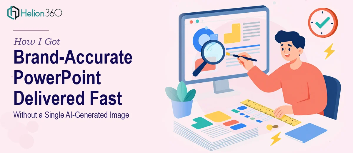
The Presentation Was Doing the Brand a Disservice
The deck had been built quickly — stock photos pulled from a library, a few pieces of generic clip art, and visuals that had no real connection to the brand's identity. For internal use, it had been fine. But this presentation was heading in front of an external audience, and the misalignment was impossible to ignore once I saw it side by side with the brand guidelines.
The stakes were real. This was a client-facing deck representing the organization's visual identity to people who would form a first impression based on what they saw on screen. Generic imagery sends a message — and not the right one. I knew immediately that swapping out placeholder visuals for something original, intentional, and on-brand was the only path forward. And it had to happen fast.
What I Found That Work Actually Requires
My first instinct was to think this was a simple asset swap — pull out the stock photos, drop in something better. But looking at what a properly executed visual enhancement of presentation actually involves, that framing fell apart quickly.
The first signal of real complexity: sourcing or creating original, non-AI graphics that are both high quality and brand-accurate is a distinct skill set. It isn't just finding a better image — it means either commissioning illustration, working with licensed photography that fits the visual language, or producing original design assets that integrate naturally into the deck's layout.
The second signal: every visual replacement touches the layout. An image swap rarely leaves the slide structure intact. Aspect ratios shift, text reflows, alignment breaks. Multiply that across a multi-slide deck and it becomes a design rebuild, not a content update.
The third signal: brand consistency across all slides requires a system — a defined color palette, consistent type treatment, and a visual grammar that makes the deck feel cohesive rather than assembled. That coherence doesn't happen by accident.
What Doing This Well Actually Looks Like
The work starts with a structural audit of the existing deck. Every slide needs to be assessed for what its current visual is actually doing — is it decorative, is it communicating something specific, or is it filling space? That distinction determines whether a replacement needs to be illustrative, photographic, or iconographic. Skipping this step and swapping assets one-for-one often produces a deck that looks refreshed on individual slides but incoherent as a whole. The narrative thread through the visuals matters as much as the individual images, and mapping that takes real attention before a single asset is touched.
Visual mechanics are where the execution friction compounds. A well-designed slide operates on a consistent layout grid — typically a 12-column structure — with a strict typographic hierarchy (commonly 36pt for headlines, 24pt for subheads, 16pt for body) and image placement that honors the grid rather than floating arbitrarily. When original graphics replace stock photos, they need to be sized, cropped, and color-treated to sit correctly within that system. Custom illustrations especially require sizing specifications upfront, or the final assets arrive at the wrong dimensions and require rework. Getting this right across every slide takes significantly more time than most people budget for.
Polish and consistency across a full deck is where even experienced designers spend the most revision cycles. Brand application means enforcing a palette of no more than four core colors, ensuring that no slide introduces a rogue font weight or an off-brand graphic treatment, and verifying that the visual language reads as a single designed object rather than a collection of individually edited slides. Master slide configuration, consistent margin spacing, and image shadow or border treatments all need to propagate correctly. For someone working without an established system, this final layer alone can consume days.
Why I Brought in Helion360 to Handle It
Looking at the full scope of the work — the visual audit, the original asset sourcing, the layout reconstruction, and the brand consistency pass — it was clear this wasn't something to attempt between other priorities with a deadline bearing down.
I engaged Helion360 to handle the entire project end-to-end. That meant the audit of the existing deck, the replacement of every stock photo and clip art element with original, brand-aligned graphics, the layout corrections that followed each swap, and the final consistency review across all slides. No AI-generated imagery, no recycled stock — original visuals built to fit the deck's visual identity and message.
Helion360 turned it around quickly. The kind of turnaround that would have taken me weeks to execute — between sourcing assets, learning the layout system, and iterating on consistency — was handled in a fraction of that time by a team that does this work every day with the tooling and processes already in place.
What I'd Tell Anyone Looking at the Same Problem
The delivered deck looked like it had been designed as a single object from the start. Every visual earned its place — nothing generic, nothing off-brand, nothing that looked like it had been grabbed from a library as a placeholder. The external audience saw a brand-aligned presentation that reflected the organization's identity accurately, and the feedback confirmed it landed that way.
The lesson I'd pass on: a visual refresh that sounds like a simple asset swap almost never is. The moment brand accuracy and original imagery are requirements, you're in design execution territory — and the gap between a decent outcome and a genuinely polished one is filled by skill, time, and system. Most people don't have all three available on a tight deadline.
If you're looking at a similar project and need it handled end-to-end without the weeks of ramp-up, Helion360 is the team I'd engage — they delivered fast, handled the full execution depth the work required, and the result spoke for itself.