

The Situation I Was Looking At
We were preparing a corporate presentation that needed to do more than look polished. It had to reflect the brand precisely, hold an executive audience's attention through a live walkthrough, and use interactive elements — clickable navigation, section jumps, embedded visuals — that made the content genuinely usable rather than just displayable. The stakes were real: this deck would be used repeatedly across leadership meetings and stakeholder reviews, not just once.
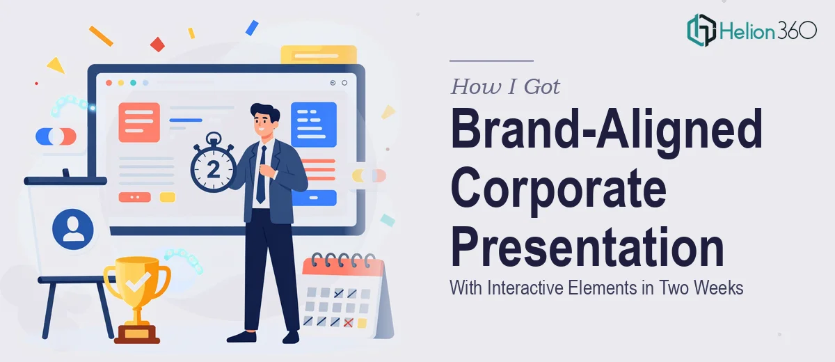
I had about two weeks before the first major use. The content was largely there in rough form — competitive context, positioning rationale, market framing — but it was scattered across documents and data exports. Getting it into a cohesive, brand-aligned corporate presentation with interactive functionality was a different category of problem entirely. I recognized immediately that this wasn't something to attempt in spare hours between other priorities.
What I Found This Kind of Work Actually Requires
Once I looked at what a properly executed corporate presentation with interactive elements actually involves, the complexity became clear fast. It isn't just about making slides look good. The interactive layer alone — clickable menus, section-to-section navigation, return-to-home anchors — requires a disciplined slide architecture underneath it. If the master layout isn't set up correctly from the start, adding interactivity later breaks formatting across the deck.
Then there's the brand alignment side. Proper brand application isn't just dropping in a logo and using the right hex codes. It means applying a defined typographic hierarchy — typically something like 36pt for primary headers, 24pt for sub-headers, 16pt for body — consistently across every slide, including charts, callouts, and footnotes. It means a restricted color palette of no more than four primary brand colors, used with intention, not decoration.
The third signal of real complexity was the data visualization embedded in the competitive analysis sections. Charts that communicate competitive positioning aren't just Excel exports resized to fit a slide. They require deliberate chart type selection, axis labeling discipline, and visual hierarchy that directs the eye to the insight rather than the data.
What the Work Itself Actually Involves
The structural and narrative foundation comes first. That means auditing every source document — strategy briefs, market data, competitive snapshots — and mapping a clear story arc across the deck before a single slide gets designed. The right approach defines the logical flow: context, insight, implication, recommendation. Without that architecture locked in, design work gets redone as the narrative shifts. A deck of this scope typically has 25 to 40 slides, and rebuilding slide order mid-project costs hours. Getting the narrative map right before touching the visual layer is what separates efficient execution from repeated rework.
Visual mechanics in a brand-aligned corporate presentation operate on a grid system — commonly a 12-column layout — that every element on every slide snaps to. Text boxes, charts, images, and callout blocks all align to that grid, creating the visual consistency that makes a deck read as professional rather than assembled. Typography follows a strict hierarchy. Deviation even by a few points on a secondary label breaks the visual rhythm. Setting up slide masters that enforce this correctly — and that propagate changes across all layouts simultaneously — requires deep familiarity with the tool's master/layout inheritance model. It's the kind of setup that takes a practitioner a couple of hours and an unfamiliar person most of a day, just for the master architecture alone.
The interactive layer adds another dimension of technical precision. Clickable section tabs, chapter navigation buttons, and slide-to-slide hyperlinks all need to be built against a finalized slide structure — because any reordering after hyperlinks are placed breaks every affected link. The right approach builds interactivity in the final pass, after content and layout are locked. Each interactive element also needs to be visually consistent: button states, hover-implied styling, and icon sizing all follow the same grid and color rules as the rest of the deck. Testing every link path across the full deck before delivery is its own quality pass, not an afterthought.
Why I Brought in Helion360 to Handle It
I looked at the scope — the narrative structuring, the master slide architecture, the brand application across 30-plus slides, the interactive build — and decided immediately that the right move was to engage a team that does this work every day. Attempting it myself would have meant weeks of learning curve on the technical side alone, and the output quality still wouldn't have matched what a practiced team produces.
Helion360 handled the full project end-to-end: they structured the narrative from my source materials, built the slide masters with the correct typographic and color system, designed the gap analysis presentation for the competitive analysis sections, and implemented the full interactive navigation layer. The deck was turned around in under two weeks — a timeline that would have been impossible to hit working through this myself. The whole project moved in a fraction of the time it would have taken me to work through even the master slide setup alone.
The Outcome and What I'd Tell Anyone in My Spot
What came back was a corporate presentation that held together visually from the first slide to the last, navigated cleanly through its interactive menus, and communicated the competitive positioning clearly to an executive audience. The brand application was consistent at a level of precision I wouldn't have achieved working in the tool myself, and the interactive elements worked reliably under live presentation conditions.
Anyone looking at a similar project — a brand-aligned corporate deck with real interactive functionality, a tight deadline, and an audience that will notice quality — is looking at a scope that rewards engaging people who build these things continuously. The technical depth involved is real, and the margin for error in a high-stakes presentation is low.
If you're in that same position and need the work handled end-to-end without the weeks of ramp-up, Helion360 is the team I'd engage — they delivered fast, handled every layer of the execution, and brought the kind of precision this type of work demands.