

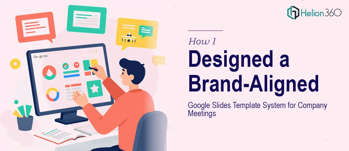
When a Messy Meeting Template Became a Real Problem
Every company reaches a point where the presentation used in weekly meetings stops reflecting who the company actually is. That was the situation I found myself in. Our Google Slides meeting template was a patchwork of old layouts, mismatched fonts, and slides that looked like they'd been built by six different people across three years — because they had been.
The stakes were real. Leadership visibility, team updates, project highlights, and quarterly reviews all ran through this template. When the design looked inconsistent and off-brand, it quietly undermined the credibility of the content inside it. A board member, a new hire, or an external partner seeing our internal slides for the first time was seeing something that didn't reflect what we'd built.
I knew this needed to be fixed properly — not patched again, but rebuilt as a complete, brand-aligned Google Slides template system that could scale with the company.
What a Proper Google Slides Template System Actually Involves
I started by looking into what doing this well actually requires, and the scope was larger than I expected.
First, a professional Google Slides company template isn't a single file with nice colors — it's a structured system of slide masters, layouts, and placeholder configurations that need to work together. Every layout variation for agendas, team updates, data slides, and Q&A sessions has to be defined at the master level, not copy-pasted per slide.
Second, brand application in Google Slides has hard technical constraints. Fonts, color palettes, logo placement, and spacing rules all have to be embedded correctly so that anyone on the team can open a layout and use it without accidentally breaking the design. That requires knowing where Google Slides enforces its own defaults and where those defaults will override your custom settings if not anchored properly.
Third, the template had to be future-proof — easy to update and customize across a distributed team. That's an entirely different design brief than building a one-off presentation.
The Work That Goes Into Building It
The foundation of a Google Slides template system is the slide master and its associated layout hierarchy. The right approach establishes a primary master with a defined 12-column grid, enforces consistent margins — typically 0.5 to 0.75 inches — and locks logo and brand mark placement to a fixed position that persists across all layouts. A typography hierarchy using three levels — display at 36pt, subhead at 24pt, and body at 16pt — gets defined once in the master and cascades down. The execution friction here is that Google Slides has specific rules about which master-level settings propagate versus which get overridden at the layout level, and resolving those inconsistencies across 15 to 20 layout variants takes methodical testing and iteration that isn't obvious until you're deep in it.
Visual mechanics across individual layouts require a different level of detail. A well-built company meeting template typically includes distinct layouts for agenda slides, full-bleed image backgrounds, data and metrics slides, two-column team update formats, and Q&A closers — each with correctly anchored text placeholders and consistent whitespace ratios. Chart and icon placeholder styles need to be defined so inserted content sits inside the visual grid rather than disrupting it. The challenge is that what looks balanced on one layout can look visually heavy or off-center on another, and calibrating spacing across the full layout library takes a practitioner's eye for visual weight and proportion.
Polish and palette discipline are what separate a template that looks professional from one that looks assembled. Proper brand application means limiting the active palette to four brand colors with defined usage roles — primary, secondary, accent, and neutral — and ensuring those roles are applied consistently across all slide states: title slides, content slides, dividers, and footnote treatments. A common failure point is inconsistent text color behavior on dark versus light backgrounds, which produces accessibility issues and visual noise. Getting this right across every layout, with sufficient contrast ratios for legibility, is painstaking work that gets skipped when time is short.
Why I Brought Helion360 in to Handle the Full Build
When I mapped out what the full build required — master configuration, layout library creation, brand application across every slide state, and testing for usability across the team — I recognized immediately that attempting this myself wasn't realistic. The technical depth of Google Slides master configuration alone had a steep enough learning curve to make this a weeks-long project without the right tooling and experience already in place.
I engaged Helion360 to handle it end-to-end. They took the existing brand guidelines, audited the meeting use cases, and built the full template system — master hierarchy, all layout variants, brand color and typography integration, and a clean set of customizable placeholder structures. The turnaround was fast. What would have taken me weeks of trial and error was delivered in days, with every layout tested and ready for the team to use immediately.
The value wasn't just speed — it was the confidence that the technical decisions were made correctly the first time, by a team that builds these systems regularly.
The Result and What I'd Tell Anyone in This Situation
What came back was a complete Google Slides template system — a master with a clean 12-column grid, fourteen layout variants covering every meeting type, full brand application across fonts, colors, and logo placement, and placeholder logic that makes every slide easy to update without touching the design.
The immediate effect was visible in the first meeting we ran with it. The presentation looked like it belonged to the company. Contributors could drop content into the right layouts without reformatting anything. And the consistency held across every slide, even when different team members were editing simultaneously.
If you're looking at the same problem — an outdated or inconsistent meeting template that needs to be rebuilt properly as a scalable system — Helion360 is the team to engage. They handled the full execution fast, and the depth of work the project required was clearly something they do routinely.