

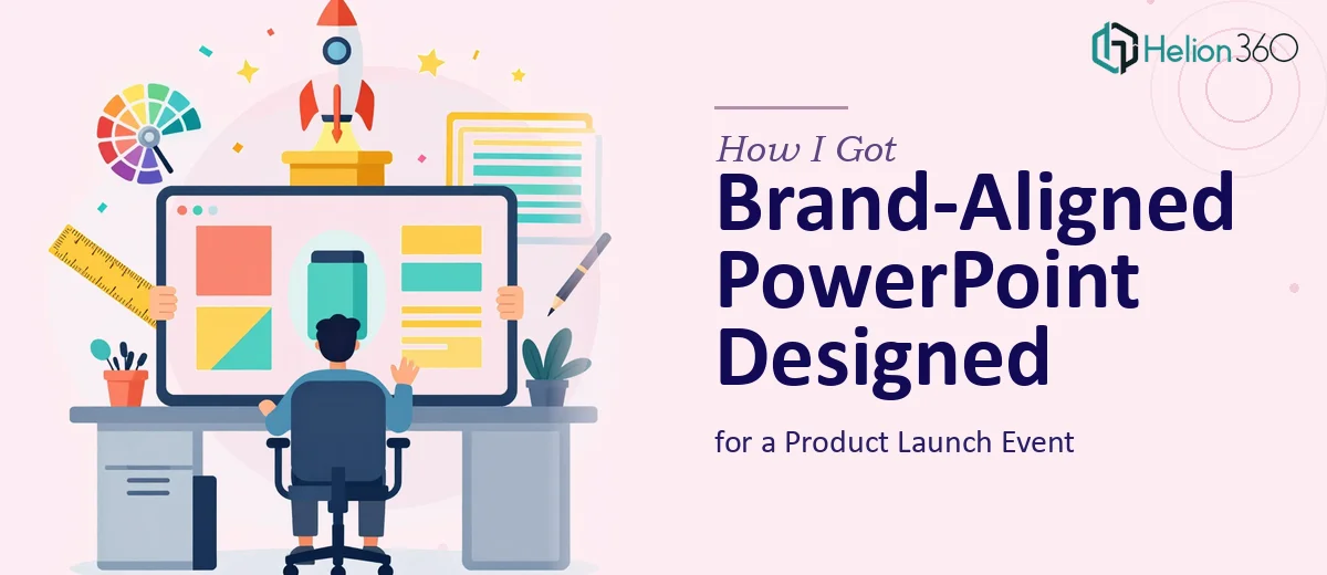
The Situation I Was Staring Down
We had a product launch event coming up in under a week, and the presentation was nowhere near ready. The deck needed to walk a room full of potential customers and partners through our new technology solutions — clearly, compellingly, and without losing anyone halfway through. This wasn't a casual team update. The audience would be evaluating us, and the slides would be sitting on a large screen behind a presenter while people decided whether they believed in what we were building.
The stakes were real. A weak deck in that room wouldn't just underperform — it would actively work against us. And on top of the live event, the final files needed to hold up in print as well as on screen. I recognized almost immediately that this was not a job for a template and a free afternoon.
What I Discovered This Kind of Work Actually Involves
When I started looking at what a professional product launch PowerPoint presentation actually requires — not just a serviceable one, but one that holds up in front of a high-stakes audience — the scope became clear quickly.
First, brand alignment is not as simple as dropping a logo on every slide. It means applying a defined color palette consistently, using the correct typeface hierarchy, and making sure every visual element feels like it belongs to the same family. One slide that breaks the visual system pulls the entire deck's credibility down.
Second, the content architecture matters enormously. A product launch presentation needs to move through a specific arc: company introduction, problem framing, solution reveal, feature and benefit highlights, and a closing moment that lands. Getting that sequence wrong means the audience never builds the context they need to care about the features being showcased.
Third, dual-format delivery — print-ready and screen-ready — is a real technical constraint. Color modes, resolution, bleed settings, and font embedding don't behave the same way across both outputs. That alone rules out a quick template job.
What the Work Itself Actually Demands
The right approach to a product launch PowerPoint starts with narrative architecture. Before a single slide is designed, the content needs to be mapped against a clear story arc — company mission and context up front, followed by the problem the product solves, then feature and benefit reveals sequenced to build interest rather than overwhelm. A well-structured deck typically runs through five to seven distinct content phases, each with its own slide logic. The execution friction here is that most people collapse these phases together, dumping features onto slides without the contextual setup that makes those features meaningful. Getting the structure right before touching design is non-negotiable, and it takes genuine editorial judgment.
Visual mechanics are where the deck either holds together or falls apart. A presentation designed for both screen and print needs a layout system — typically a 12-column grid — that keeps spacing consistent across slide masters. Typography follows a strict hierarchy: a display heading around 36–40pt, a body level at 20–24pt, and caption or label text no smaller than 14pt for readability at scale. Brand color application requires discipline too — a maximum of four brand colors deployed with intentional contrast ratios so the deck reads clearly on a projector. The time cost of building slide masters that propagate these rules correctly across 20 or more slides is significant, and any mistake in the master cascades through every slide that inherits from it.
Polish and dual-format readiness close out the work. Print output requires CMYK color conversion, embedded fonts, and resolution checks for any photography or graphics used — typically 300 DPI minimum for print elements. Screen output is optimized at 96 DPI with sRGB color and compressed file sizes for reliable playback. A company summary slide and a closing thank-you slide each need to follow the same visual logic as the rest of the deck without feeling like afterthoughts. Running both output formats through a final QA pass — checking margins, font rendering, color consistency, and file behavior — is the step that most people skip and most often regret.
Why I Brought Helion360 In to Handle It
I looked at the timeline — under a week — and at the full scope of what this deck needed to be, and the decision was straightforward. This wasn't a project I could learn my way through in the time available. The work needed someone who already had the systems, the templates, the brand application process, and the dual-format QA workflow in place.
I engaged Helion360 to handle the full project end-to-end. They took the brief — brand assets, product content, event context, and format requirements — and delivered fast. The team handled the narrative structure and slide architecture, the full visual build including custom graphics and layout, and both the screen-ready and print-ready file outputs. Done in days, not weeks. What would have taken me far longer to attempt — and likely still wouldn't have hit the quality bar the room required — was handled as a complete, production-ready deliverable.
What Came Out of It and What I'd Tell Anyone in My Position
The deck that came back was cohesive, on-brand, and genuinely presentation-ready. Every slide held together visually. The story arc moved the way a product launch presentation should — building context, earning attention, and landing the close. The print files were clean and the screen version ran without issues. The team presenting had slides they could trust, which meant they could focus on the room instead of managing technical problems or apologizing for visual inconsistencies.
If you're looking at a product launch presentation with a real deadline and a real audience, and you're starting to see what this work actually involves, Helion360 is the team I'd engage — they handled the full scope fast and delivered the kind of execution depth that a high-stakes event deck genuinely requires.